My Mini Kitchen Makeover
With a small budget, I recently set about giving my kitchen a mini makeover. Here’s what I did....
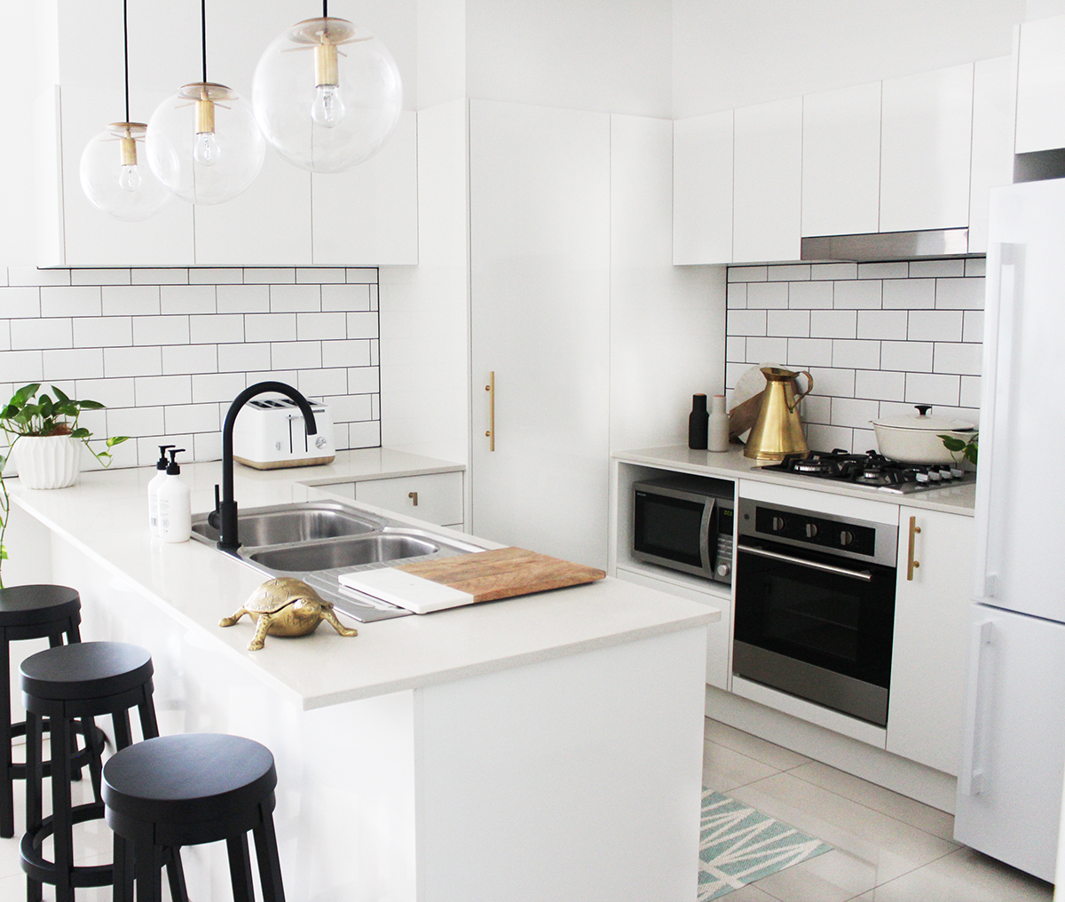
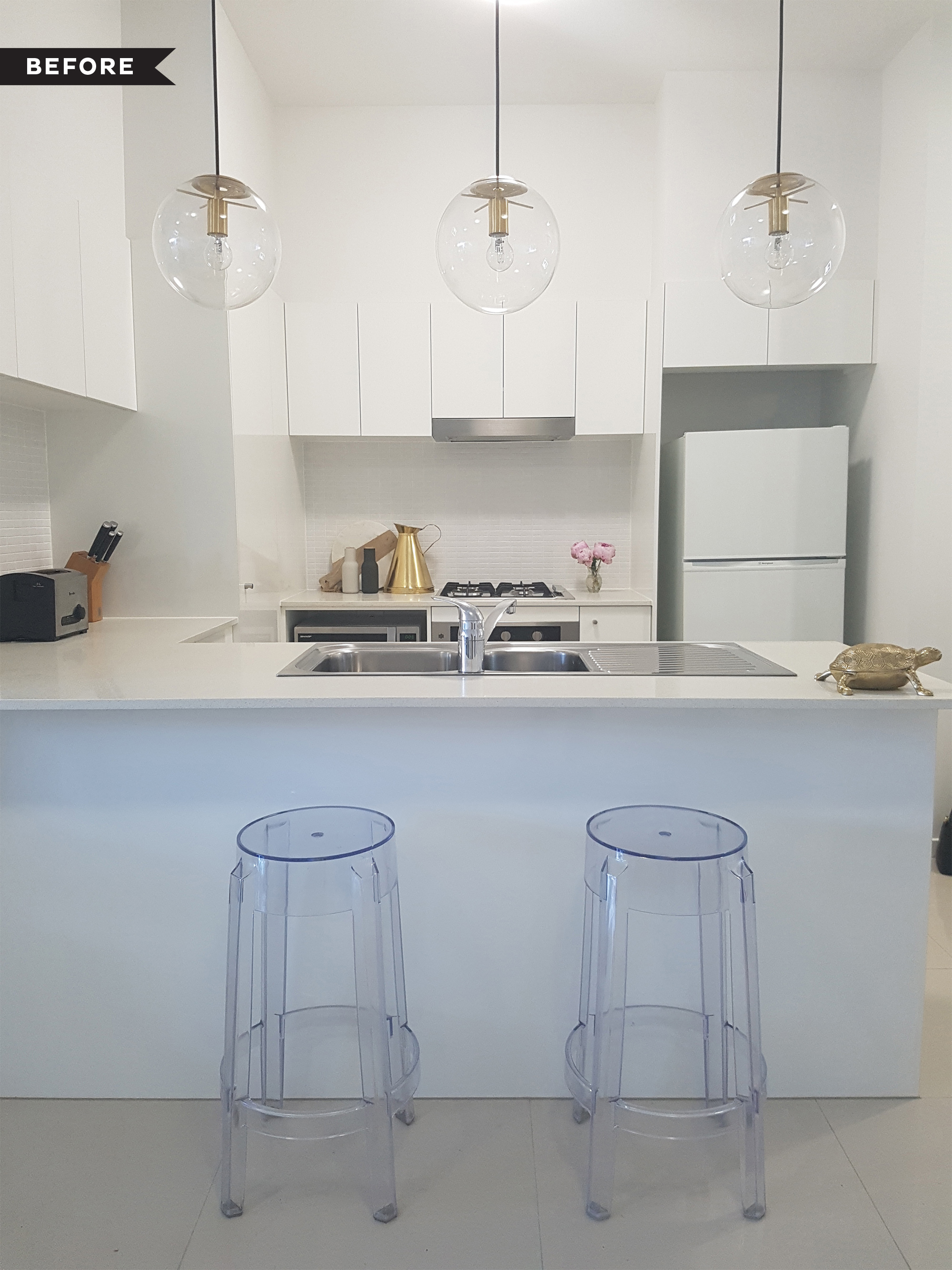
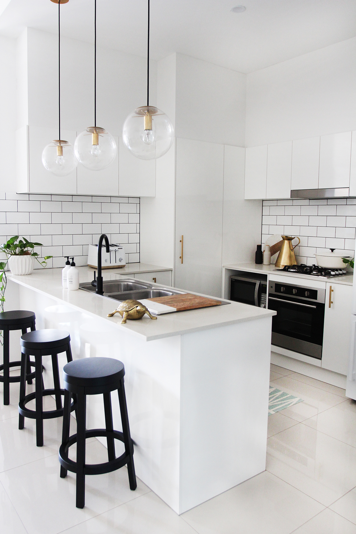
When I purchased my apartment off the plan, it was a little disappointing when I found out that I couldn’t make a lot of design changes. There were however, a couple of things that I could do – adding these pendant lights at the build stage, along with closing in the space above the top cabinets to make it look more streamlined. As you can see in the before image to the right, there wasn’t a huge amount I changed. And in hindsight, I have to say it’s not that bad, at least it’s very white. It just didn’t speak to my personality though. It all felt a bit blah.
So here’s what I changed:
- New barstools for more contrast
- New gooseneck tap
- Bigger fridge to fill that space
- New tiled splashback with more visual impact
- New toaster and kettle
- New brass door handles to tie in with the pendants
- Remove oyster light and replace with 2 downlights
The Morphy Richards range of toasters and kettles are super stylish. I love that their new Scandi Aspect design has a timber-look trim giving it a fresh modern look. Another favourite addition are my new Lewis Dolan brushed brass pulls and handles from US online store My Knobs. I had to use a secondary shipping company (shipito) to be able to get them here to Australia, but it’s worth it, as brass hardware in Australia is hard to come by (and not to mention super expensive in comparison to these).
I really love my new plastic mat in the kitchen from Habitat Home Collection. The icy blue colour is nice and fresh and adds just the right amount of colour to the monochromatic space. It’s also really durable, and because it’s made of plastic, it grips quite well to the tiles so you don’t need to worry about it slipping around.
When it came to budget – the tiles were actually the cheapest thing in the space, coming in at $61 for 2 cartons from Bunnings. The labour was about $250. I’m lucky to know a tiler who did a great rate for me – and as he just tiled over the top of the existing tiles it cut time down. Another budget friendly addition was the black tap from Meir. What a difference it makes replacing the existing ho-hum mixer that was previously there. I love that it’s a matte finish - it dries quickly and never looks streaky (like it can with a chrome one).
Overall, I’m really happy with how the makeover turned out. It’s now a space I enjoy using.
Get the look with these finds:
FRIDGE / TOASTER / KETTLE / HAND CREAM / HAND WASH
BAR STOOL / MAT / DOOR HANDLE / PENDANT LIGHT / TAP


