A Charming Laundry/Mudroom Reno
Today we’re chatting to interior designer Lydia Maskiell, who together with her client transformed this once dark and gloomy laundry/mudroom into a beautiful and bright, functional space.
Interior design Lydia Maskiell / Photography Ben Dilger
1. Tell us about this mudroom/laundry space - what it looked like before, and also the size.
This mudroom/ laundry space was very dark and gloomy. It was originally lined with dark timber vj panelling in both the ceiling and in the original cabinetry. The dark materials felt heavy in a space with no natural light other than a small side window at one end of the room, especially paired with the original brown vinyl flooring. This size of the space overall is approximately 2m x 4m and is divided into two separate spaces–one side for the mudroom and the other is the laundry.
2. How have you transformed the space?
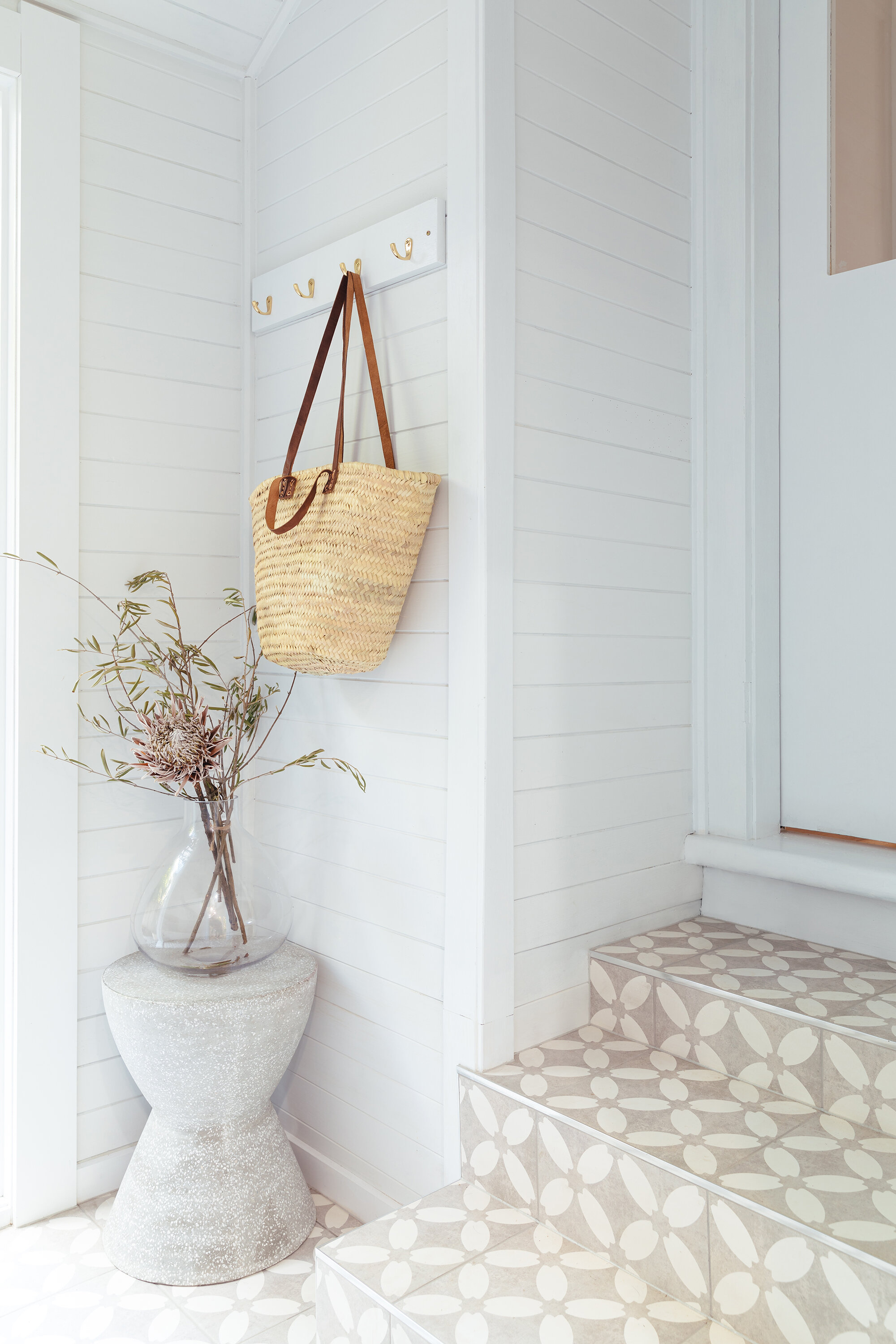
This space has been a great collaboration with the builder, Shane Wager from Framed Renovations and the client Sarah Meddy who’ve all played a huge role in this transformation and the design of the space. The two spaces have been completely renovated with all new cabinetry, new floor covering and two new glass doors on either end of the mudroom and laundry. This has been a great opportunity to let more natural light into the space and create a sense of depth with views out to the garden. This has also allowed for an outdoor connection and transparency between the two spaces. New Easycraft lined cladding has been used behind the bench seat for texture and also references the original cladding.
BEFORE
BEFORE
3. What did your client need out of this space and how have you achieved this?
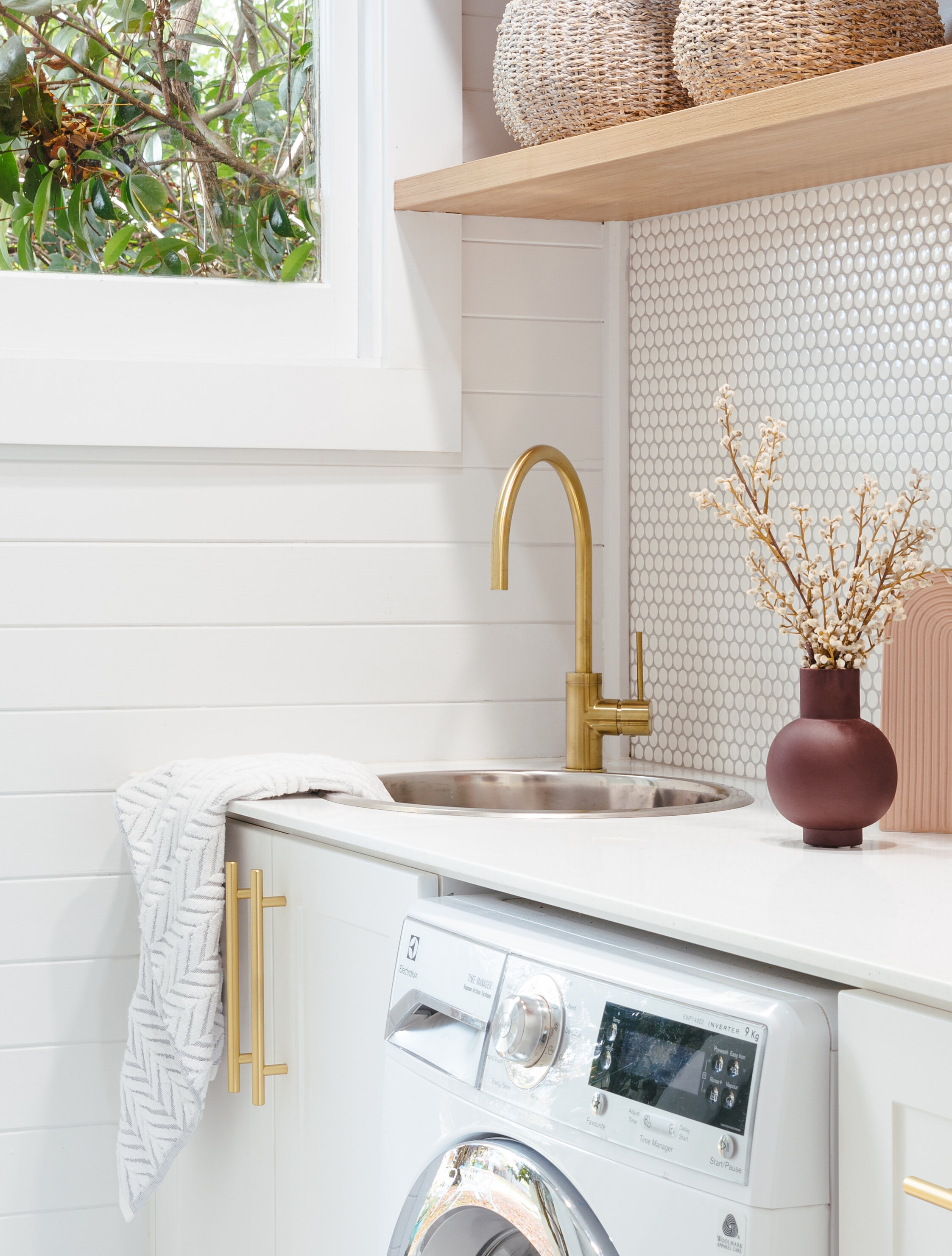
The client’s brief was to make this space feel light, bright and warm. The texture in the original timber panelling has been painted in white which has immediately freshened up the space. This predominately all white interior is full of texture. There is a subtle texture in the shaker style cabinetry that works in beautifully with the all-white panelling. The white pennyround mosaics paired with a subtle contrast in the grout is another way that we’ve injected texture into the space.
4. Is there anything else you’d like to add?
The homeowner has such beautiful taste and it was important that the laundry/ mudroom married into the homeowner’s distinct style. The rest of the home is so bright and warming that it was important for this space to be a natural progression of this. We’re so thrilled to be able to bring the client’s vision to life!


