Artist Profile: Kimmy Hogan
We interview Kimmy Hogan about the inspiration behind her two new art collections Vessels and Honey Flower.
Photography Cricket Studio / Styling Kimmy Hogan and Rose Goodall-Wilson
Can you tell us briefly about your two new collections - the inspiration and themes behind each.
I wouldn’t usually release two collections at once but for the first time my stock was incredibly low across the board – so many editions have sold out. These collections were created earlier this year and came so naturally – so when I realised our stock was really low I decided to do two shoots then ultimately launch them together.
“My drawings always start in my journal and my hand is so familiar with the shapes of petals and sporadic angles of leafy foliage. ”
Vessels
Describe your Vessels collection.
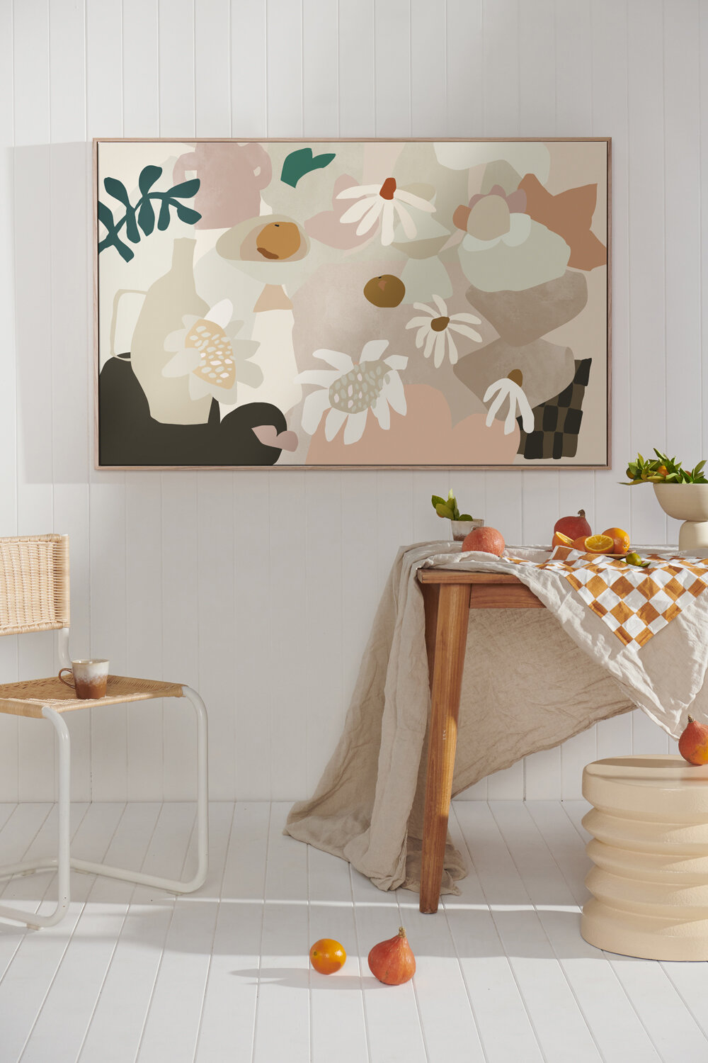
My journal is filled with pages of vessels... I draw them loosely in pencil, sometimes not even looking at the page. These wobbly imperfect shapes reveal themselves and look alive - so fluid and unexpected. Overlapping flower shapes is a given, while adding hints of check is a surprise. I've experimented with some favourite tones as well as splashes of new ones. This has collection has come from a place of pure joy.
Honey Flower
Describe your Honey Flower collection.
For the flower lovers... the romantics... the unashamedly feminine... I never stray too far from my love of florals and this collection was truly a gift to create. My drawings always start in my journal and my hand is so familiar with the shapes of petals and sporadic angles of leafy foliage. The soft dreamy palette is anchored with some dark cool greens and vibrant rust. To me, the giant centre of a protea flower is like a generous heart.
How do you decide on the colour palettes you use for each collection - is there a starting point?
I always start with my base favourites of cream, blush pinks and terracotta – then I start to introduce new colours as the drawing progresses. Along the way if I feel the drawing is taking on a different mood it can completely transform into a whole new colour scheme. Overall there are usually a few tones that will tie the entire collection together, but I like each artwork to sing it’s own song.
How do you create your artworks (technique and program-wise)?
All artworks start as a sketch in my journal. I could fill pages with drawings for hours on end if I had the time. When I see something special in a sketch I then redraw this on the computer (with hand motion) and let the lines be as loose and flowy as the original drawing. I don’t go back and ‘neaten up’ lines – my artwork looks hand drawn because in essence it is – and retains all the goodness of the original sketches. I then flood the drawings with colour and test out different schemes until somehow it all just works and is exactly how it was meant to be.
I use Adobe Illustrator for the drawings and colouring then use Adobe InDesign for overlaying handmade brush strokes and textures to bring the artwork to life. My art is printed with archival inks on the most amazing quality canvas or paper. All my canvases are coated with a sealant to protect from UV and moisture which is above industry standard. Artworks are all made to order, and all editioned individually after they are printed.


