Colour Trend: Burgundy + Blush
We’re officially obsessed with 2017’s hottest colour trend – burgundy and blush pink. When the two hues combine, it’s pure magic. The pale pink helps to balance the richness of the burgundy – creating a perfect harmony.
SOURCES (PICTURED ABOVE)
EVENT STYLING / CHAIR / CARD / THROW / PRINT / SHEEPSKIN / LIGHT / CUSHION / DRESS
Not only does this colour combo work in interiors – it also crosses over into fashion, and even event styling as illustrated above in the work of business Styled By Coco. This is typical of most colour trends, they tend to filter into all sorts of areas.
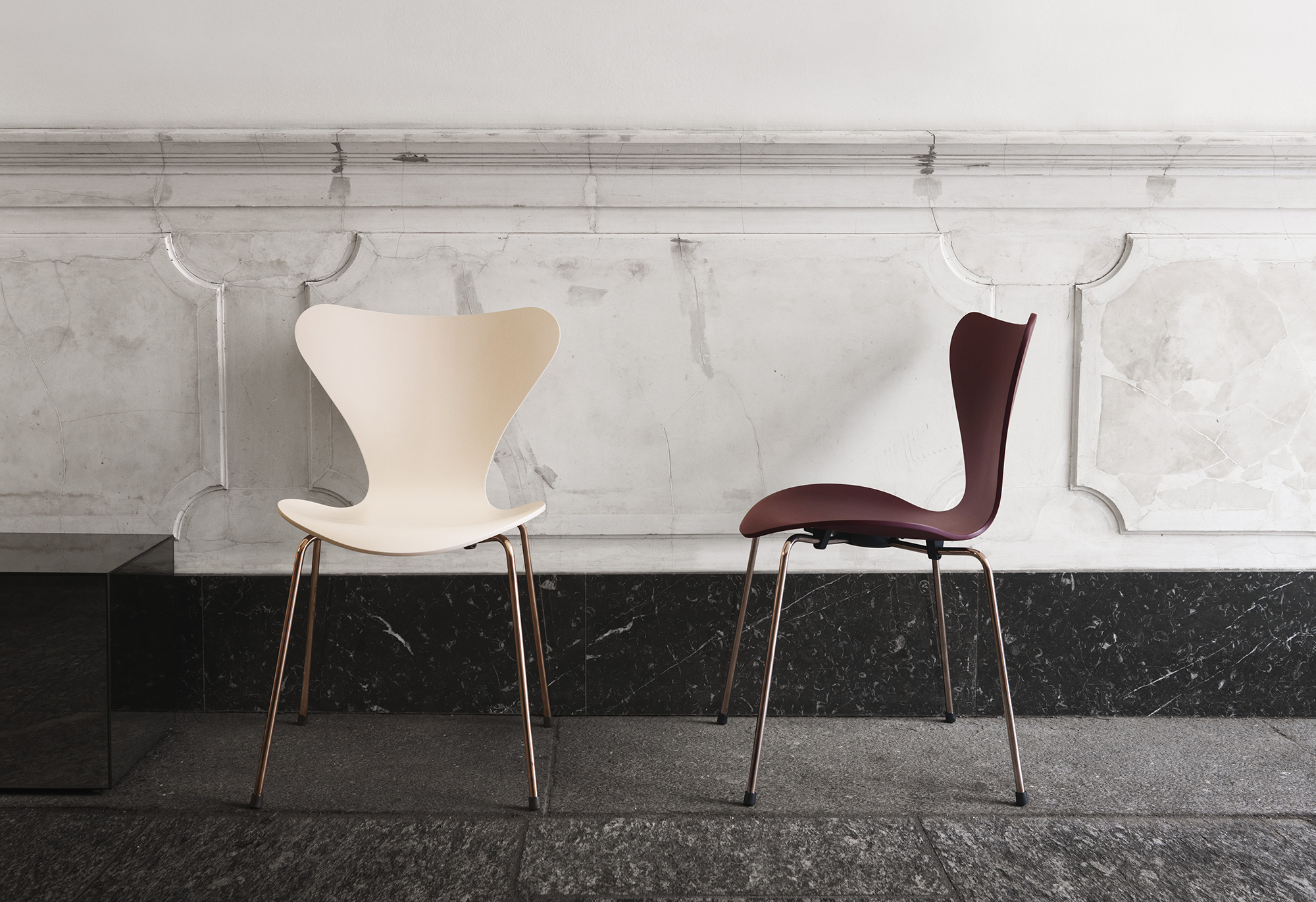
If you had of told me a couple of years ago that burgundy would be in, I would have scoffed and thought don’t be ridiculous. Well, I’ve come around to this colour, but here’s the clincher. It looks best with pale blush pink. Throw in some rose gold/copper accents and you’ve got the perfect colour combination - it’s got great contrast, with the softness of the blush cutting through the richness of those dark burgundy hues.
There are so many brands embracing these colours – including Republic of Fritz Hansen (available from Cult). The iconic Arne Jacobsen Series 7 chair pictured above, has been given a makeover – inspired by the soft, feminine colours of Japanese cherry blossoms. The shell of this special 2017 edition is available in two colours – a deep-red merlot and a serene, pastel nude. Both are paired with rose gold coated legs. Dreamy right?!
SOURCES (PICTURED ABOVE)
CITTA’S NEW COLLECTION / FASHION BLOGGER / CAKE STAND / HANDBAG / THROW
PINK COAT / NAIL POLISH / PEONY PRINT / CHAIR / OTTOMAN / TEALIGHT LANTERN


