Higlett House front entry + exterior
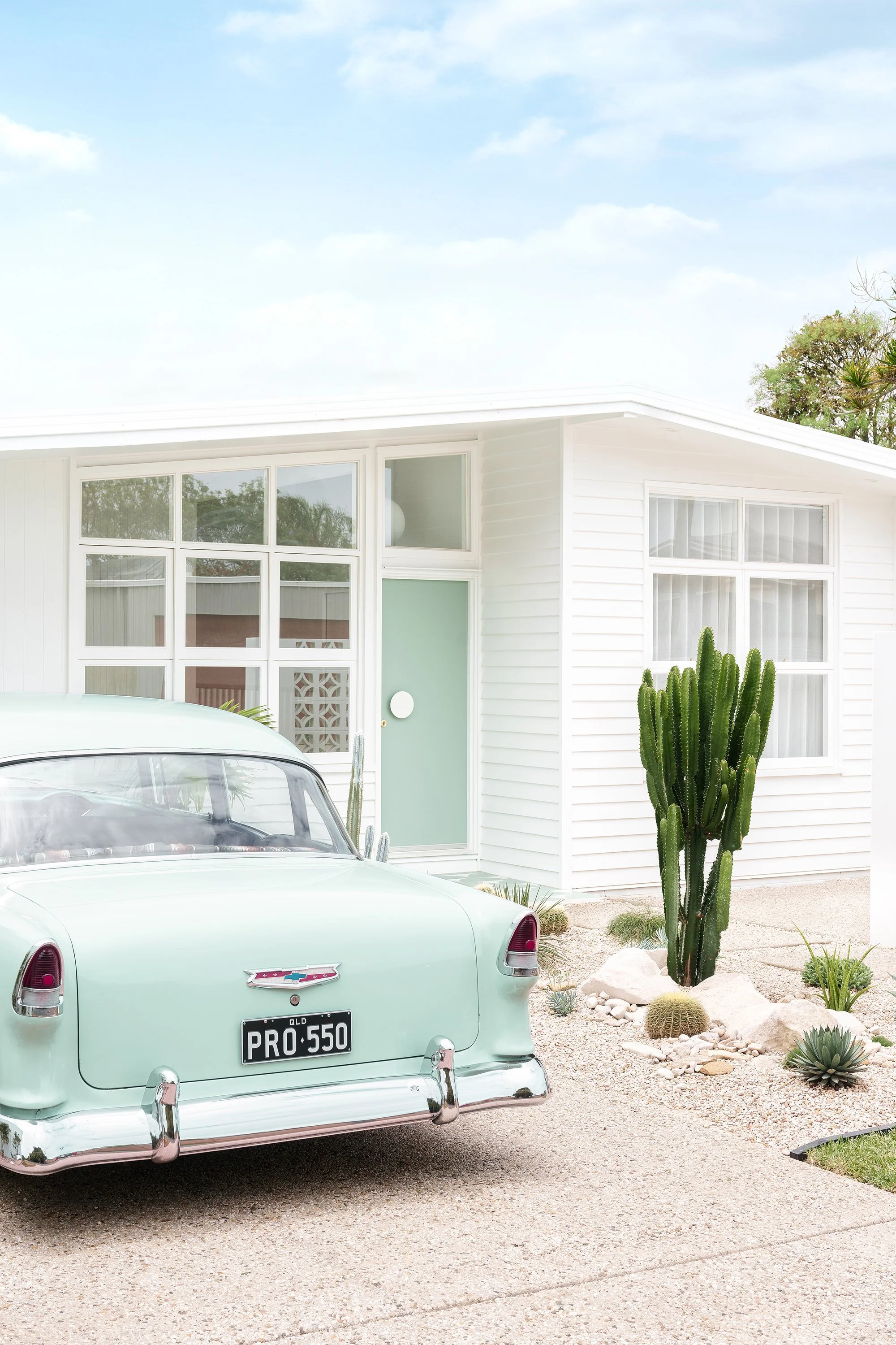
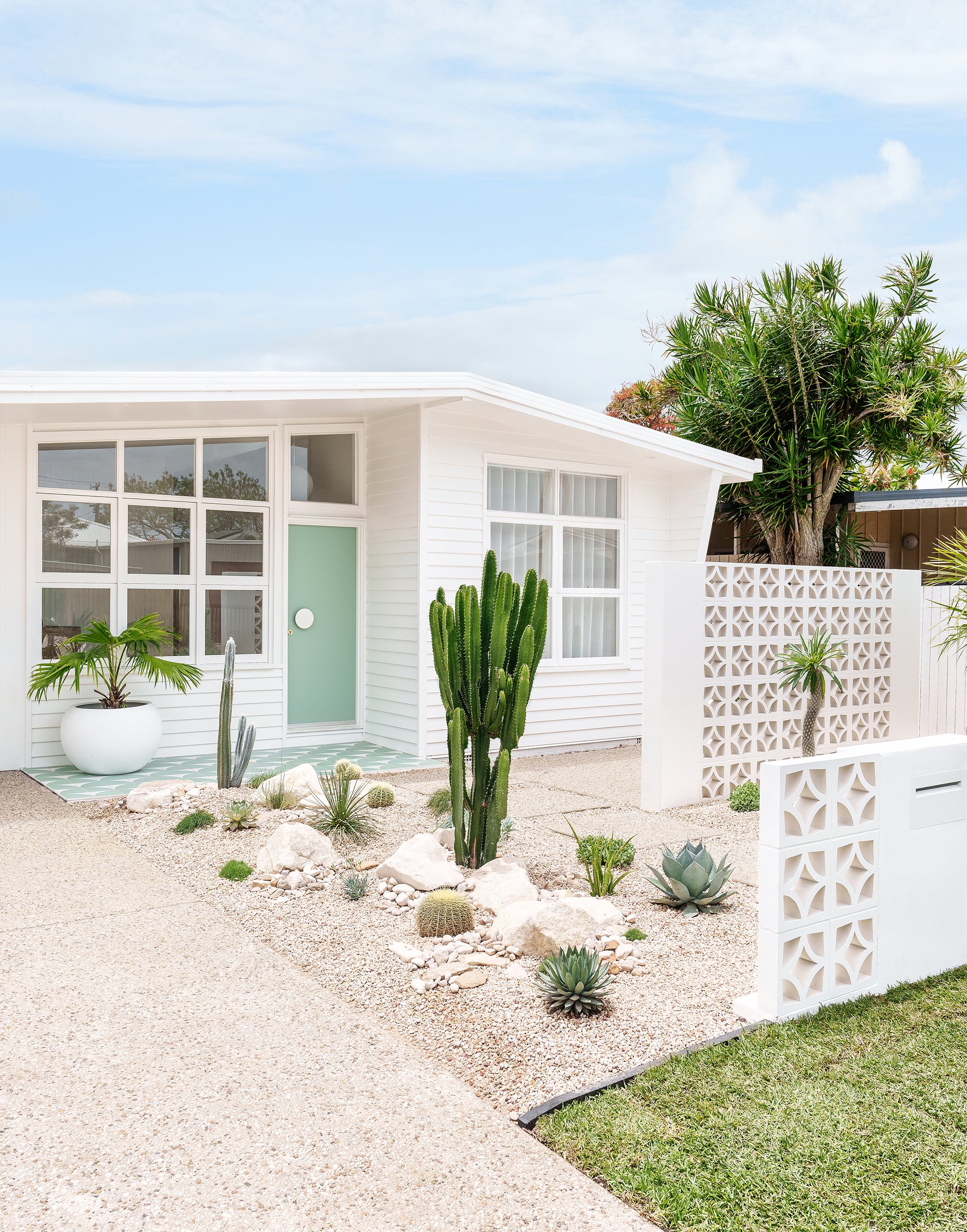
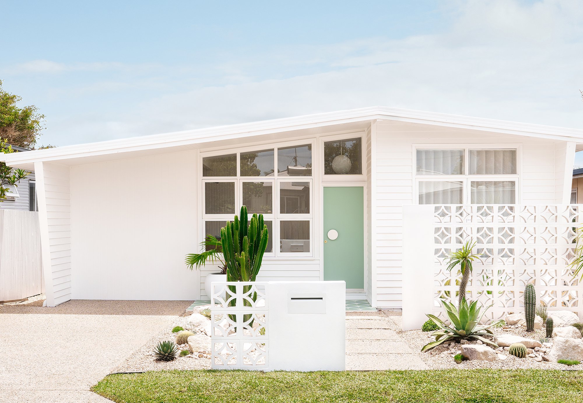
This has to be my favourite transformation of our home - the front facade and garden. We’ve embraced our home’s mid-century modern roots, and turned the front into a Palm Springs style oasis.
Photography Coastpark Creative
Front exterior before
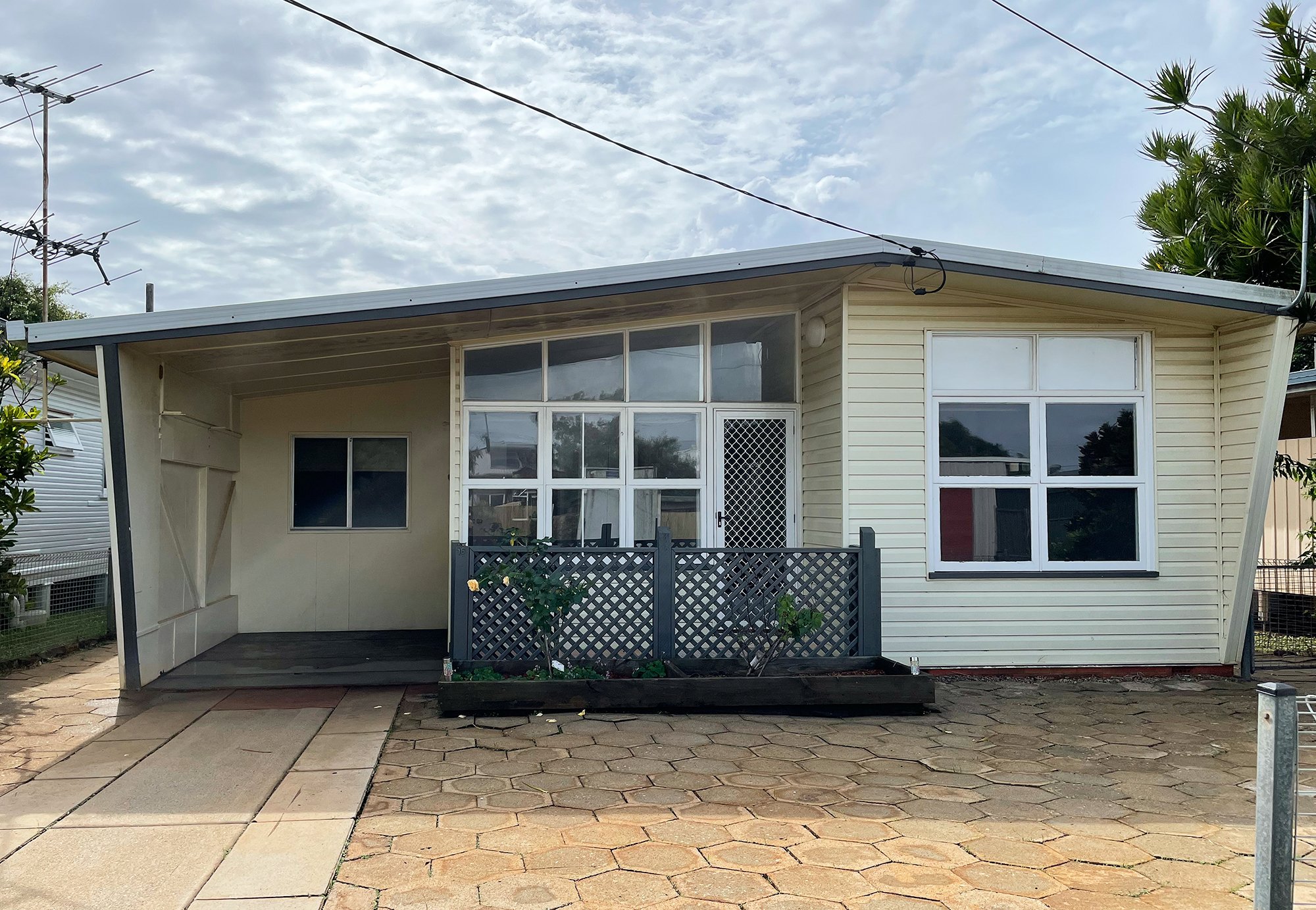
BEFORE
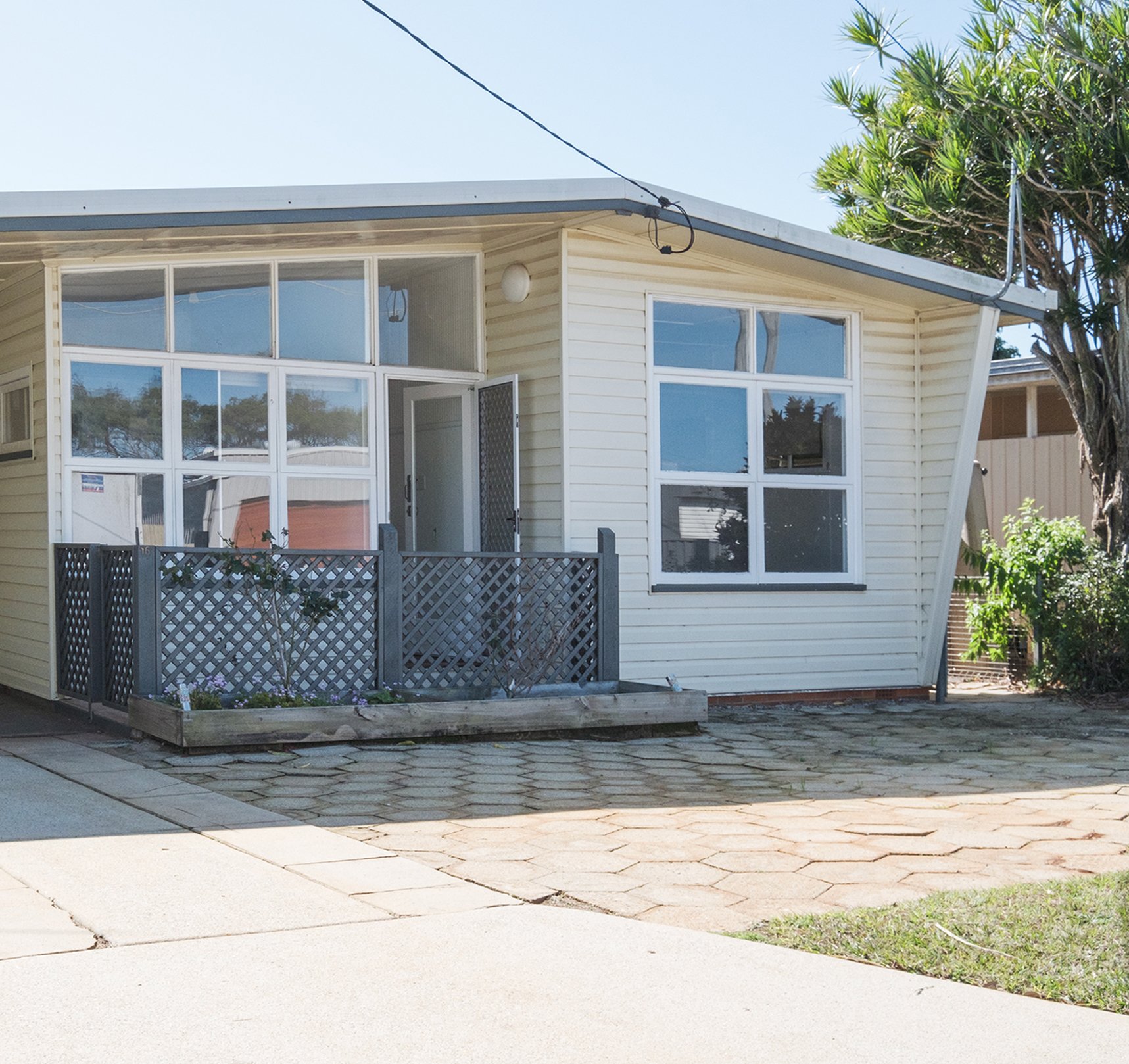
Our home was built in 1960 and had a great shape - long and lean with winged details on the sides and clerestory windows. However, whilst it might look like we just painted the front of house, and did a little bit of landscaping, there’s actually a lot more to it than meets the eye. The house was completely clad in a vinyl cladding that looked like weatherboards (but wasn’t). And underneath it (on the front) was asbestos fibro sheeting with paint that was bubbling and flaking off. The whole front of house needed to be re-clad. Fortunately the sides of the house had real timber weatherboards under the fake vinyl ones so we were able to save most of it (with the exception of some bowed boards being replaced). And due to some structural changes we were going to make inside, we had to re-make the front living room windows and clerestory windows to replace the existing ones due to a structural beam that needed to be added (right where the windows are - scroll down to see our front entry inside as it makes more sense when you see the beam placement). That was heartbreaking and a massive blow to the budget as we hadn’t planned on replacing those.
There was not much of a garden out the front either - a lonely rose bush, and a million and one hexagon pavers (which we later found out were all hand made by a previous owner in the 90s). They weren’t our style and we gave away most of them on marketplace.
AFTER
The whole front needed to be re-clad and we needed something that would be tough and weather resistant. Our home is close to the beach and I wanted to retain that mid-century beach shack vibe by cladding in Linea™ Weatherboards by James Hardie. Painted in Tabumans ‘Crisp White’ it looks so fresh and makes a statement in our street.
Another major change to the home was closing in the ‘carport’ and I use that term losely as you couldn’t actually fit a car in there, and combine it with the front living room (which was formerly used as a bedroom) to create a larger, more usable space. This particular zone was clad in Axon™ Cladding by James Hardie. It’s a VJ style cladding and is super quick to go up, easy to paint and complements the Linea weatherboards with its coastal feel. Our eaves are clad in Hardie™ Groove Lining by James Hardie which again looks like VJ but is exterior grade to hold up to the weather. Believe it or not, this is actually one of my favourite features on the home. When you look outside from the main bedroom and front living room you can see the overhang of the eaves and that VJ just looks so coastal.
Other things we added were a new fence, aggregate driveway, breezeblock screen wall and Milkcan built-in letterbox, along with a cactus garden and brand new turf.

THE COURTYARD
This space looks like a dream and I couldn’t be more happy with it. Obviously breeze blocks were a must for our home, and I’ve always loved the ‘Star’ pattern ones. I sourced mine from The Breeze Block Co, a local company which specialise in breeze blocks. If you’re stumped as to what pattern to use or what it could look like, Candice the co-owner of The Breeze Block Co can actually design it up for you (for an additional fee). I hired Stella Brick and Blocklaying to build my breeze block screen wall along with the custom letterbox with breeze blocks and they did such a great job. I am so happy with how it turned out. I then had the letterbox and columns on the screen wall rendered and painted those in Tint ‘So Fresh and So Clean’. Would you believe I still need to do 1 more coat on these, you can’t tell in the photos luckily!
Now this little open courtyard is a nice spot to sit with an afternoon drink and soak up those garden views! It also looks gorgeous from our main bedroom which overlooks this space. It’s really elevated the way our home feels on the inside (not just the outside). Umbrella, stand and sling chairs from Business & Pleasure Co, pots from The Balcony Garden, side table from Kmart.
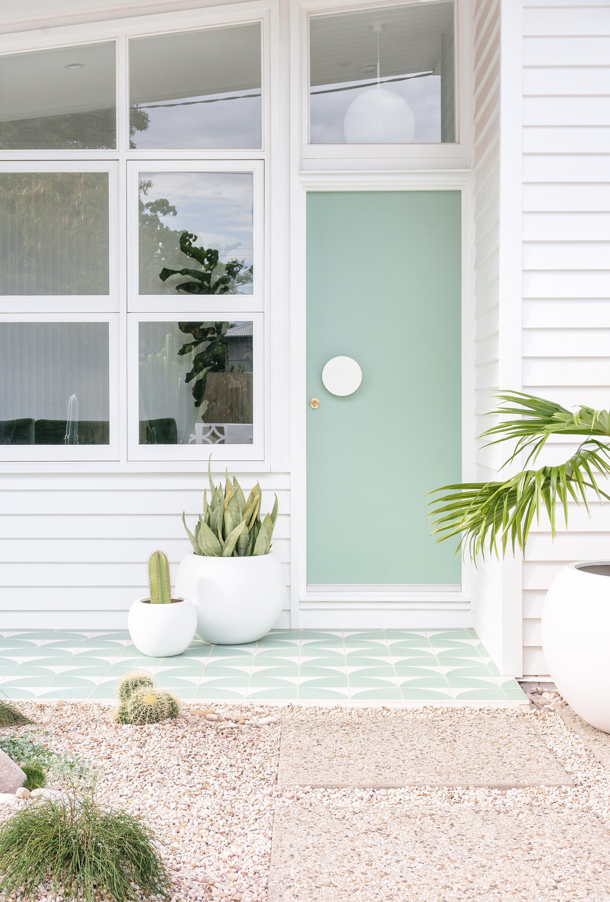
‘Halo’ entry door pull in white / Front door painted in Taubmans Silver Leaf and house painted in Taubmans ‘Crisp White’
THE FRONT DOOR
In Palm Springs, colourful doors rule the town, so we wanted to embrace that, and have a little bit of fun with colour for our door. I chose Taubmans ‘Silver Leaf’ for the front door which is a nice soft minty green. The door itself was an inexpensive one from Bunnings. To dress it up I chose a statement door handle (‘Halo’ entry pull) from Lo & Co. It ties in with our whole Palm Springs vibes and I just love it!
THE TILES
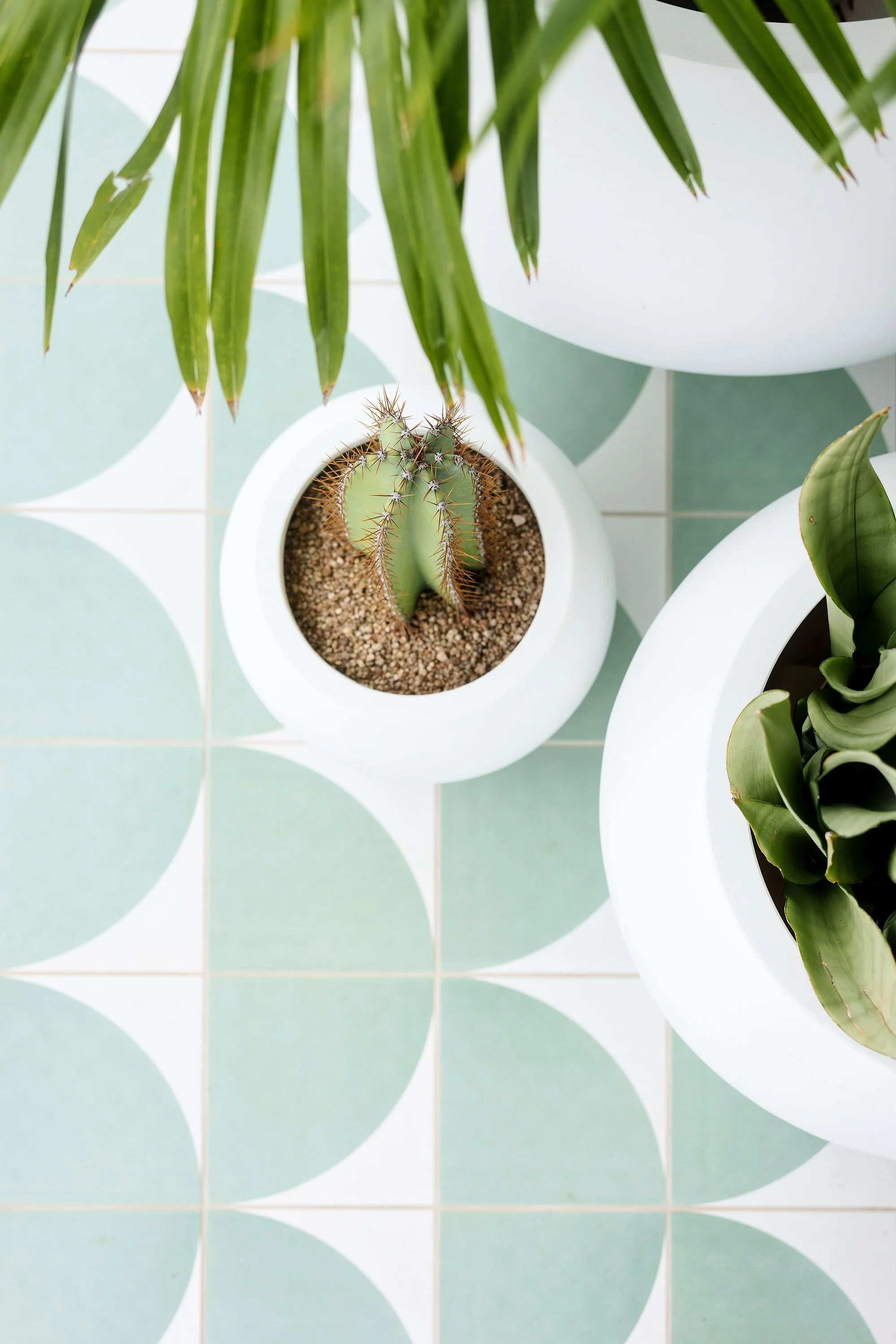
Nothing says Palm Springs like a bold patterned tile and for our front entry I wanted something that was a little bit retro and that also matched the colour of our front door. When I couldn’t find anything quite right, I reached out to my friends at Tile Cloud to see if they would be interested in collaborating and creating this fun quarter-circle patterned tile in a matching colour to my door. When they said yes, I was so excited. I had mine laid in an arch shape pattern to create a fun pattern (which also made my tiler’s eyes go cross-eyed after a while haha). The tiles are called the ‘Adore’ tiles from Tile Cloud and they’re suitable for both interior and exterior use. I’m so over the moon with how it turned out - it’s quirky, unique, a little bit retro, and very fitting for our home. The versatility of this tile is endless though and you can create lots of different patterns with the quarter-circle.
THE FRONT ENTRY
Nothing is more quintessentially Palm Springs than an orb pendant light so it was a very obvious choice for us to use this Orb Max XL size pendant from Lighterior in our entrance. It is beautiful - and you can see it through our clerestory windows which also complements the bones of our mid-century home.
Running down the length of our hallway is Surround By Laminex ‘Scallop 135’ panelling. We wanted to add interest to the walls in this space, along with the ceiling (which is clad in VJ panels).
Entry before
Entry after

