Higlett House guest bedroom reveal

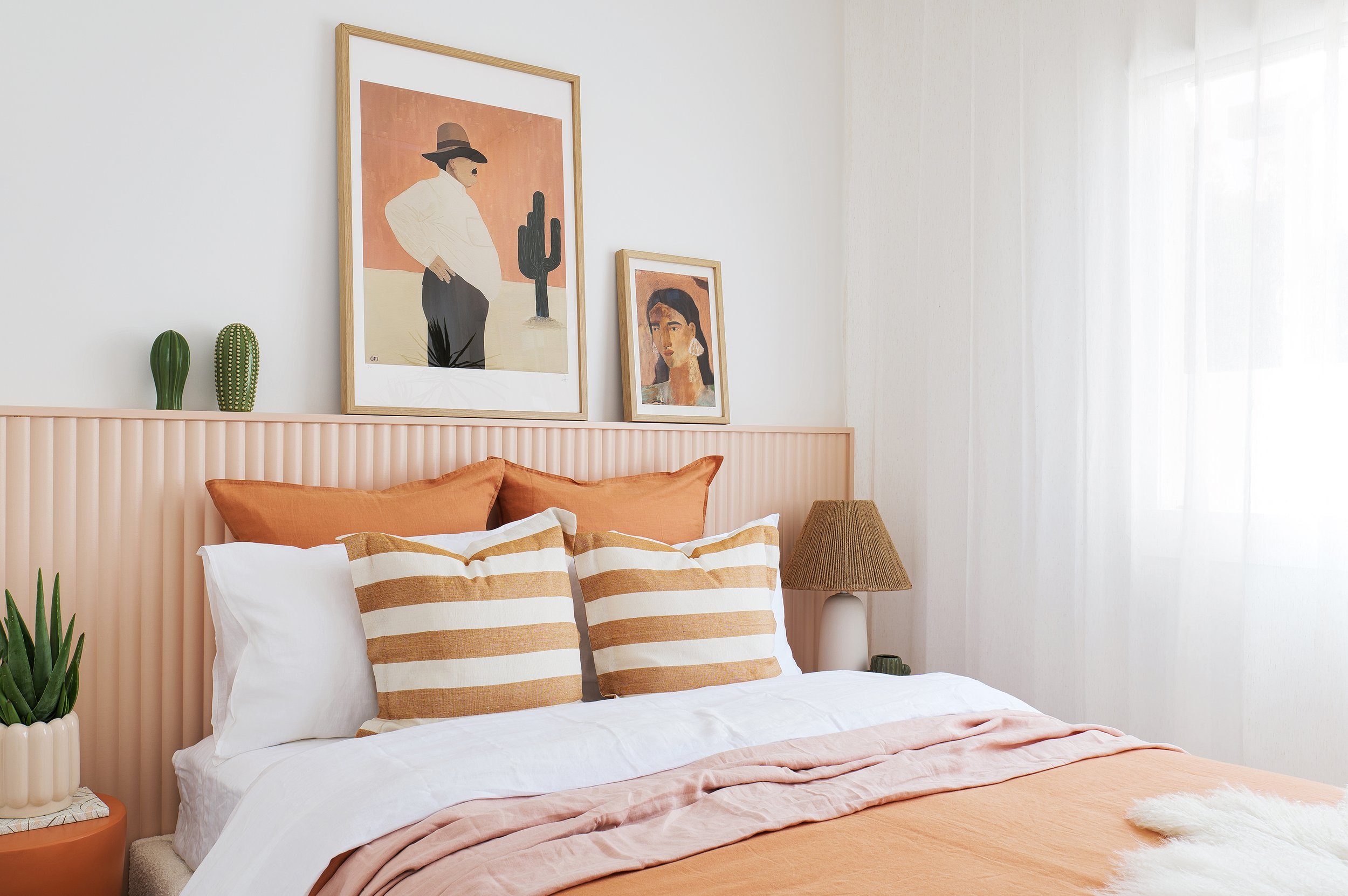
Our guest bedroom’s sunset colour palette was inspired by the colours of Joshua Tree National Park. This fun space packs a punch with colour and texture.
Photography Coast Park Creative

BEFORE The wardrobe was located next to the window - we kept the doors and tracks and changed the position of it in the room, so that the window appeared more centred in the space.
BEFORE
This room was fairly boring, it’s also not a big room at just 3.2 x 3.2m. There were awnings outside blocking the natural light, and a wardrobe that in my opinion, was on the wrong side - it made the window look unevenly spaced in the room. We had this room stripped of all its asbestos sheeting, and moved the wardrobe and door into the room to create a more cohesive floor plan. The outdoor awning has also been removed to allow plenty of natural light to flood the space.

LINEN
The thing that brought this whole space together and took it to the next level, was the linen. I chose the Eve range of linen from The Sheet Society and it is so soft. The quality is excellent and they have quite a large range of colours to choose from. I ordered some samples online first to make sure I was happy with the colours before ordering. I highly recommend doing this as linen is quite the investment, so you want to make sure you get it right. I used a combination of blush, white and clay and they really do work beautifully together.
STYLING TIP: I’ve used a blush flat sheet as a throw (if you don’t have a throw, try using a coloured linen sheet to add an extra layer of colour to your bed).


DOOR HARDWARE
Have you seen a more sexy door handle? I think not! This is the ‘Linear’ lever handle in brass from Lo & Co and my goodness it is beautiful! Brass is our metal of choice in this home, so this was a no brainer. Plus the quality is excellent, you can feel it just by holding it - nice and heavy. If brass isn’t your thing, they also come in a range of finishes including black, bronze, nickel, and aged brass.
To match it we have used these gorgeous hinges in brass (also from Lo & Co). There’s nothing better than seeing that little pop of brass when you open the door.
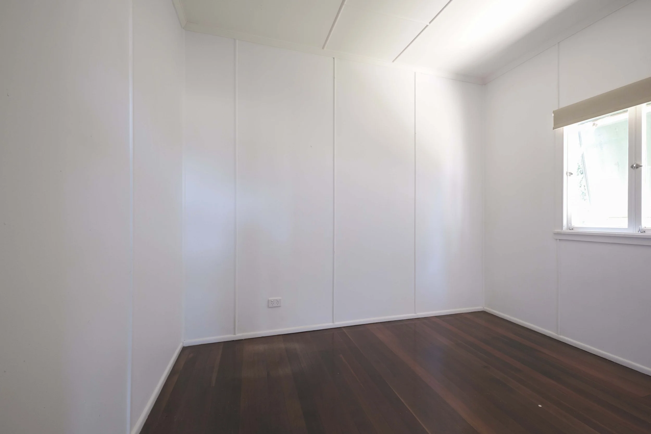
BEFORE The walls and ceiling were clad in asbestos sheeting and overall a fairly boring space

FLOORING
I’m a big fan of combining rugs and carpet together. I think layering a rug on top of carpet can add extra texture and pattern which is always a good idea from keeping a room feeling flat. In here I’ve used the same carpet as our main bedroom - the Lake Chalice in bisque from Carpet Court. It’s made from 100% wool and is beige in tone. The colour variation throughout it is beautiful and best of all it’s soft underfoot. Combined with the underlay, this room is also better insulated – cold drafts are no longer an issue and outside noise is definitely more muffled.
The rug is the Alayna from Miss Amara, and my goodness it’s so gorgeous and soft. I’m not worried about the white colour as this is our guest bedroom and to be honest might only get used a handful of times each year. The bed isn’t the first thing you see as you walk past (as illustrated in the above image), so I wanted to make sure that when you do walk past you see something exciting and the rug does the trick (along with that fabulous potted Dracena plant).


WALLS + PANELLING
I loved how our custom bedhead looked in our main bedroom, so decided to replicate it in our guest bedroom but using a different profile and colour. We had our builder make this one and clad it in the Demi Round 40 paneling from Surround By Laminex. I love the texture it gives to the room. And the ledge on top is the perfect spot to lean art and smaller decorator pieces. Having a bedhead like this gives so many opportunities to change up the styling as you wish.
The very first piece of art I bought for this room was a photographic art print of Joshua Tree National Park. There’s a lovely dusty peach colour in it, and I looked high and low to find the right colour to match for the bedhead and ended up on Tint Paint’s ‘Dawn Patrol’. It’s a gorgeous soft dusty peach colour. The rest of the walls are painted in Tint Paint ‘So Fresh and So Clean’ - it’s a lovely white - if you’re looking for a white that doesn’t throw any undertones of another colour - this is it! I’d also like to mention the quality of the paint is excellent, nice and thick and has good coverage. It’s also low VOC - meaning less nasty chemical smells.


FURNISHINGS
With this style of bedhead, I needed to find a bed frame with no bedhead, and the store that has the best range of bed frames, is Life Interiors. They have so many gorgeous options and I went with the Georgia boucle bed frame with brass legs. You receive two sets of legs with this particular bed - brass and black, which is great if you feel like changing it up with your styling. Our bedside tables are also from Life Interiors but have unfortunately been discontinued now. For something similar I’d suggest this terracotta side table from Life Interiors.
I added a simple lamp to one of the bedside tables - the ‘Freya’ lamp from Beacon Lighting has a jute shade which gives an added layer of natural texture to the room.


CURTAINS
In my opinion sheer curtains always make a room look more high-end. I ordered a bunch of fabric samples from the Tuiss Blinds Online website and really liked that the Madagascar sheer neutral curtains had flecks of natural coloured fibres through it. It’s a softer, creamier look than your standard white sheer curtain. I’ve mounted the curtains to the ceiling and have them drop right down to the floor. The curtains run the whole length of the wall which adds a dreamy softness to the space.
Currently we don’t have any landscaping outside this room, so our window looks directly out to our neighbour’s house. By introducing the sheer curtains, that view is softened. This room is east facing so it does get hot in the early morning. Now that we have added ‘Moda’ blockout blinds (also from Tuiss Blinds Online), it absorbs a lot of that heat and the room feels a lot cooler now.
TOP TIP: When choosing a blockout blind you can choose from front or back roll. Choose back roll if you want to block more light out – the blind sits closer to your wall or architrave, meaning less light can get in.