Higlett House retro sitting room
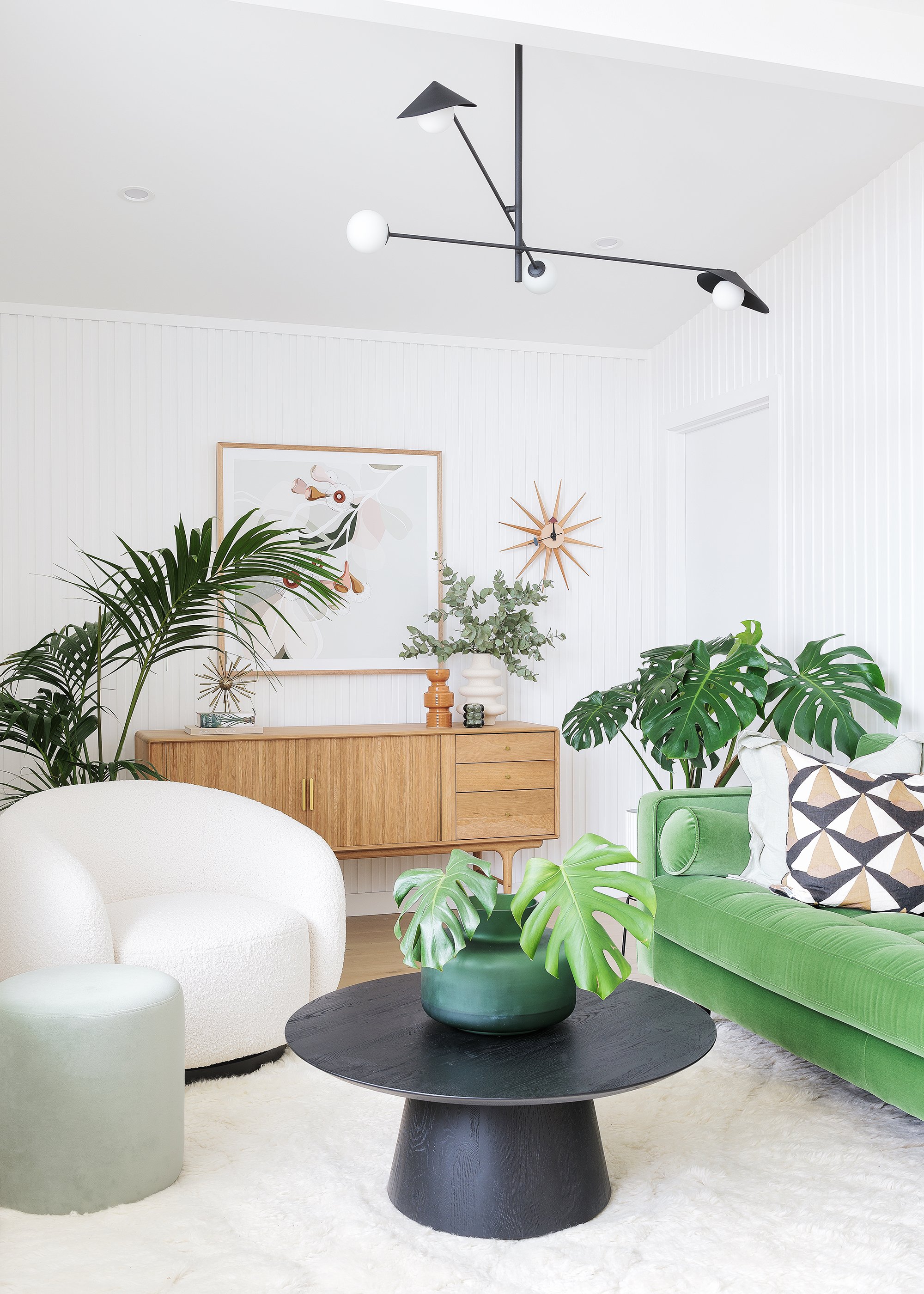
Welcome to our front sitting room at Higlett House. This space blends mid-century modern and contemporary styles together to create a fun hangout space.
Photography Coastpark Creative
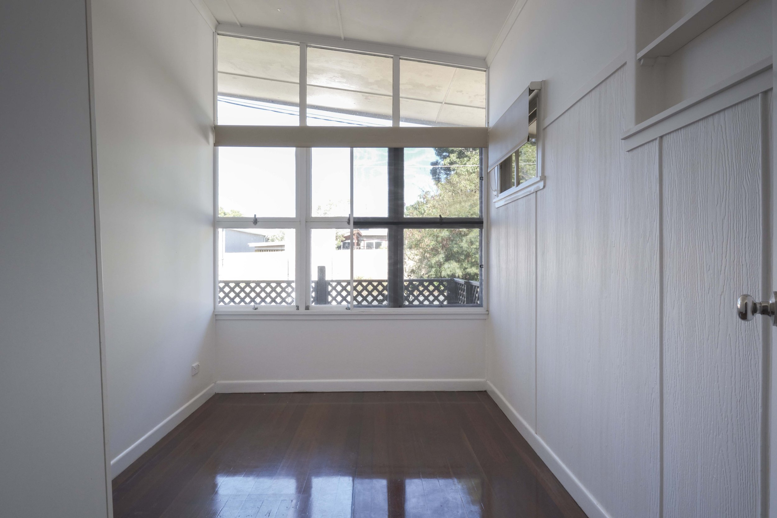
BEFORE This room was formerly a small bedroom
BEFORE
This room had been turned into a bedroom by a previous owner, however I suspect this space would have been a living room originally, and so we have returned this space back to its intended purpose. By removing all of the walls in this space, and extending out on the right hand side (where the carport was), we have been able to create a longer living room area. This space has beautiful clerestory and awning windows, and are actually the whole reason we purchased the home, it was this architectural detail that we fell in love with.
FURNISHINGS
If I had to describe the style of this room I’d call it retro botanical. I wanted to celebrate the home’s 1960s roots by embracing items with a mid-century feel - like the pedant light, sofa, side table and sideboard. The starting point for this room was that amazing ‘Quill’ pendant light from Beacon Lighting (it’s currently on sale too). It has a mid-century modern aesthetic and its black colouring really pops against the white walls and ceiling.
I chose all of the furniture (minus the mint green ottoman) from Lounge Lovers. They have a great range of mid-century modern style pieces (along with more contemporary pieces) which really lent themselves towards this room’s overall vibe. As soon as I laid eyes on that gorgeous green velvet ‘Draper’ sofa - I knew I had found the perfect piece for this space. It’s bold, retro and super comfortable as well. We love to just lounge around on it, listen to music or read a magazine. Another hero piece in the room is the ‘Manhattan’ sideboard in oak. It’s made from real timber and you can just feel the quality of it. I love the brass details too, it’s definitely an heirloom-worthy piece of furniture!
Other complementary furniture in the room include the ‘Graze Mushroom’ coffee table, ‘Clover’ side table and ‘Billie’ swivel armchair.
ON THE FLOOR
Continuing with the same flooring throughout the rest of the main areas of the home – we’ve used the ‘Refined Oak’ in Hamptons engineered timber flooring from Carpet Court. It really is a beautiful colour. I don’t think I’ll ever go back to using hybrid or vinyl planking in another home. The look of engineered timber flooring is amazing - it is essentially a real timber veneer so you get all of that lovely natural variation in timber grain that you can’t get with a hybrid plank (it typically always looks artificial with its repetition of pattern).
No 60s room would be complete without a shaggy rug! And this ‘Ashanti’ wool rug from Miss Amara is such a gorgeous, soft rug. I love the tassel ends and how soft this rug feels underfoot.
ON THE WALLS
Two of our walls in here are lined in Surround By Laminex ‘French Stripe 30’ panelling. It adds a lot of subtle texture to the space and adds loads of personality (even though it’s a white room). We love the look of it!
Playing into that botanical feel, we chose two new artworks from Booie & Ben. It felt like fate when Laura (the artist behind Booie & Ben) came to our home to do an art photoshoot, and showed us her new collection! The colours in both this ‘Eucalypt Bloom’ artwork and ‘Summer Bloom’ in sage artwork tied in perfectly with all of our styling. I’m so pleased with how they look in the room.
Another little nod to mid-century design is our ‘Starburst’ clock (a replica of a George Nelson design that originally was released in the 1950s). I love this clock – it adds a bit of fun to the space and the colours tie in so well with everything else in the room.


