My Guest Bedroom Renovation Reveal
My guest bedroom is finished and also happens to be the least expensive room in the house to renovate (thank goodness)! I reveal all of my product selections and renovation budget in this post.
Photography Mark Zeidler
BEFORE: the daggy nana lace curtains, mouldy blind, old carpet and freestanding wardrobe had to go!
Firstly, let’s talk about what was here before. Cream walls, nana lace curtains teamed with a festering mouldy brown blind and a freestanding wardrobe built by Wazza in 2005 (that’s literally who made it according to the sticker inside the wardrobe haha). The wardrobe wasn’t too bad on the inside but the mirrored sliding doors were really cloudy and when you looked into it, it gave that hazy, slightly fuzzy filter you see on The Bold & The Beautiful. Actually it was probably a little worse than that. It had to go – we chose to have a built-in wardrobe for this space instead – it was worth every cent putting it in. Looks much better! The carpet was old and in need of replacing and the walls and ceiling were desperately crying out for a new coat of paint.
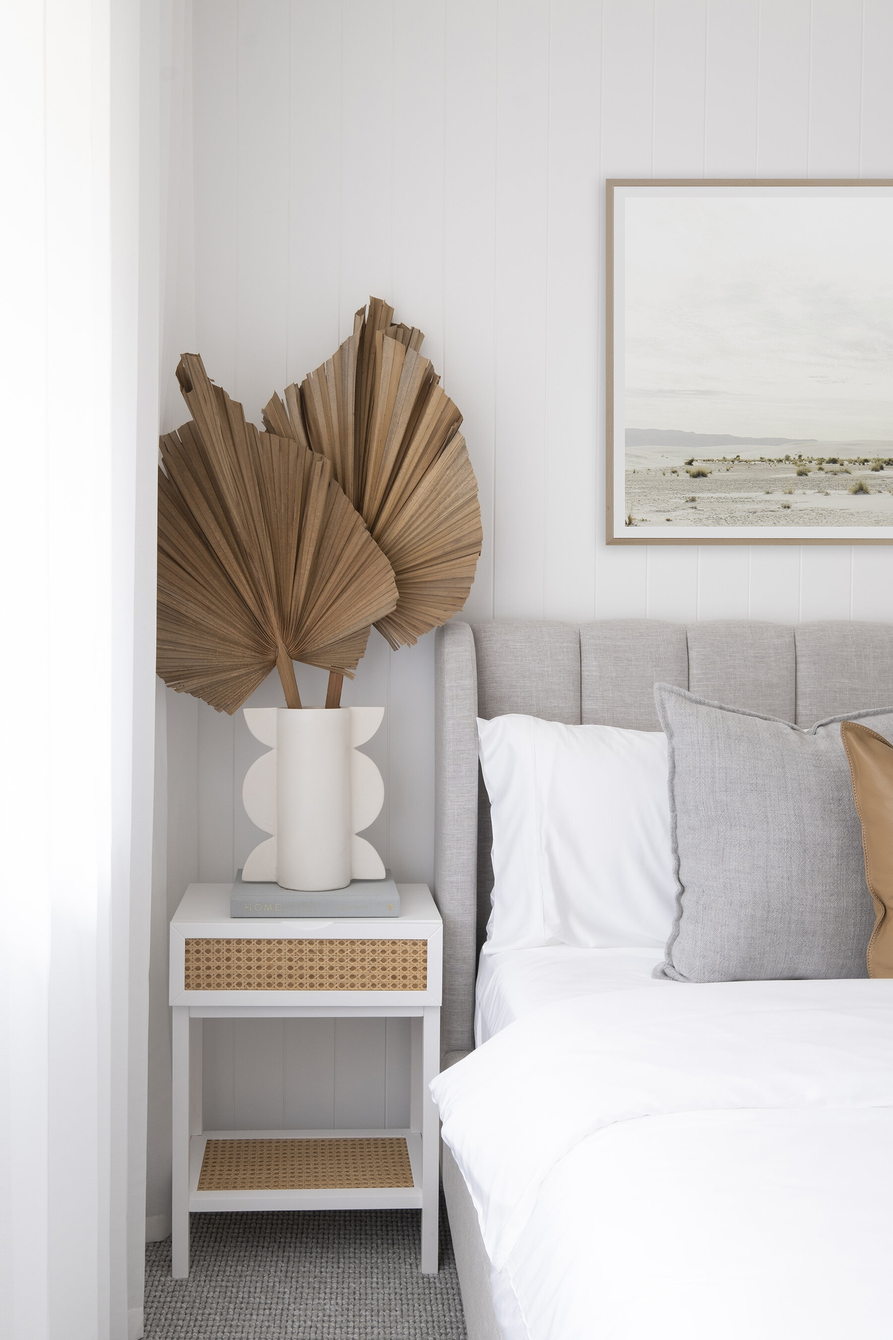
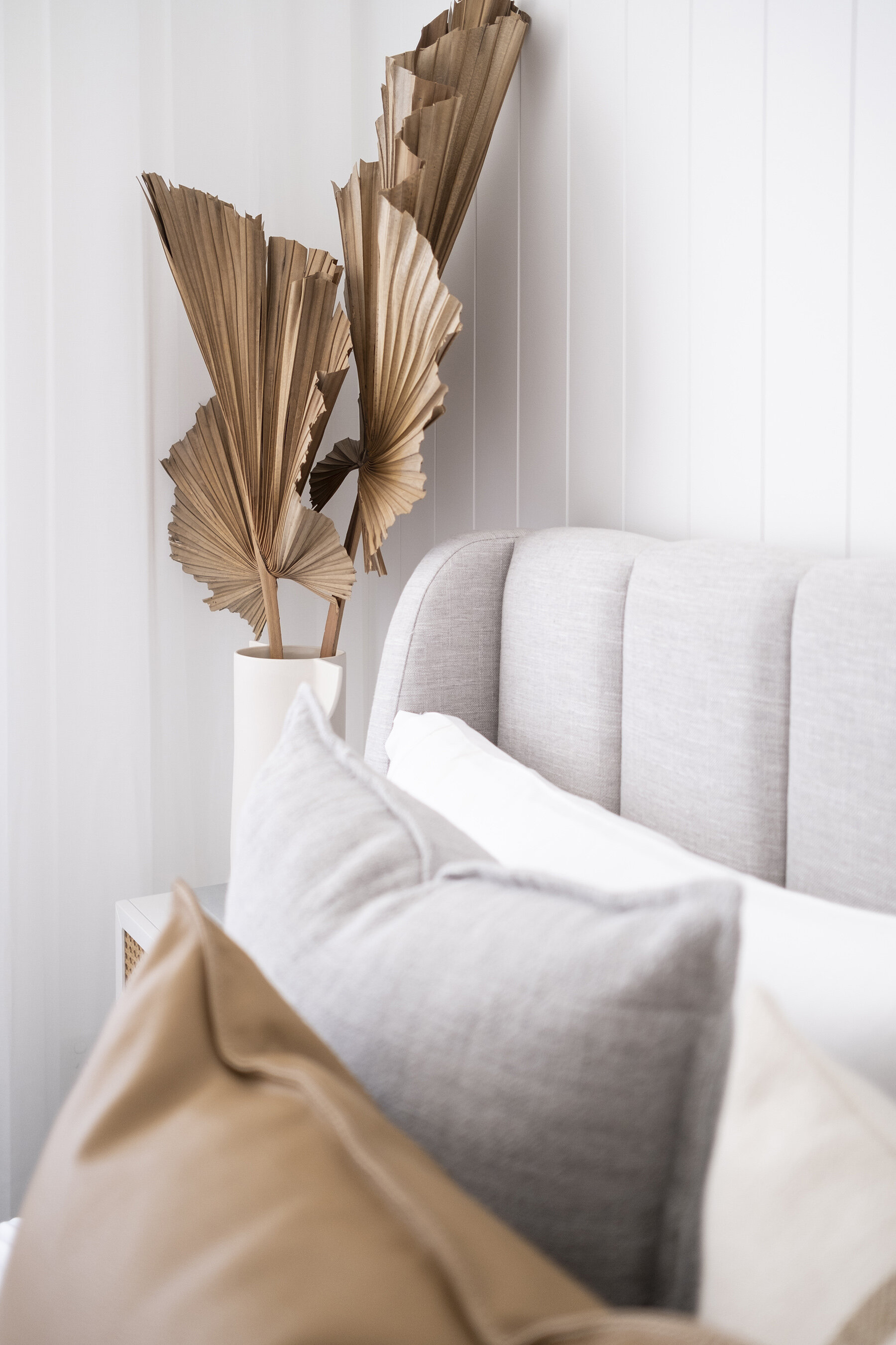
The room is by no means big measuring 3.2 x 3.2m – however it’s the perfect size for a double-size bed. A queen would have felt too cramped, and single too small – but a double bed gives the illusion that it’s a queen size and that the room is decent in size. Until you’ve looked for a double size bed you’ll quickly figure out there’s not a lot to choose from. Luckily I found this gorgeous ‘Georgia’ bed from Life Interiors. It’s upholstered in the same grey fabric as the bed in the master bedroom which helps to tie these two bedrooms together. It’s a lovely sturdy bed with a timber slat base.
The mattress is from Ecosa – they delivered it in record time and it comes rolled up in a box with wheels – making it super easy to wheel it all the way into the room. The white sheets, pillowcases and quilt cover are also from Ecosa. They’re made bamboo and are the silkiest and smoothest sheets I’ve ever touched. I’m seriously considering buying the same set for my master bedroom. At the end of the bed is a textured throw from White Grove House. I love the white-on-white look!
Mirror by Sarah Ellison available from Life Interiors
The easiest design decision I made for this room was the carpet. I knew straight away that it needed to be the same carpet as in the master bedroom. I chose the Stoney River in Shale colour from Carpet Court. The number one reason was colour. It shows a bit darker in these images but it’s more of a mid-light grey colour with white flecks through it. It almost looks like a wool blend (without the price tag) and is made from nylon which is super durable in terms of resisting stains and keeping clean. It’s nice and soft underfoot and a carpet I’d use again in a future home.
Painting the walls in Dulux Vivid White was also a no-brainer for me. We’ve used it throughout the entire house so far, so why stop now?! I wanted this room to have a sense of calm about it and it truly makes me happy when stepping inside. I used to think this room was dark and dingy – not anymore, it’s actually got the most amazing light and that’s thanks to the crisp white walls.
Stoney River carpet in Shale colour from Carpet Court
Blinds and sheer curtains from Blinds Online
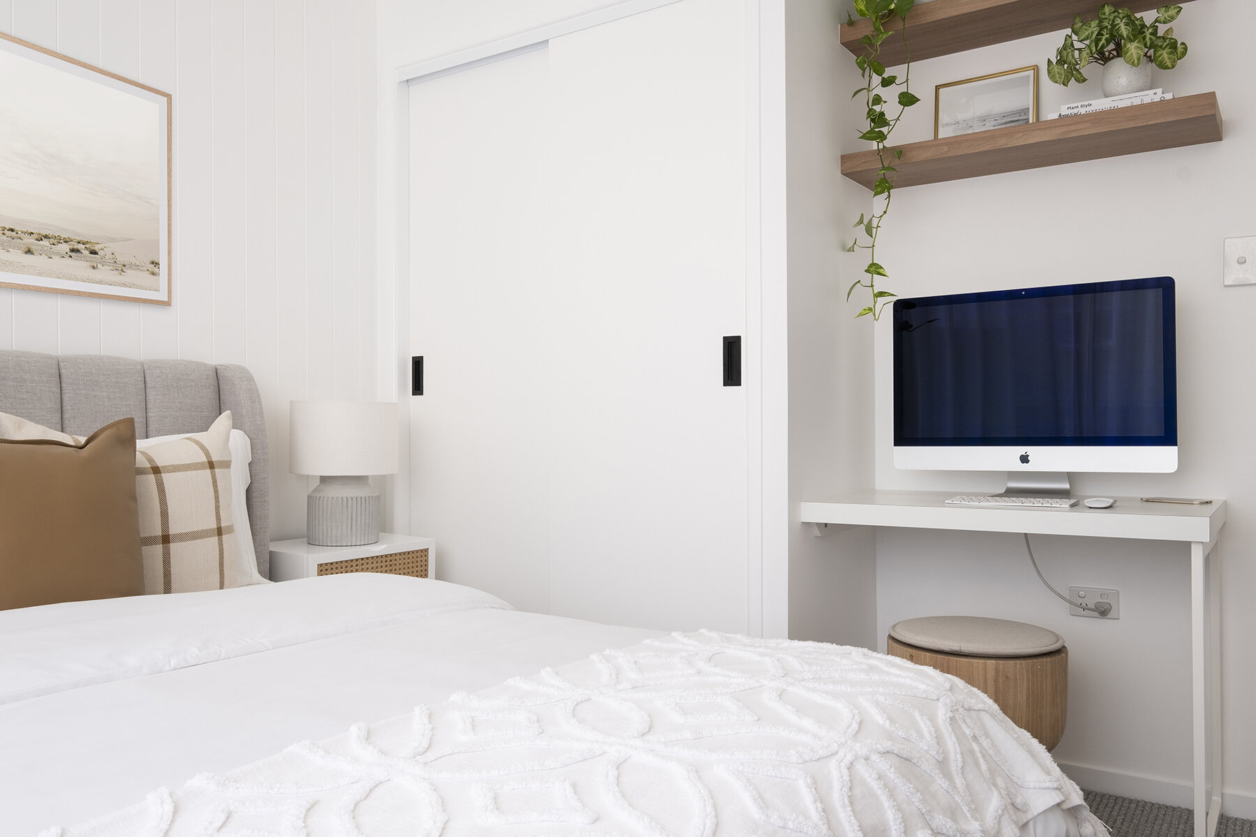
I didn’t get to put sheers in the master bedroom – so I’ve made up for it in this room. We installed S-fold sheers in Tahiti Voile Snow from Blinds Online and instantly the room feels bigger, lighter and taller – all thanks to mounting the track to the ceiling and having the sheers run the whole length of the wall. That, my friends, is the secret to making your room look taller, even when it’s just a standard ceiling height. I teamed the curtains with a simple blockout blind (in Serenity White). It’s a winning combo – and all up actually comes in at about the same price if you were to do plantation shutters for anyone interested in the cost comparison. We did the installation ourselves and pretty proud of the end result.
Another hot tip: running VJ panels along the main wall in the room will also help to draw the eyes up thanks to the vertical lines. We installed Easycraft EasyVJ panels from Bunnings here – something we’ve done throughout the home. They’re affordable and easy to install.
If you’re furnishing a smaller room – might I make the suggestion of using kids’ room furniture. Here, we’ve used bedside tables from Adairs’ kids range. They’re by no means small in terms of height. They’re just more petite in width and depth – it meant I could fit two in this room instead of just one. Plus there’s certainly nothing ‘kiddie-ish’ about them.
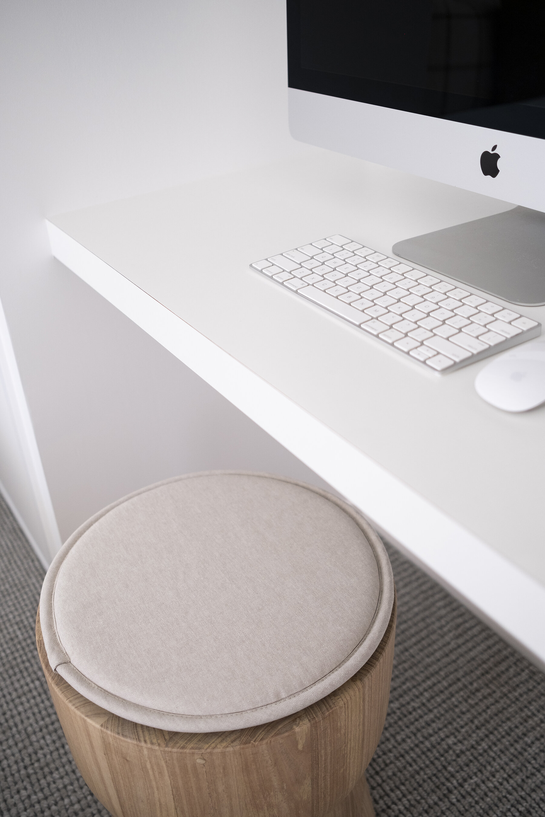
The guest bedroom also doubles as my office (temporarily until I renovate the next room in the house into a home office). I opted to get custom joinery for this space – the desk, metal leg and shelves were made by JMK Joinery. The reason I went with custom was so that it fit the space perfectly (it’s hard finding small desks) and so that I could have the shelves matching with the Tasmanian Oak shelves in the laundry. I’m all about consistency so this room now ties in with the other rooms. Plus I know when we go to sell the property in the future, if this was a kid’s bedroom a cute little study nook is always going to come in handy for homework and arts and crafts!
I’ve included this room’s budget below. This is just for the bones of the space – and doesn’t include furniture or decor.


