My kitchen + dining reno
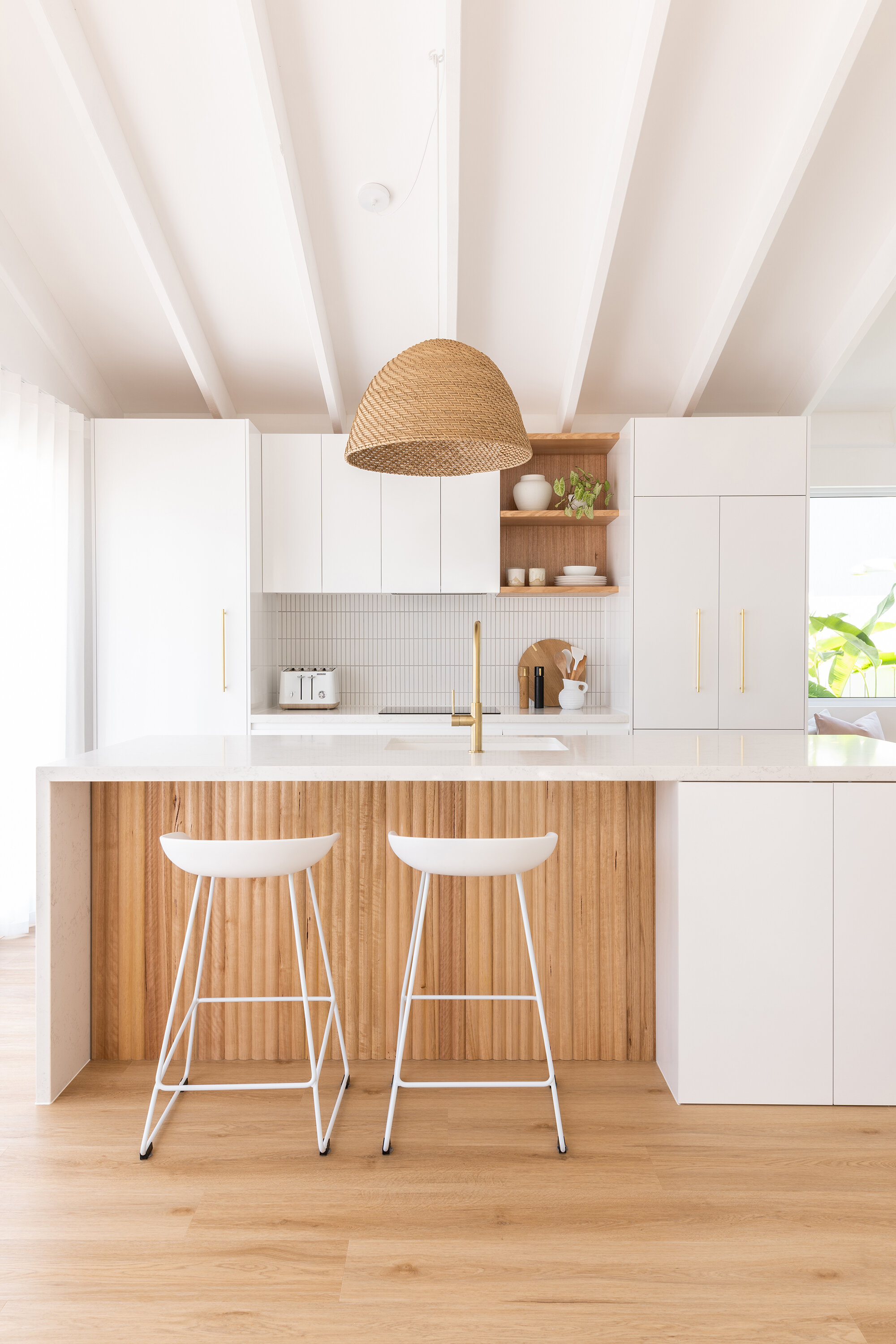
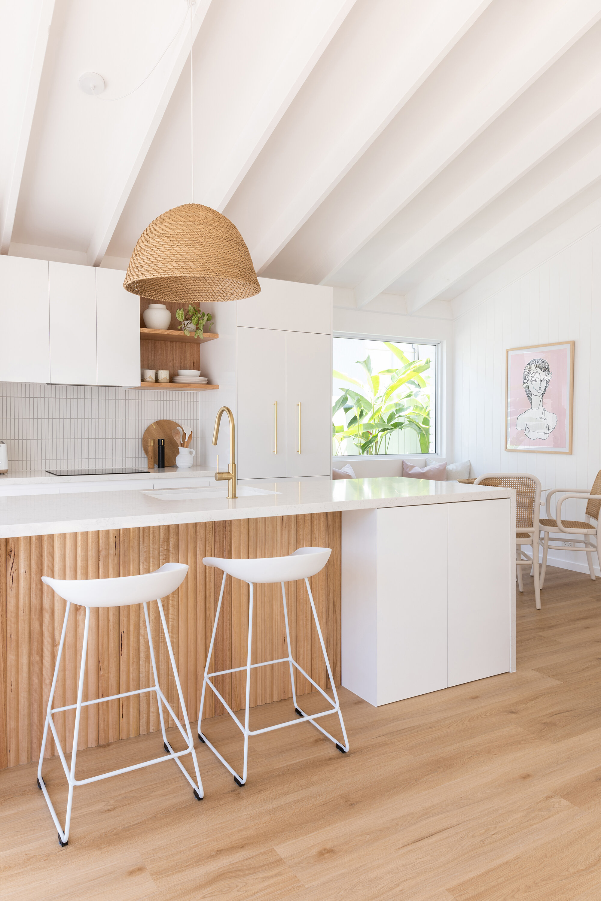
Our kitchen renovation is finally fully finished and I’m so excited to be sharing the professional images and details. Buckle up, this is a long blog post with all the finer details plus the before images.
Photography Mark Zeidler
BEFORE
From an aesthetic point of view I really disliked our kitchen. It was dated and felt really dark due to the beams being painted in mission brown. It also wasn’t a practical kitchen. Because of its ‘G’ shape configuration, there were a lot of corner cupboards, and that meant it was hard to reach in and grab things at the back. A cupboard door fell off its hinges a few months after moving in, the air conditioner vent caught on fire, then the oven fan died, oh and it was in grubby condition after being a rental property for so many years. It honestly could not get any worse haha. There was also a non-structural wall dividing the kitchen and the living room. Once we knocked that out, the space felt more open-plan. We replaced the two windows with bifold doors (purchased from Trend Windows) and they let so much amazing light in now. Painting everything in Dulux ‘Vivid White’ has also really freshened up the entire space.
I knew as soon as we moved in that I wanted to change the layout in here. Having a large island in the middle has made the space feel more contemporary. But it meant we had to change the positioning of the plumbing. We have a concrete slab so the plumber had to cut the slab, dig the dirt out, lay new pipes and pour concrete back over the top (after the termite protection was painted over the top - this is a crucial step that you cannot miss). The electrician also had to lay his electrical wiring in the cut slab for power for our dishwasher in the island. All up the plumbing bill was a little under $1500, so whilst it was a bit pricey, overall in the scheme of the budget of the kitchen renovation it wasn’t too bad. Plus we now have a better layout that works for us so it was definitely worth it.
BEFORE
AFTER
CABINETRY
I had designed our kitchen layout (and tweaked it countless times) over the last year. When we were finally ready to renovate the kitchen, I took my final design to JMK Joinery – local cabinetmakers who also did my laundry and study nook desk and shelves, and Mitch the project manager there, took my designs and further streamlined them. For example instead of having a stack of four drawer fronts he suggested we do two and have two concealed drawers inside. It was something I hadn’t even considered, so I found it really useful to have a cabinetmaker on hand to help with the kitchen design. He made a few great suggestions and was so details-orientated which I loved. Throughout the whole process I have found JMK so helpful and probably the easiest company to deal with. They went above and beyond with my kitchen – right from the planning stages through to the final installation. If anyone in Brisbane/surrounds is looking for a good cabinetmaker, I can highly recommend JMK Joinery.
I have used Polytec ‘Polar White Sheen’ for the door fronts. Mitch at JMK suggested to do something different for the carcasses (the internal linings of the cupboards and drawers). To be honest, I’d always just assumed I’d go with white, but I’m so glad I went with his idea, and in the end I chose FlexiPanel ‘Native Oak Matt’ finish. It’s one of those nice, unexpected surprises when you open the cabinets. I think it also makes the kitchen feel a bit more high-end.
On the front of the island we chose Porta ‘Riverine Contours’ in Tasmanian Oak – it’s so beautiful and warms up the space. And then JMK sourced some matching Tasmanian Oak for the custom made open shelves to tie in with the island. Tasmanian Oak is another running theme throughout our home – having used it in the bathroom, laundry and study nook shelves.
SPACE-SAVERS
Our kitchen isn’t huge, so we packed it with a few great Blum and AMBIA-LINE products (available through Wilson & Bradley - your cabinet maker will be able to source for you) to make the space fully functional. We added three Blum Space Tower pantry units that make finding grocery items a breeze! In old pantries I’ve had, there’s always been items you forget about that linger right at the back of the cupboard, but with these drawers, everything can be easily seen and reached. There’s also a Blum Narrow Cabinet (great for storing spices and oils and takes up minimal space), and a Blum Wide Sink Unit which makes use of awkward and otherwise unused space around the sink. The U-shape design is great for storing away things like cloths, sponges, dishwashing liquid and dishwasher tablets. And then underneath that, there is an additional drawer fitted out with AMBIA-LINE bins (for waste and recycling) and drawer dividers for bottles and other products.
STONE
The biggest decision you’ll make for your kitchen is the stone for your benchtops (if you decide to go with a stone that is). It’s a decision you don’t want to mess up, so I visited the Smartstone showroom on the Gold Coast to take a look at the full size slabs to make it easier. Let me tell you now – it is so worth taking the time to do this. A small sample is never going to be the same as seeing it in its entirety. I had gone in thinking I would go with one stone, and came out picking something entirely different based on my showroom visit. I went with Smartstone’s ‘Amara’ and I am thrilled with my choice. It’s got a really soft subtle marble vein that isn’t overpowering. I think it’s one of their more whiter looking stones too and that’s exactly the look I wanted for this very white-on-white kitchen.
TILE SPLASHBACK
In our laundry we used kit kat tiles, so it made sense to continue with that theme and run kit kats again in our kitchen. We’ve used the ‘Kalana’ kit kat mosaic tiles from Tile Touch. The finish is matte white and they look great with the light grey grout our tiler picked out.
SIZE OF KITCHEN
Our kitchen isn’t huge. Overall the kitchen sits in an area of 3.6m long x 2.7m wide. The island measures 2.53m x 0.9m and we left 1.1m between the island and the back row of cabinetry. I have found that depth to be good for me and my partner and we can generally work in the kitchen together without too much tripping over each other. My tip for the back row of cabinets is to do a depth of 700mm. Most kitchens will do 600mm but I’m finding that extra space great for meal prep. Plus we needed to make it that depth to allow for the integrated fridge to sit comfortably within the space.
Grinders and board from Country Road, jug from Hello Trader
TAP + SINK
We opted for a large single granite sink and whilst I was a bit worried about the practicality aspect before we renovated, now that it’s in, I think it’s one of the best decisions I’ve made. Having always had a double sink (one large bowl and then one half bowl), I was wondering if I’d be ok with just one single bowl. But I quickly discovered having one larger sink is way better and not a compromise at all. I can fit larger, more bulkier items in there to clean and it just works better for us. Ours is an affordably priced one from Temple & Webster. Because it’s white it can mark easily - but I just use a little bit of Gumption cleaning product and it comes up super clean.
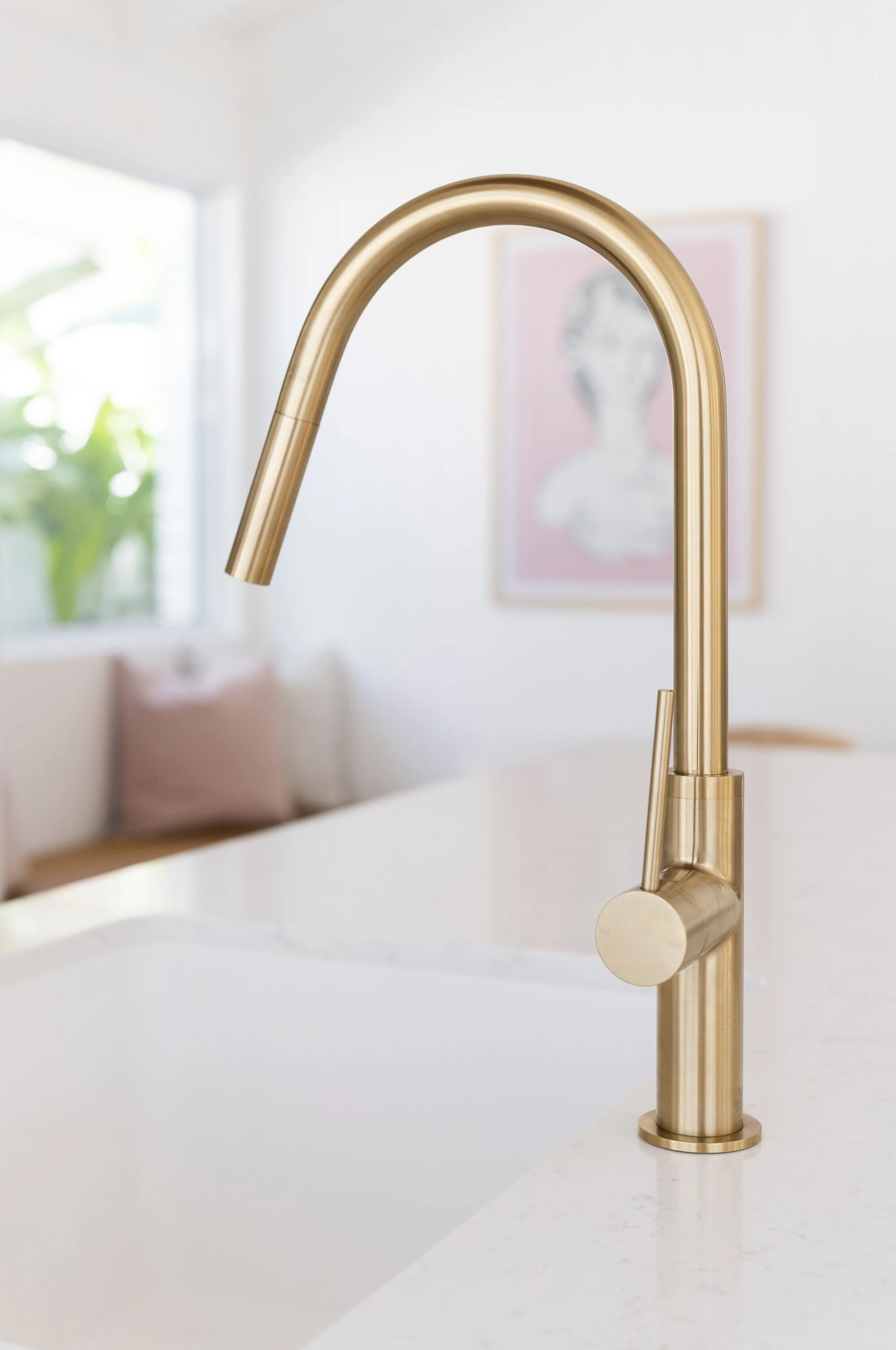
If you’re going to get one large sink, may I suggest to opt for a pullout sink mixer. Ours is the ‘Vivid Slimline’ pull out sink mixer from Phoenix Tapware and it’s brilliant. It makes it so much easier to clean the sink down after washing dishes – honestly I don’t think I’ll go back to a regular tap in the future. The brushed gold finish also ties in with our recurring theme of brass finishes throughout the rest of the house. It’s all about the cohesiveness!
INTEGRATED APPLIANCES
I have always wanted an integrated fridge, but I ummed and ahhed about putting one in, as they’re expensive and tend to be smaller in size than standard fridges. That being said, the Fisher and Paykel french door integrated fridge freezer (80cm size), has a lot of compartments and shelves to fit everything. I tend to be a bit of a minimalist anyways so this suits us just fine. The overall look is so streamlined – I love it! And I was able to pair it with some beautiful polished brass slimline door handles from Made Measure. We also put one on the pantry and they really up the glam factor in our kitchen.
We also opted for a semi-integrated dishwasher from Bosch. It looks great and cleans well, but I have found the layout (in particular for plates/bowls) not as good as my previous dishwasher so it has taken a bit of getting used to.
For our cooking appliances we sourced a Westinghouse integrated rangehood, induction cooktop and pyrolytic oven through Betta. They’re Australian-made and great quality. We are loving using them. As there are a number of great features to outline, I’m going to do a separate blog post dedicated to this (so stay tuned)!
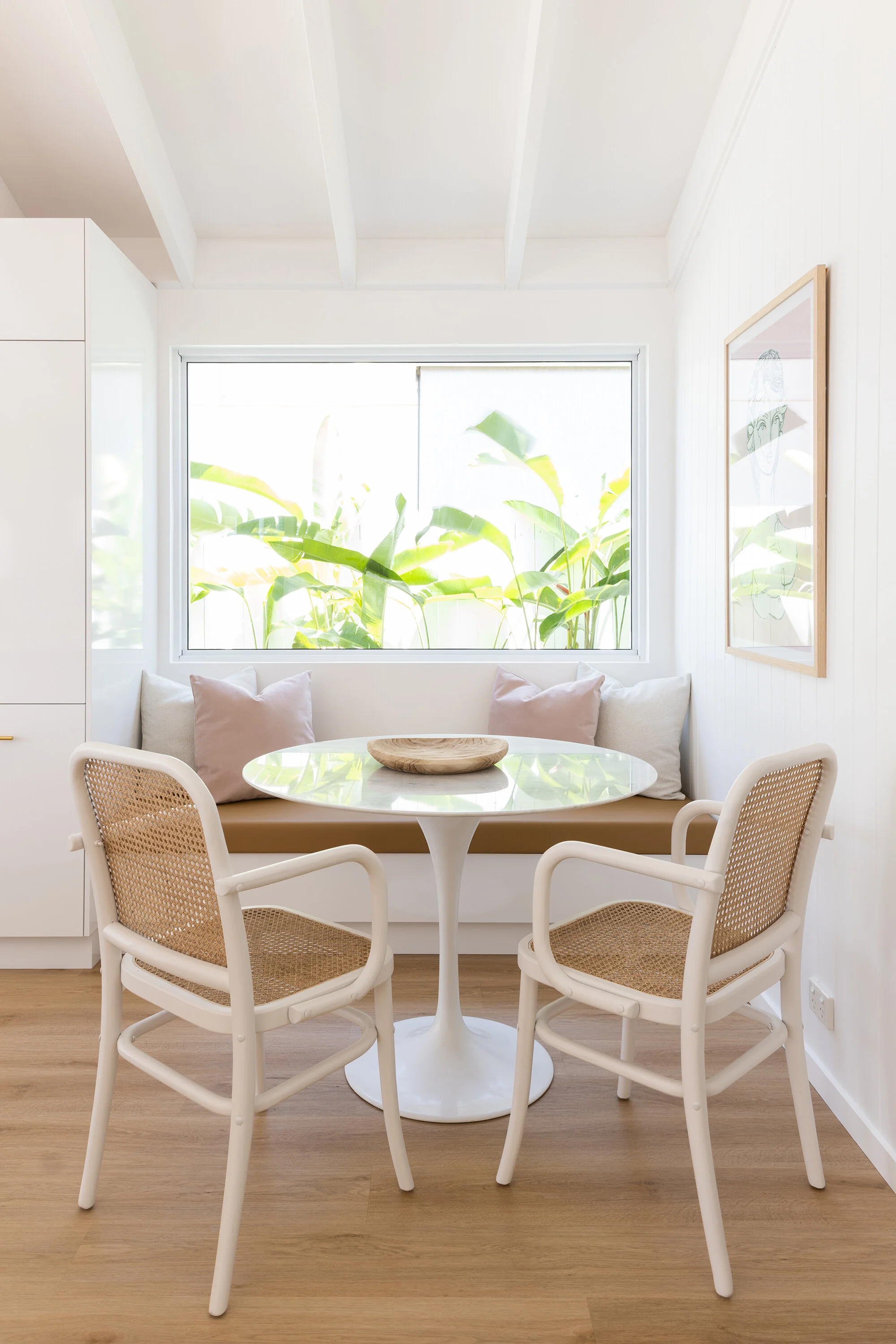
Dining table from Life Interiors, chairs from Eureka Street Furniture, bowl from RAW Sunshine Coast
DINING NOOK
Our dining room isn’t very big at just 1.9m wide x 2.1m deep. It was a fairly obvious choice then to add a bench seat under the fixed window. Ours was custom made by our cabinet maker. There are actually two drawers that pull out underneath – giving us much needed storage space. It really does feel like an extension of our kitchen and works beautifully with the same materials/colour palette. JMK Joinery sourced the bench seat cushion and had it custom made to fit perfectly. I chose Warwick Fabrics ‘Lustrell Charisma’ in camel (a faux leather).
To top it off and add to the cosy factor, my mum who owns Adorn Homewares, made up some custom cushions in Warwick Fabrics ‘Kindred Snow’ and ‘Plush Petal’. They tie in really well with the colours in my ‘Lani’ art print by Jai Vasicek.
Our house features Easycraft EasyVJ panels throughout, and we also have them again in our dining/living room space. Painted in Dulux ‘Vivid White’ they feel super fresh and give the whole room its coastal vibe.
BEFORE
AFTER
FLOORING
It almost felt like fate when I spotted the new Tasmanian Oak hybrid flooring (as part of their Highlands range) from Carpet Court. You see, Tasmanian Oak is a recurring theme in our home so finding this flooring felt like a sign that it was meant to be. And it sure was! I love the tone of it, it feels warm and ties in well with our contour timber panels on the front of the island.
We had old tiles in this space prior, and after having Carpet Court’s installer come out and look at our orignal flooring, he made the decision to pour a self-leveling concrete straight over the top of the tiles (as our tiles weren’t drummy and glued down well), and then that gave us a nice flat, even surface to work with. The kitchen was then installed on top of that concrete floor, and then the floorboards laid around the kitchen. Note - if you don’t want scotia boards, you’ll need to leave the kickboards off your kitchen, flooring then goes down, and then cabinet maker comes back afterwards to put the kickboards on. Talk to both your cabinet maker and flooring company about this to make sure you get the look you want.
I was very impressed with the installation team at Carpet Court and also have to say Phil the sales person at the Enoggera Carpet Court store was so helpful and just lovely to deal with.
HANDLE / PENDANT LIGHT / OVEN / ART PRINT / PULLOUT MIXER / STOOL
TILES / SALT GRINDER / PEPPER GRINDER / BOARD / JUG / STONE / TIMBER PANELS


