Current Crush: Subway Tiles
Kristin’s kitchen photography: Hannah Blackmore / Styling: Claudia Stephenson
Subway tiles are one of those enduring classics – whether they’re laid in a traditional brick-style or herringbone pattern, there’s no denying their beauty.
I love a good herringbone pattern, pair it with a long and lean subway tile, and black grout, and you’ve got instant chic. A perfect example of this, is fashion stylist Kristin Rawson’s neutral kitchen (as featured in Adore Home’s Annual edition). After living in the home for a few years, Kristin decided to make a few changes to her kitchen including a new tiled splashback, natural wooden floating shelves and copper pedant lights from Dunlin. The combination of all three give this space a luxe, yet personalised feel– the open shelving allows Kristin to display the things she loves, along with giving easy access to the things she uses on a regular basis.
“The water candle by Tom Dixon smells so wonderful. I light it every evening when making dinner. When using all the items on the shelf I restyle them around just for fun,” comments Kristin.
If you prefer your subway tile laid in a brick-style pattern, there’s certainly no shortage of inspiration out there. Studio McGee in the U.S are also big fans – you’ll find subway tiles in a number of their design projects including this stunning modern mountain home pictured below (you simply must check out the full home tour by clicking here - it is amazing)!
Studio McGee kitchen Photography: Travis J Photography
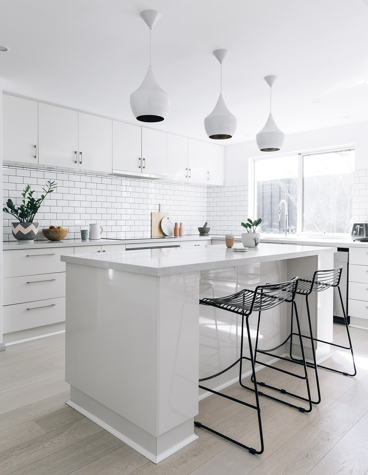
In the new Sweet Dreams edition of Adore, we took a tour of Sharon Sunderland’s Perth family abode (pictured below), with a distinct Australian/Scandi style. Subway tiles laid in a brick pattern with the addition of black grout create a classic yet graphic look in her dreamy kitchen. It also provides the perfect backdrop for all of her designer kitchen accessories.
Sharon Sunderland's kitchen Photography and styling: Tarina Lyell
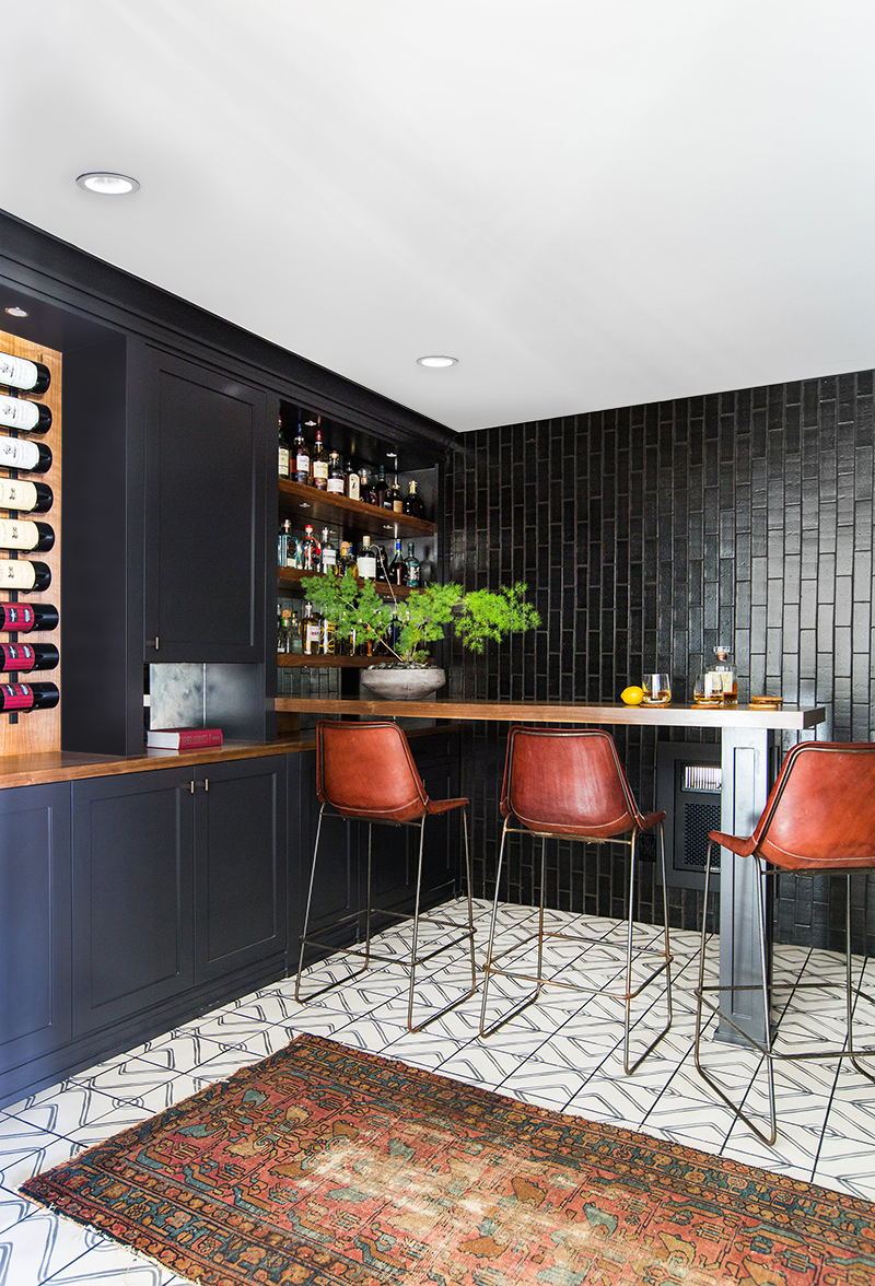
I love what Amber Lewis (of Amber Interiors) has done with these black subway tiles – laying them vertically and in super sexy black . It’s masculine, sophisticated and a bit more daring than laying them horizontally. It works in a space like this where you can tile all the way up to the ceiling.
Amber Interiors' images Photography: Tessa Neustadt
Another interior by Amber Interiors, (pictured below) this time laying long black tiles horizontally and stacked directly above each other. I think if it were just white it might have looked a bit boring in this configuration, but in black, it’s genius.


