Dreamy Family Home
Interior designer Nicole Rosenberg shows how to transform a ‘70s-style Melbournian home into a stylish haven fit for a family.
Words: Beth Greshwalk / Photography: Hannah Blackmore / Styling: Aimee Tarulli / Styling Assistant: Jessica Frazer
Who can resist the magic of a makeover? And nowhere does it stand out, like within a home.
Ask interior decorator/designer Nicole Rosenberg, whose seven years as founder of Little Liberty (an interior decorating firm specialising in kids’ rooms) landed her “a renovator’s dream” gig – transforming an entire ‘70s style, family home in Melbourne.
Although all-inclusive renovating has become the norm for Nicole in recent years, this two-parent, four-child abode required a complete overhaul, made slightly more challenging by the client’s initial scepticism.
“The home was pretty dated and needed a massive freshen-up,” Nicole recalls. “I knew the house had excellent bones, but my client couldn’t see the potential and was sceptical of how it would end up. But I changed her mind.”
The makeover required refreshed floorboards, carpet, paint colours and sheer curtains – and the numerous spaces within the two-level house ensured the designer had her work cut out for her. Structurally, however, Nicole believed nothing needed changing: there were many vintage features worth embracing, such as the gridded doors between the entrance landing and dining space.
“My client wanted to rip them out, but I begged her to keep them,” says the designer. “Now that everything is renovated, they look so amazing.”
The existing wide-open spaces and floor-to-ceiling windows throughout were also assets, allowing the free-flow of natural light. This played directly into Nicole’s overall colour palette.
“I really wanted to let the light do its job, so I chose light grey, neutral tones for most of the bigger design choices. I then brought in colours with art, pendants and soft furnishings.”
The soft backdrop played the perfect canvas to the dining room’s Tom Dixon copper pendant lights and stunning Katie McKinnon artwork, while allowing the pink story to continue into the lounge, with the addition of the sunset-pink, Jardan ‘Wilfred’ chair.
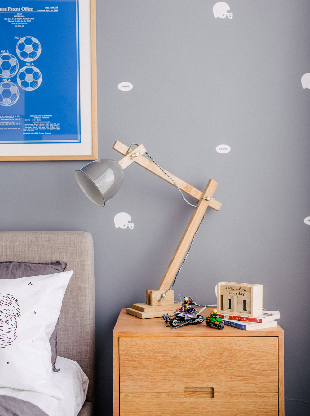
Seamless intermingling of different patterns and textures, particularly within the master and kids’ bedrooms, also provided abundant flair without compromising cosiness.
“I really wanted to let the light do its job, so I chose light grey, neutral tones for most of the bigger design choices.”
“I think the key is to stick to two to three colours and make sure some of the patterns are easy on the eye, like a grid or stripe,” recommends Nicole. “People can go overboard with mixing too many patterns – I always try to make spaces looking calming and inviting. I also love the use of texture. For example, a lambswool cushion or thick weave cushion can create interest and add warmth.”
Durability and function was just as important as style in this transformation, especially being a family home of four children, ranging from preschool- to school-aged.
“I wanted the living and dining area to feel like an adult zone, but still kid-friendly,” Nicole says. “So, I decided against fabric HAY dining chairs and went with the white/wood version, which are more durable.”
Arguably the most striking example of style-meets-purpose lies in the study, where the lush, green velvet lounge, Lumiere Art & Co. prints and built-in cabinetry not only ‘work it’, but work hard.
“You can do so many things in this stylish room,” says Nicole.“I wanted this space to be a parents’ retreat where Mum could come home and work on the computer, or where Dad could just sit on the couch, watch some TV or read the paper. It’s a small space, but we made use of every square metre.”
“The children have their own kids’ retreat, which I made extra inviting so they’ll want to stay. And the adults have lots of areas to get away from it all, when needed.”
What made the family happiest about the makeover? Personal spaces and break-away areas – “so important for a family this large,” Nicole says.
“The children have their own kids’ retreat, which I made extra inviting so they’ll want to stay. And the adults have lots of areas to get away from it all, when needed.”
PRINT / VASE / HIDE THROW / SIDE TABLE / SOFA


