TOTAL LIVABLE LUXE
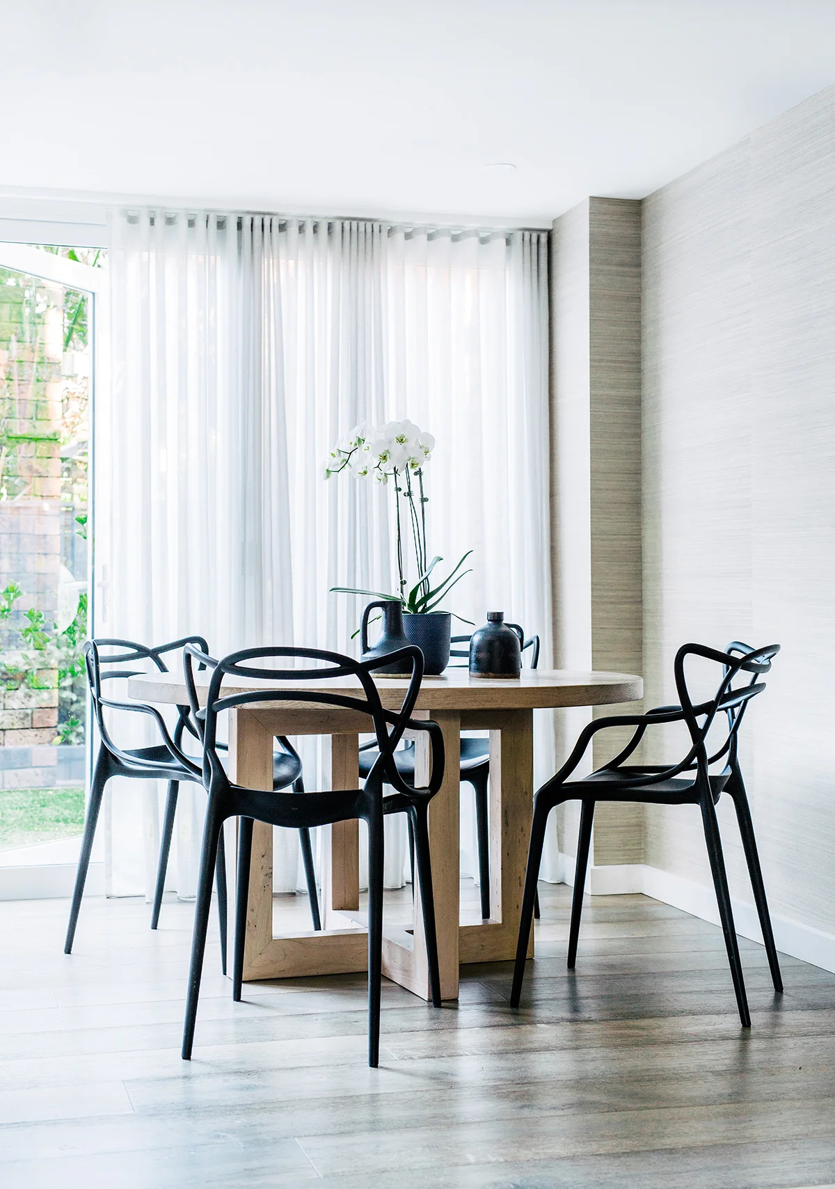
This airy, light and open home has nailed the concept of family-friendly, while knocking the notion of laidback sophistication out of the ballpark. It is total livable luxe.
Photography: Hannah Blackmore / Styling: Claudia Stephenson / Interior: The Designory / Words: Jacqui Greig
Home to Adam and Lavinia and their two children, this 1970s townhouse in Sydney’s Paddington underwent a complete transformation, from front fence to back fence, and everywhere in between. Working with Larissa Raywood (pictured opposite) from The Designory to tackle the substantial venture, Adam and Lavinia were completely hands-on, which allowed for a seamless project from conception to completion. “With an awkward existing layout, achieving the brief meant making every area of the home work harder,” explains Larissa.
Brendon Bott from B2 Construction – an in-house building consultant with The Designory – was brought on board to help with the townhouse renovation.
“We were looking for a team who could manage the project end to end, spanning across DA application and planning, interior design, and the building works. The Designory’s relationship with B2 Construction made the project a breeze for us,” says Lavinia. Brendon worked on the design and development from the very beginning, ensuring the designs were buildable, on-budget and able to meet the timelines required: “It is essential to have a builder’s input right from the start, when you are making a lot of key decisions. It’s also critical during the build itself that the builder involves the designer, so that the overall design intent is maintained throughout the build. In some cases, when the designer isn’t involved, decisions can be made that loosen the connection from the initial concept,” says Larissa, who believes it is important to note that the builder is what makes a designer’s visions become reality, so a collaborative relationship is key.
Creating a sanctuary was top of the agenda, and this was achieved by establishing a relaxed aesthetic with a muted palette and a light-filled, contemporary interior. Textures were layered in soft hues of blues, navy and metallic accents, and furniture was chosen for its laidback sophistication. Pre-renovation, the home was quite dark, so “we explored all opportunities to brighten it up,” says Larissa. These included the large bi-fold doors and windows, keeping the kitchen white (including a mirror splashback) and an overall, vivid white paint on the walls and ceiling.
The element with the most impact in the house was the new opening created in the kitchen/dining area, allowing it to connect effortlessly into the backyard. Previously, the laundry and powder room blocked this area and made the whole house feel extremely small and dark. “Adam and Lavinia just love that (the home) feels visible and connected,” says Larissa, who is as thrilled as the family with the transformation.
CHAIR / QUILT COVER / TRAY / BEDCOVER / FRAMED PRINT / LIGHT
Want to see this home in print? You’ll find the full home tour in our Sweet Dreams edition, available through our online shop. Click here to buy.


