
Beyond the blackened timber exterior of this Mornington Peninsula home lies a light-filled sanctuary that’s a study in restrained colour and curated continuity.
Words Casey Hutton / Interior design The Grace Collective / Interior Photography Annette O’Brien
Interior Styling Amber Lenette / Landscape Design Mint Design / Exterior Photography Erik Holt

Much like the Mornington Peninsula’s native melaleuca trees – from the Greek words melas (black) and leukos (white) – whose pale papery bark remains charred after fires, the dark facade of Sarah and Beau Muston’s home masks its light interior.
“We wanted a black house as soon as we purchased the land,” recalls Sarah. The block’s established greenery was the main reason they chose it, she explains, and a charred timber-clad home would offset the colour of the lush foliage.
Beyond the home’s outer shell, though, the contrast is immediate. High ceilings, generous skylights, gleaming polished concrete floors, white walls, and soothing layers of colour create the atmosphere of an inner sanctum.


Home owner Sarah Muston
“Our aim was to make it our own unique aesthetic, while remaining cohesive to create a soft flow throughout our home,” says Sarah, who is a stylist (The Grace Collective) and owner of clothing boutique Mirror Mirror. She and Beau had built before and were confident when it came to envisioning this home: “We designed every detail, including the entire floor plan.”
Natural light and colour were crucial elements in the home’s design. “For me, colour evokes happiness and joy, so to be surrounded by it every day really elevates your mood,” Sarah reflects.
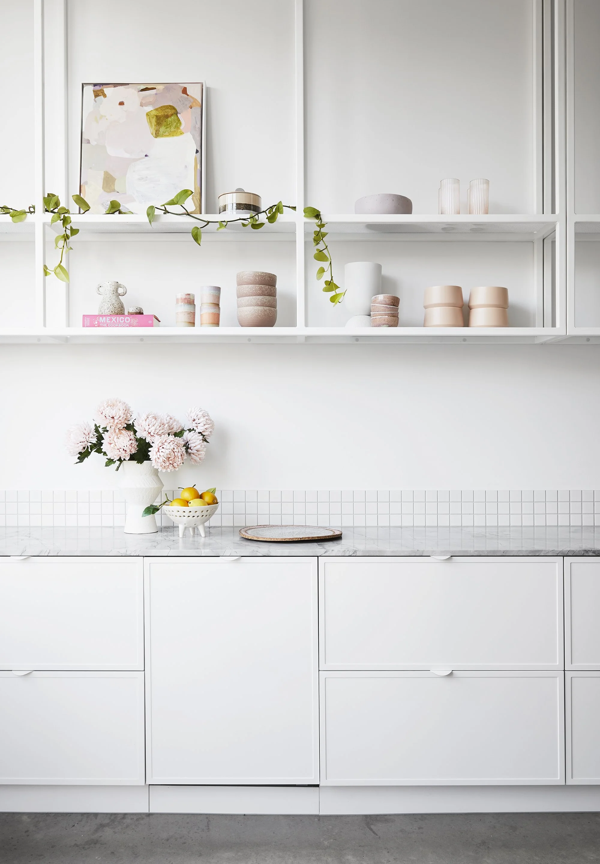


The home’s approach to colour is restrained and carefully considered. Dusty pastels and earthy hues are introduced sparingly but with great effect via floral arrangements, artworks, ceramics and textiles. “We really wanted to create a crisp yet textural home, mix cool tones with warm tones, and introduce sharp lines against soft curves,” she says.
The result is a layered and tactile space, in which all elements exist in a calming equilibrium. Sarah’s decor, florals and soft furnishings are often chosen in response to cherished artworks. “Most times I will wait to start styling a room until I find an artwork that I fall in love with.”
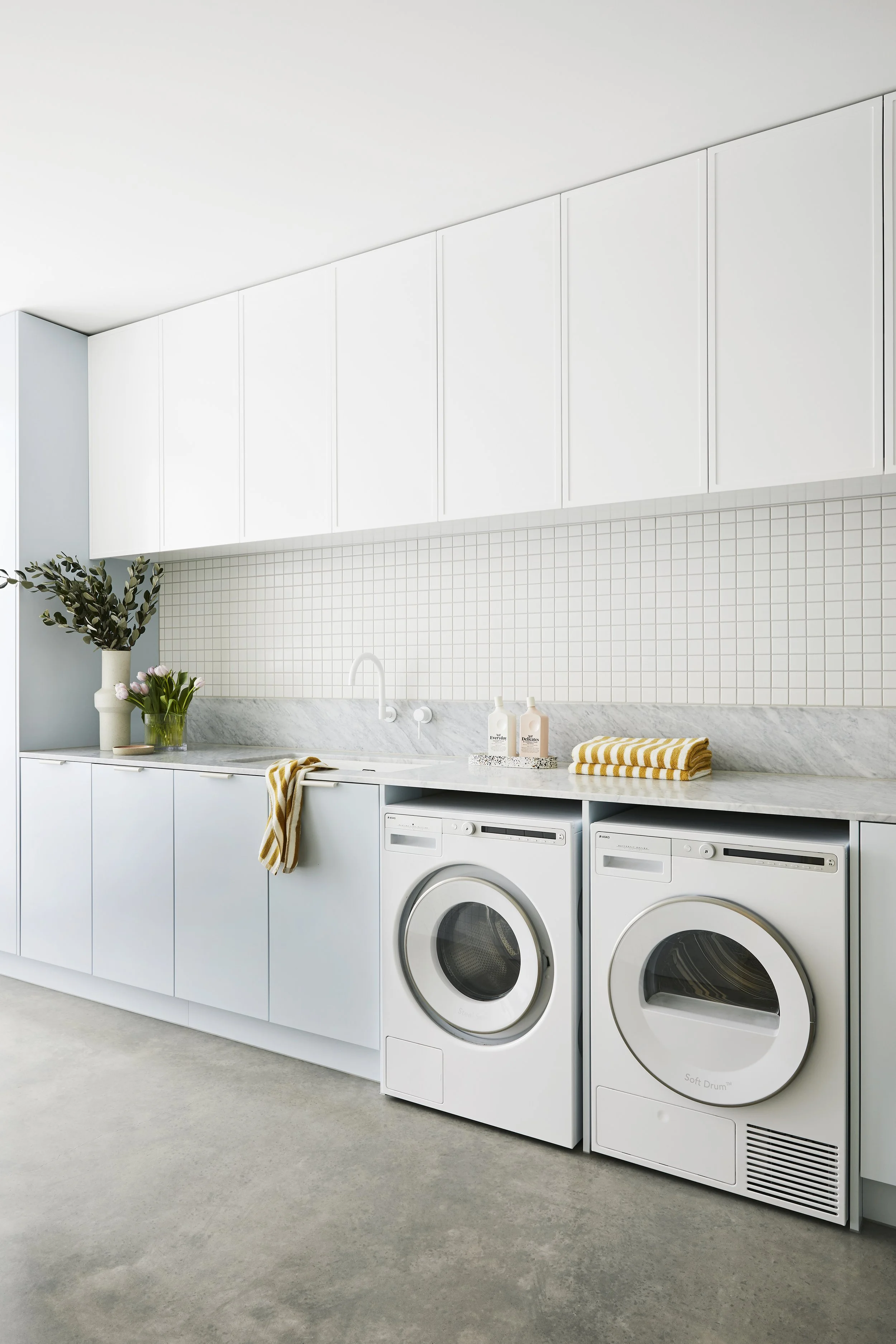


Likewise, the choice of finishes in each room is carefully balanced against the whole. “It was important to me that each space needed to flow into the next,” Sarah explains. “I subtly changed up the tile composition in each bathroom while using the same tiles or, alternatively, selected the same tile in a different shape or size for the next space.” Likewise, the profile of white tapware throughout the home is consistent, but slight variations in design work to differentiate spaces.
Built over three descending levels, the home unfurls beautifully into an airy living and kitchen zone. Floor-to-ceiling glass runs the length of the room, opening up seamlessly to an outdoor area and pool surrounded by mature trees. This generous living space is the heart of the home for Sarah, Beau and their three young children, while a media room on the middle level – cleverly lit with clerestory windows – is where they barrack for their favourite sports teams.


Sarah explains that the floor plan was designed not only for how their family lives now, but also in terms of how they’ll use the spaces in years to come. “This included multiple inside and outside living zones, considering space and privacy so everyone in the family is able to have their friends visit simultaneously and enjoy our home comfortably together.”
Sarah’s favourite spot to retreat to is the luxurious freestanding bath in their ensuite. “It’s positioned in front of a large window in the treetops – a very Zen escape from our busy day-to-day life.”


