Minimalist Warmth
Paola Gredler shares the trials of her massive home renovation and the triumph of achieving her dream home in Melbourne.
Photography: Annette O'Brien / Styling: Alana Langan / Interior design: Paola Gredler / Words: Beth Greshwalk
Deciding to renovate based on the need for more rooms, living space, weather insulation and energy efficient appliances sounds like your everyday remodel, right? Not so much, as Paola Gredler discovered. But with hard work, perseverance and a serious eye for style, the Gredler family survived the seven-month ordeal and are now living happily in the extraordinary, Melbourne-based home they’ve always wanted. So, how’d it all begin?
“We wanted to keep the façade of the existing (Edwardian) house – and there is a heritage overlay on the property,” Paola explains. “So, we decided to maintain the front two rooms, then demolish from that point on.” The addition would then require the building of one top-floor and two bottom-floor sections, which would include two bedrooms, two bathrooms, walk-in wardrobe, powder room, laundry, stairs and study nook.
With two boys aged four and two at the time, Paola and husband Steve decided it would be the most family-friendly scenario to have the sections built offsite. From there, it was off to live in the homes of Paola’s mum and her in-laws, for two months.
“We did receive lots of photos, which was great, but it was harder to keep an eye on things,” Paola recalls. The challenges didn’t end there.
“Planning the renovation with the view of utilising our space the best we could was an issue with neighbours and council planning,” says Paola, who says the larger home size received initial objections from both, causing her to reconsider the second storey. “Also, access was an issue, as we built out to the boundary. The builders needed access to both our neighbour’s properties on various occasions.”
But Paola and Steve stayed true to their vision, even designing the interior themselves – sourcing everything from tiles to appliances.
“I have always loved interiors. I spent lots of time on Pinterest and reading house mags for inspiration – and had been doing that for a few years prior to the renovation,” says Paola, who is currently undertaking an interior design course while working as a senior tax advisor. “Steve is in construction, and at the time, was producing high-end, residential towers. So, we knew what we liked.”
The chosen fixtures, paired with a timeless palette of
dark and neutral colours, embodied Paola’s interior style –
“a mix of minimalist, Scandinavian and contemporary.”
“I have always loved interiors. I spent lots of time on Pinterest and reading house mags for inspiration – and had been doing that for a few years prior to the renovation.”
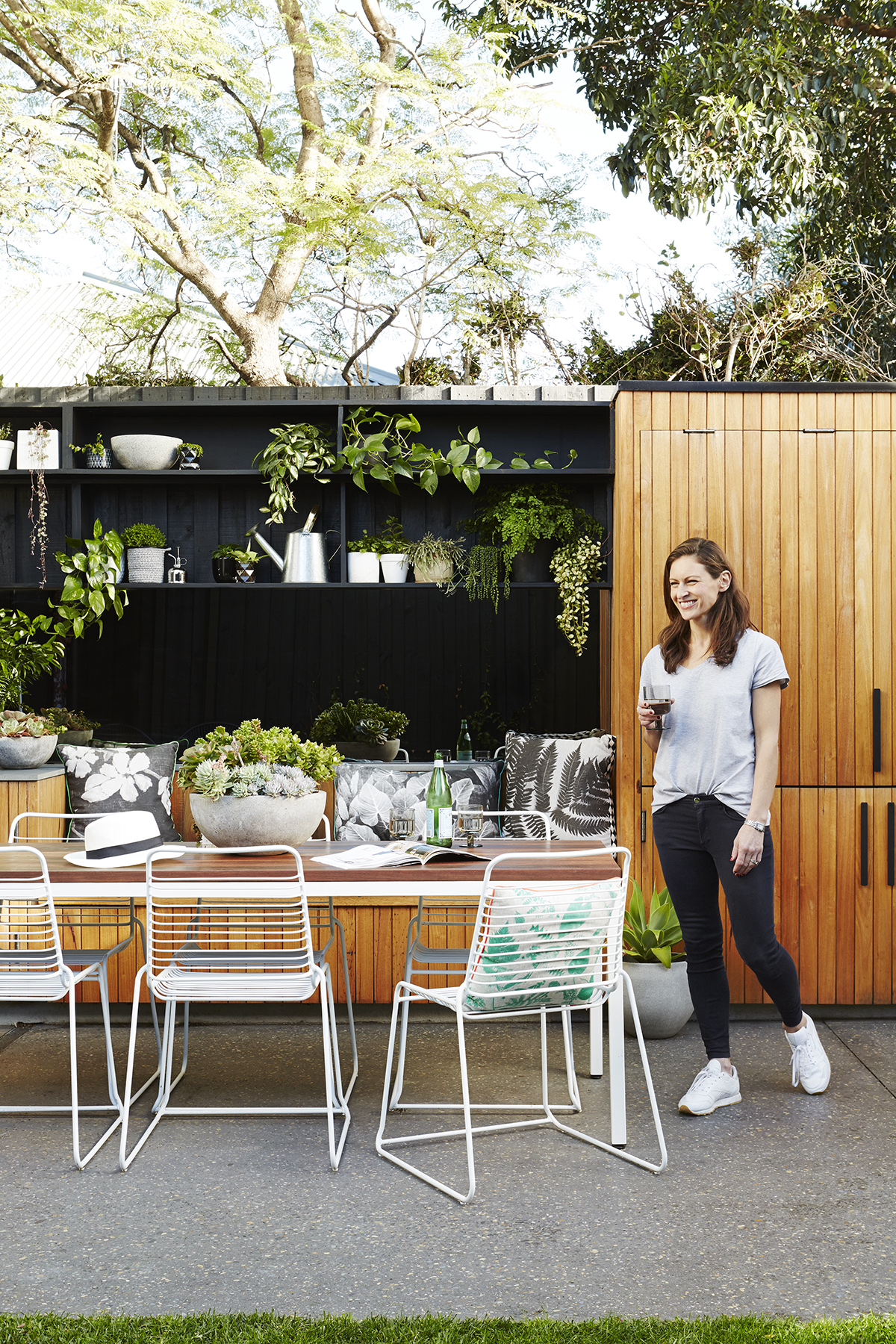
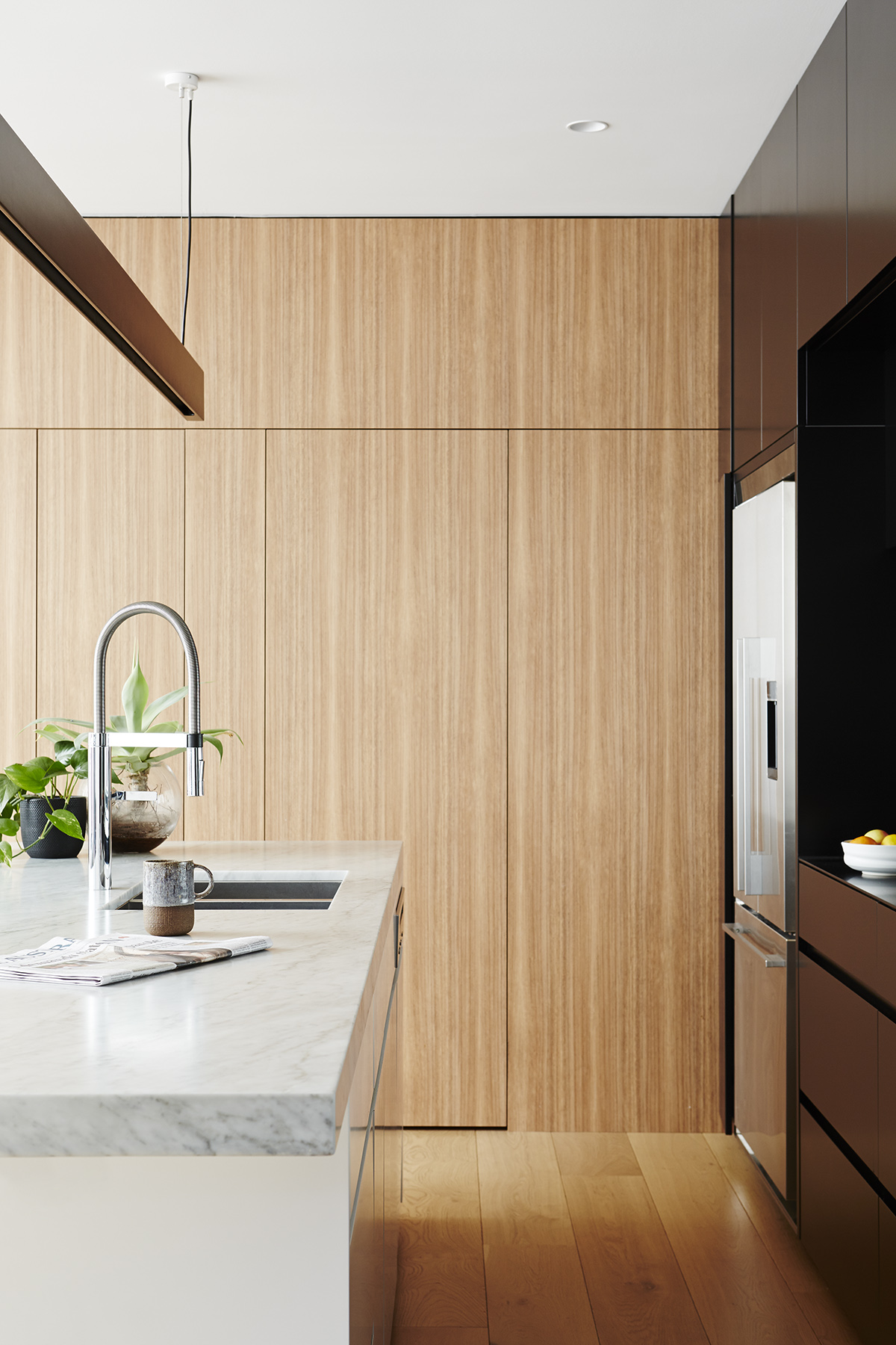
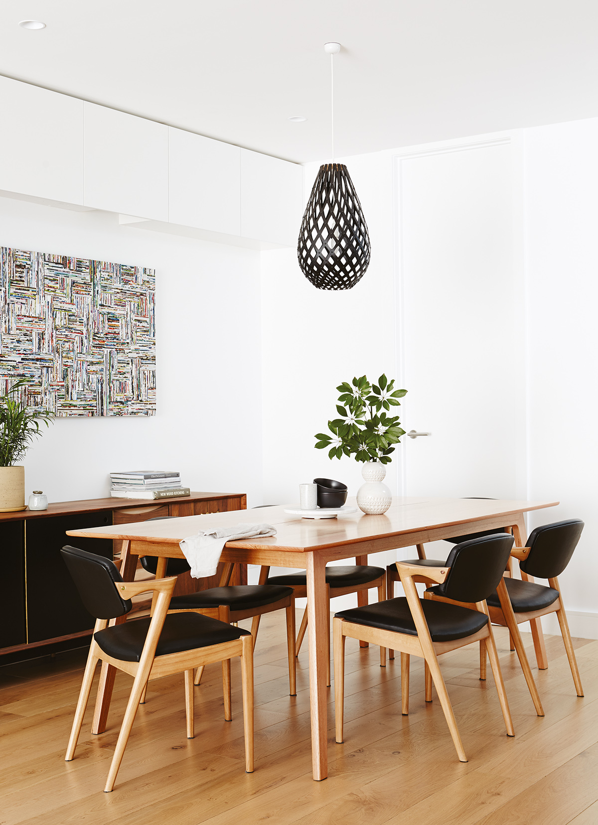
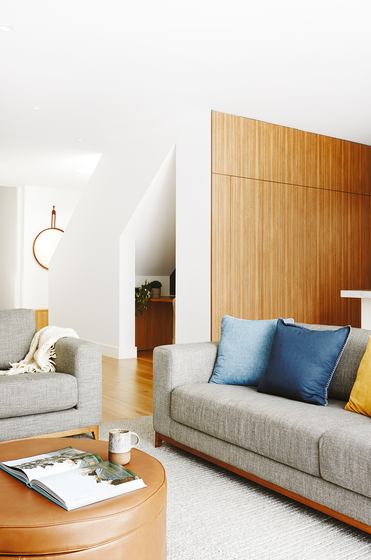
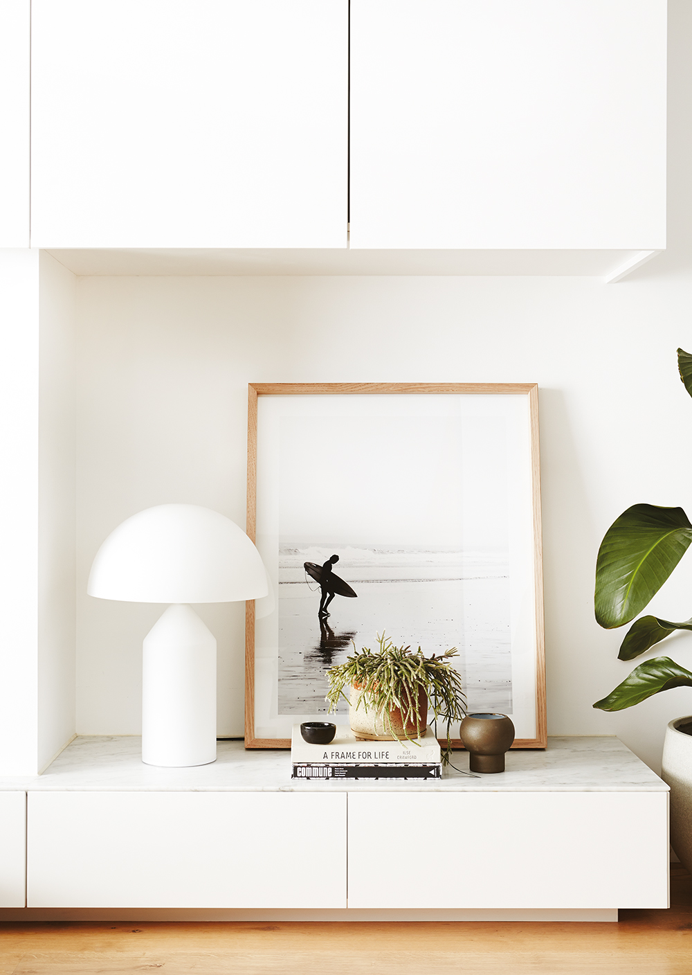
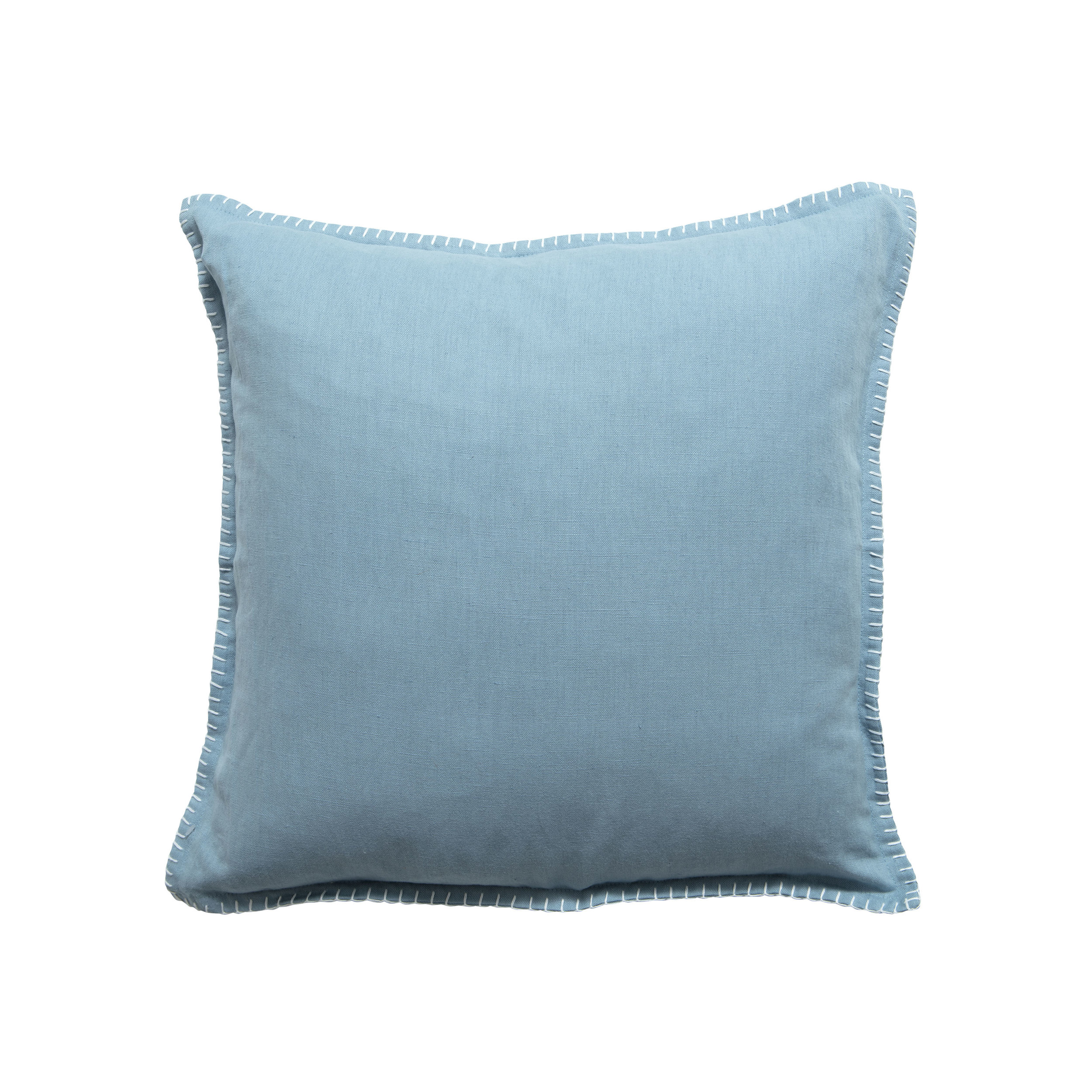
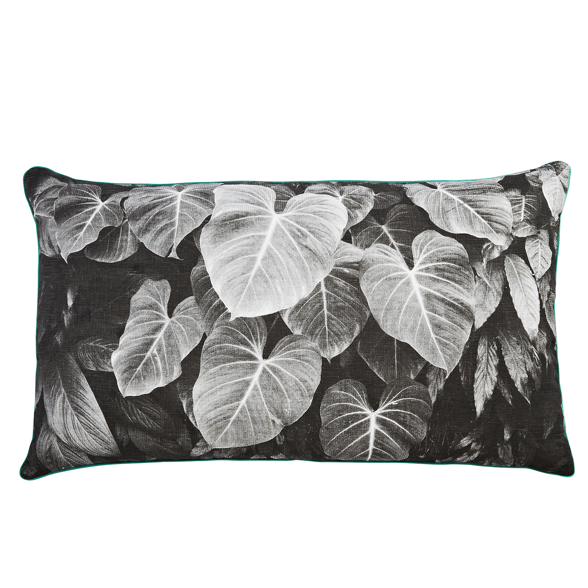
The minimalist element is evident through minimal shades of grey, white and black (“I like using some colour with cushions and throws, but keep it minimal.”). Meanwhile, softening greenery and timber floors, cabinetry and outdoor storage sing Scandi. And when it comes to contemporary flair, look no further than any room in the house: the master bedroom’s cushioned headboard, the bathroom’s sleek timber vanity, the kitchen’s Carrara marble island benchtop. Not to mention, the seamless storage and seating in the open-plan living and dining area.
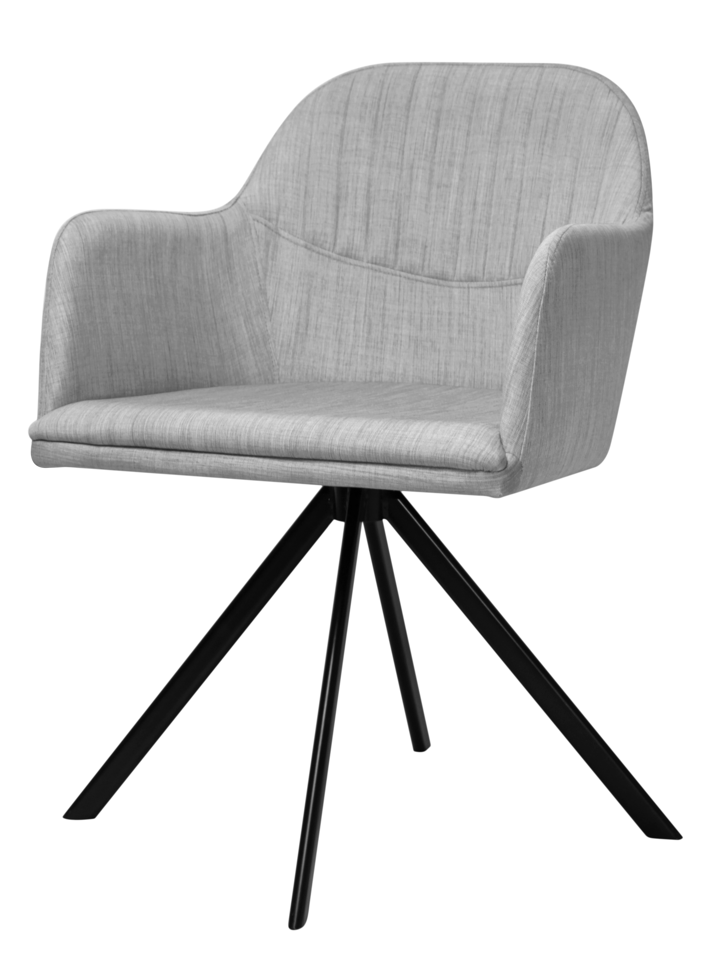
Though Paola nearly nixed her modern chesterfield leather couch due to cost, and chased down her sold-out then discontinued dining chairs until she found a company that would reupholster the same style chair– she remained committed to her dream of the home she wanted.
Today, the whole family is glad she did. “We now feel we can all have our own space within the house,” Paola says. “The kids can play upstairs happily, while we relax downstairs.” And no doubt they’d be doing it in style.


