Understated Warmth
This new family home exudes warmth and vibrancy, with a bold and carefully considered aesthetic.
Photography: Hannah Blackmore / Styling: Claudia Stephenson / Interior: Kristine Jenkins / Words: Jacqui Greig
Building from scratch was a labour of love for Kristine Jenkins – who together with husband, Lionel, and six-month-old daughter, Harley, moved into their home in May 2016.
With an innate sense of style and big dreams, Kristine invested herself in creating the perfect space for her family.
Kristine gave more emphasis to the airy, open-plan layout through the addition of impressive, two-storey staircase voids featuring bronze-tinted mirror panels. Furthering the inviting sense of space and feeling of connectedness, she opted for bi-fold windows and doors that opened from the kitchen and family room into the alfresco area.
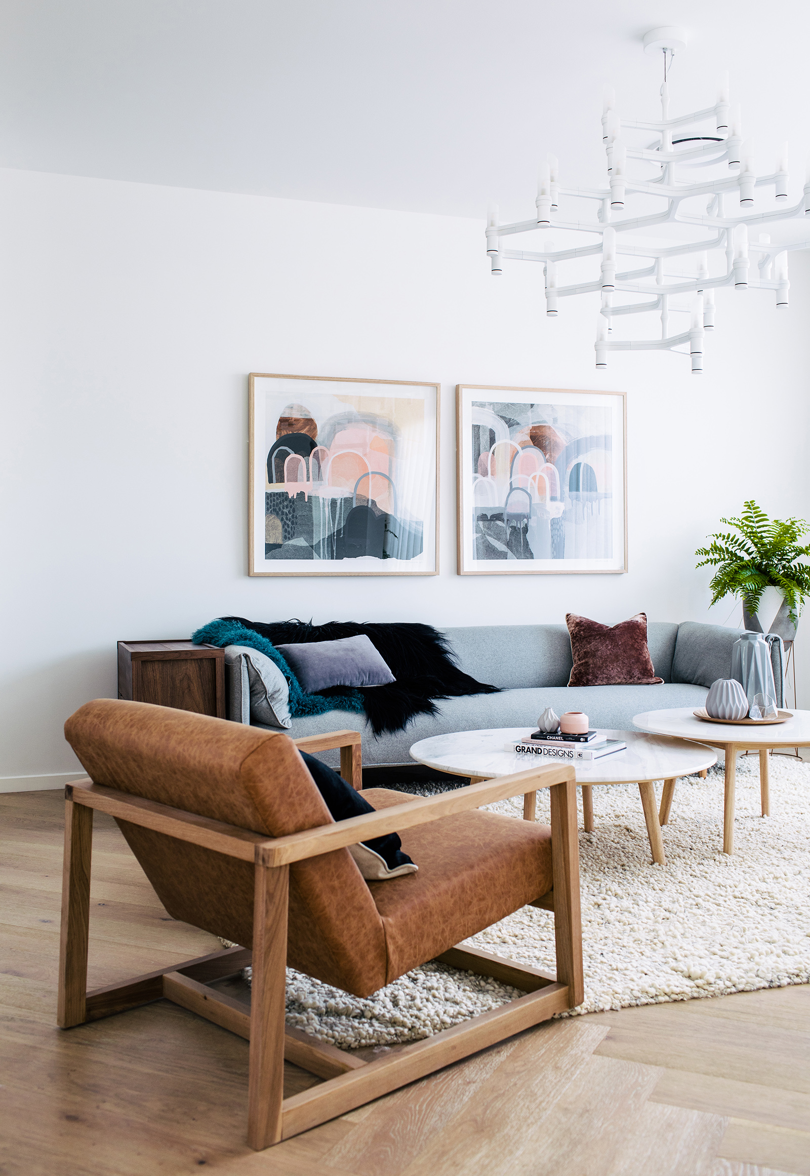
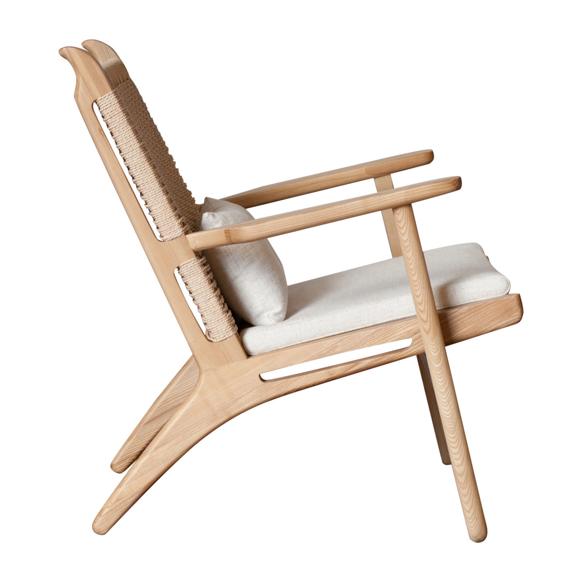
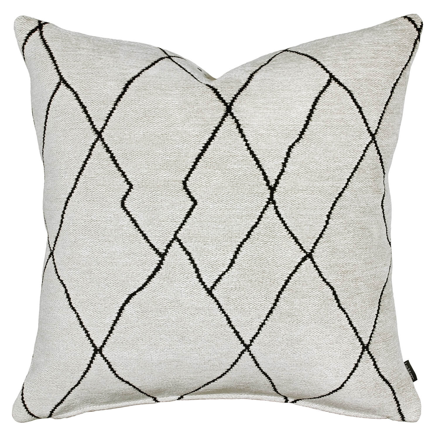
“We chose to use a base of neutral colours, and then layered different textures through the use of timber; woven-linen sofas; wool rugs and wall hangings; leather dining chairs; and stone bench and table tops.”
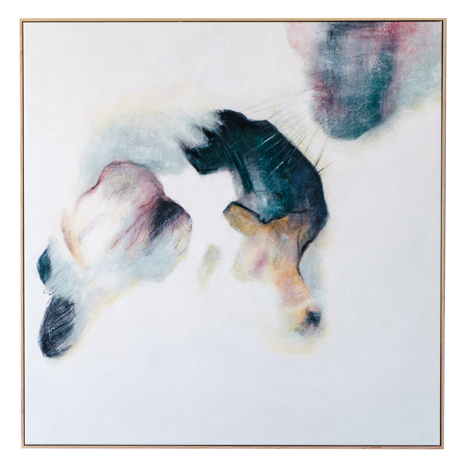
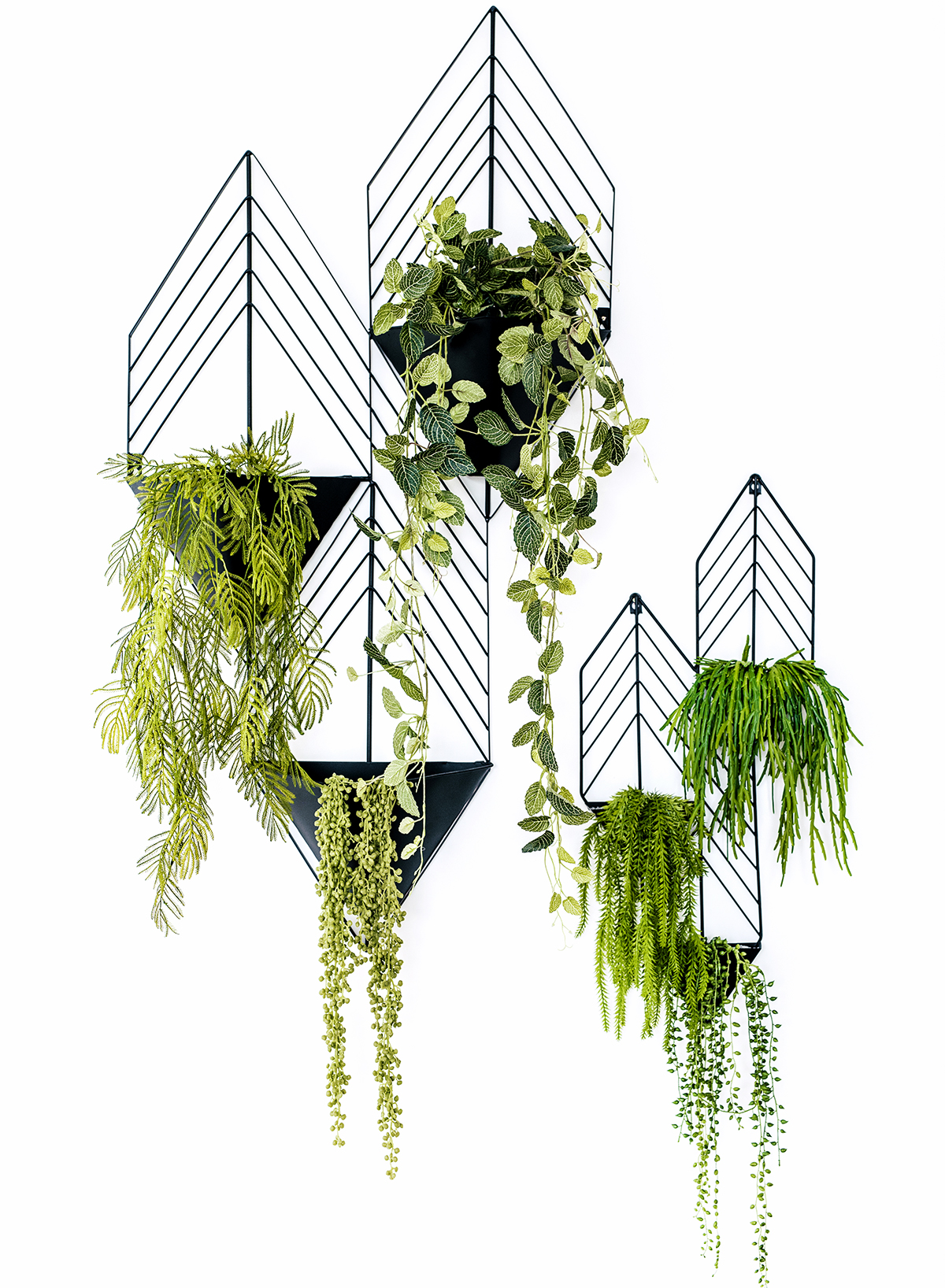
Pops of colour were then incorporated with carefully chosen artworks from United Interiors, and a stunning, vertical wall garden (with faux plants for easy maintenance).
“As we have such an open plan, it was really important for me that the colour palette had a flow through the house, with each room having its own unique character using different colour accents,” explains Kristine, who used varying tones of cream, tan and grey to complement the crisp, white walls – against which, the accent colours would add contrast and depth.
One of Kristine’s challenges was purchasing via the Internet: “Since I only had pictures and descriptions to work off of (it was rare that I could get colour swatches), I was always a little uncertain whether the proportions and colours of the different pieces would work together,” she says. “So, I created mood boards using Pinterest, and searched for images on Instagram to see how specific pieces were used in other people’s homes. And I always had the tape measure handy with our floor plans, to determine whether dimensions would work.”
The home is definitely not short on statement elements. Take, for example, the intricate craftsmanship of the herringbone flooring, which takes on a contemporary edge through the use of boards that were longer and wider than what is typical of traditional, parquetry style.
“...I created mood boards using Pinterest, and searched for images on Instagram to see how specific pieces were used in other people’s homes.”
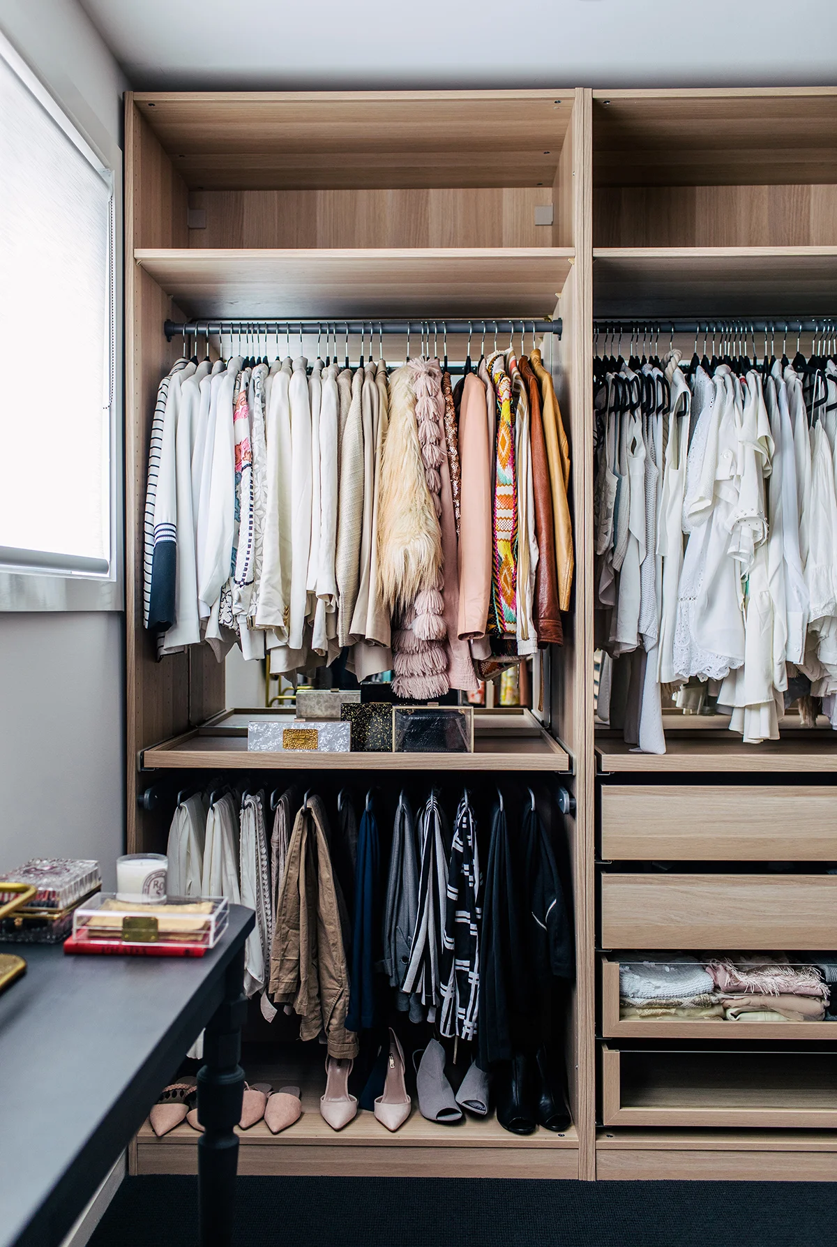
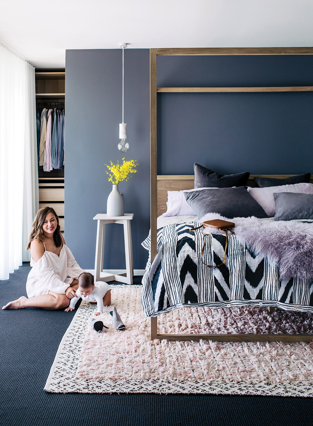
And if the luxe Cultiver linen in the bedroom was impressive, it has nothing on the custom walk-in robe that Lionel built for Kristine.
“I am so very lucky!” she says. “We were initially going to have a walk-in custom made, but when we got the quote back, it didn’t fit our budget. Not ready to give up, I was able to use this great online tool of IKEA’s to design the layout. The only thing that IKEA didn’t have was the middle island bench. So, we came up with an awesome IKEA hack, where Lionel cut one of the components in half to make up two parts of the island.”
It was this hands-on approach to the pursuit of perfection that resulted in a flawless home that Kristine and her family can now take immense enjoyment from.


