CONTEMPORARY CLASSIC
Once tiny and dark, this Federation-style home became bigger in size and better with style. Homeowner Linda Scott shares the scoop on this Balmain-based renovation.
Photography Hannah Blackmore / Styling Alice Stephenson / Words Beth Greshwalk
Living in a beautiful, three-level, Federation-style home is undoubtedly a dream for many – but what if yours was “very dark and very bitsy”? This was the predicament retiree Linda Scott and husband Maurice faced with their classic two-bedroom abode in Balmain, Sydney. Their solution – a complete renovation to increase space, light, and the overall value of their home.
A big job for a little dwelling, the expansion entailed removing “the whole back of the house,” and adding an extension of four square metres, according to Linda.
“The ceilings range from three to nearly four metres in the lounge area, and five metres in the void,” Linda confirms.
“While keeping the façade and front two bedrooms, we added an extra bathroom on the ground level, as it was only a one-bathroom home,” she explains. “We then increased the size of the ensuite.”
The ceilings of the open-plan lounge room/dining area were also significantly heightened as part of the reno – a ‘face-lift’ creating a definite feeling of space. “The ceilings range from three to nearly four metres in the lounge area, and five metres in the void,” Linda confirms.
It gets roomier, with tall doors employed throughout the home, plus a wall-to-floor, bedroom ‘window’ glass overlooking the dining area and outside trees – changes Linda believes further the appearance of greater space.
So, how did the pair solve the darkness dilemma? Quite brilliantly, through the installation of two skylights on the ground level; three-metre high, bi-fold steel doors on the ground and second levels; and two small bi-fold windows in the kitchen – solutions that add value to the home and subtract from energy bills: “We no longer need the lights on during the day,” Linda reveals.
Now, let’s get down to the decorating – that classic, contemporary and oh-so-cool scheme directed by Linda and Maurice. Though neither have a design background, the couple proved that sometimes a little inspiration is all you need for maximum wow. Linda’s muse? The bi-fold steel doors and windows. “I’d call the look – a bit of French Provincial,” she says.
Indeed, this tres magnifique style is evident, from the lounge/dining’s chic, rustic windows, to the lavish marble tiles in the bathroom. The interior’s curvy furniture, tactile fabrics and lush greenery also contribute to the look, along with a neutral colour backdrop that keeps the design cohesive throughout – while giving the illusion of more space.
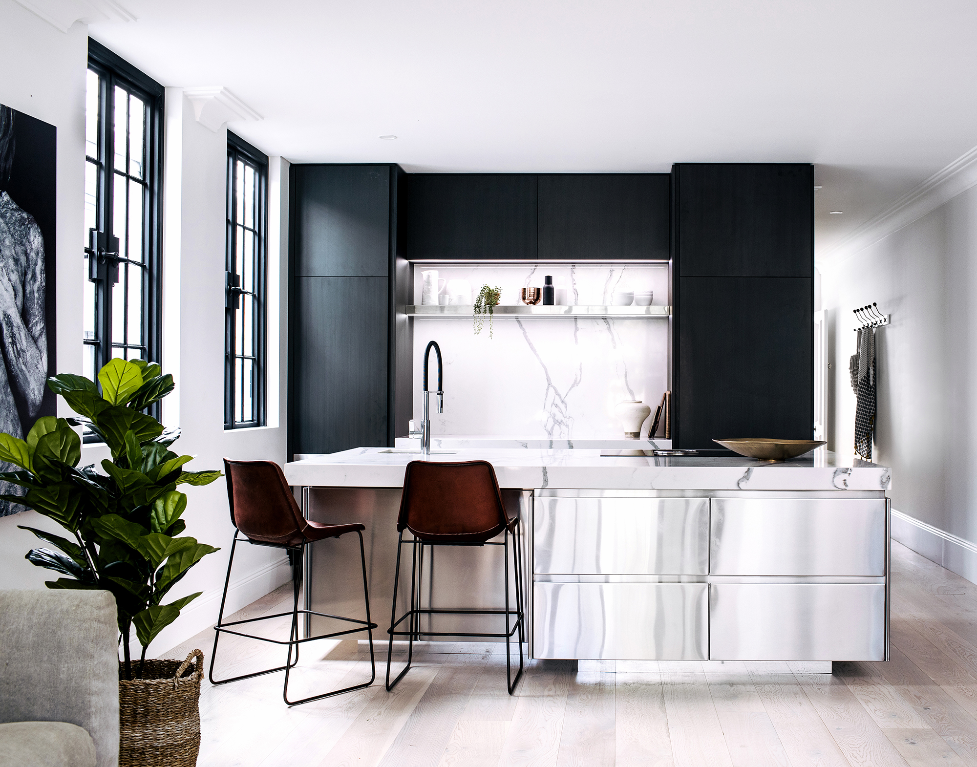
The style, however, has been made their own – modernised by sophisticated furnishings like the stainless steel, kitchen island; hand-painted black cabinetry; and contemporary artwork. These pretty yet refined punctuations help make the newly extended abode more livable and conducive to entertaining.
“We can use the kitchen whilst interacting with guests,” Linda points out. And those include her six grandchildren – all boys – for whom the downstairs and backyard are currently being designed. Meanwhile, Linda and Maurice will continue to enjoy all they’ve accomplished with just an extra four square metres and divine decorating: “We just love it.”


