Australian/Nordic Fusion
Sharon Sunderland reveals how she made family-friendly look fabulous by combining modern Australian and Scandinavian styles in her new Perth home.
Photography + styling: Tarina Lyell / Interior: Sharon Sunderland / Words: Beth Greshwalk
Sharon and Phil Sunderland set out to build a modern home that would adapt to their growing brood – three kids under six – and the daily disarray that came with them. But unlike the elusive “life balance” many parents strive for, the Sunderlands achieved an abode as family-friendly as it is stylish.
Built at the rear of their first home, a 1940s two-bedroom cottage, their contemporary castle features open-plan living on the first floor, with the kitchen/dining room opening out to a scenic courtyard – an additional living space designed by landscaping guru Mon Palmer. The second level now showcases a generous master bedroom, whimsical kids’ rooms and one happening home office. And let’s not forget the sweet plunge pool in their reversing driveway.
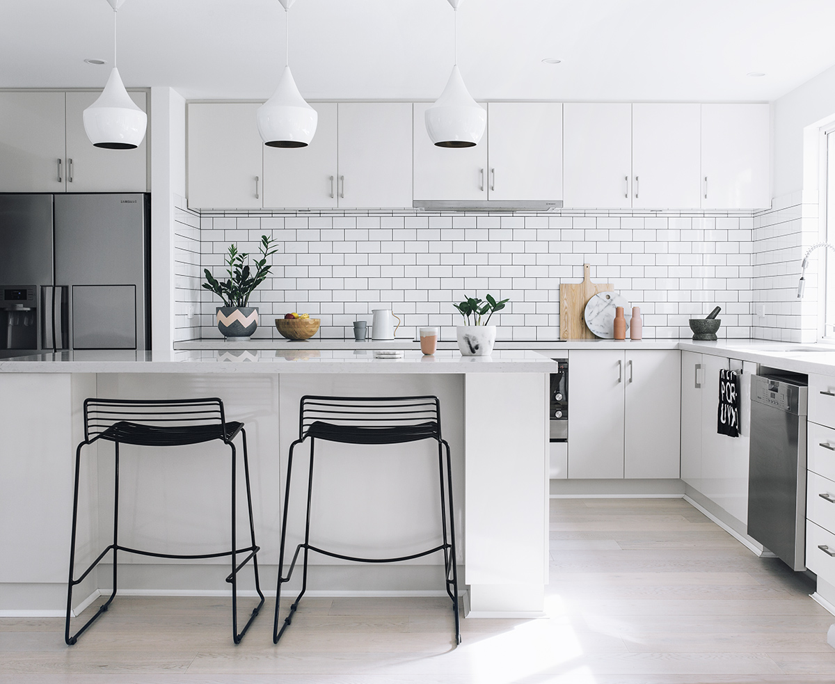
As for overall design, the Sunderlands chose the sought-after Australian-meets-Scandinavian look: A relaxed ambience of clean whites and neutral tones; lush textiles; natural light and woods.
“We wanted our home to accommodate three young children, and as we are located on a rear block, our house is very much in the shade, making it important to bring in as much natural light as possible,” Sharon explains. “We took inspiration from the Scandinavians, since they are masters at casual yet minimal interiors that maximise natural light. We also love how Australian design is casual, non-fussy and very much about the backyard as much as the interiors.”
Decorating the space was a no-brainer for Sharon, who calls styling her creative outlet. And even though her husband, Phil, operates a computer at work, he’s a true blue “renovator” at home.
“It wasn’t too difficult to work together, as we have quite similar taste and style,” Sharon says, which is evidenced by a chic home office that “best shows my husband’s and my personalities.”
But when it came to streamlining the backyard with the interior, the adorning duo lacked inspiration due to minimal space, an “ugly” green bond fence and pile of endless dirt, Sharon contends. So, they contacted Scarborough’s renowned landscape designer, Mon Palmer. The result: a beautiful alfresco oasis paved in travertine, alongside a flourishing garden.
“Mon was great – she had the expertise to advise me it was possible to have a low-maintenance garden and still enough space for children,” says Sharon. “(She) understood what I wanted to achieve, based on what I was doing with the interiors.”
Indeed, with the wood panel ceiling and clean-lined lounge furniture, the courtyard embraces the laidback Aussie vibe and serene Scandi style of the open-plan kitchen/dining/living space, adjacent via large glass doors.
“I really like having open-plan living,” Sharon adds. “I can keep an eye on the kids when I’m in the kitchen.”
The multi-zone space further befits her family with easy-clean benchtops, chairs and stools, chosen to withstand kids “throwing food everywhere,” as Sharon can attest.
“We chose low-maintenance surfaces which only require a quick spray and wipe, like wood and stone,” she says. “They’re less likely to leave marks compared to glass, stainless steel or marble.”
Although their new home didn’t come without budget constraints or difficulty giving rooms equal focus, Sharon learned it’s best to “go at your own pace and always have fun with it,” when it comes to renovating.
And ultimately: “Just go with what will work best for you and your family.”


