
Welcome to Adore's
HOME TOURS
Take Tour
CONTEMPORARY CLASSIC
Once tiny and dark, this Federation-style home belonging to Linda and Maurice Scott, became bigger in size and better with style.

Once tiny and dark, this Federation-style home became bigger in size and better with style. Homeowner Linda Scott shares the scoop on this Balmain-based renovation.
Photography Hannah Blackmore / Styling Alice Stephenson / Words Beth Greshwalk


Living in a beautiful, three-level, Federation-style home is undoubtedly a dream for many – but what if yours was “very dark and very bitsy”? This was the predicament retiree Linda Scott and husband Maurice faced with their classic two-bedroom abode in Balmain, Sydney. Their solution – a complete renovation to increase space, light, and the overall value of their home.
A big job for a little dwelling, the expansion entailed removing “the whole back of the house,” and adding an extension of four square metres, according to Linda.


“The ceilings range from three to nearly four metres in the lounge area, and five metres in the void,” Linda confirms.


“While keeping the façade and front two bedrooms, we added an extra bathroom on the ground level, as it was only a one-bathroom home,” she explains. “We then increased the size of the ensuite.”
The ceilings of the open-plan lounge room/dining area were also significantly heightened as part of the reno – a ‘face-lift’ creating a definite feeling of space. “The ceilings range from three to nearly four metres in the lounge area, and five metres in the void,” Linda confirms.
It gets roomier, with tall doors employed throughout the home, plus a wall-to-floor, bedroom ‘window’ glass overlooking the dining area and outside trees – changes Linda believes further the appearance of greater space.
So, how did the pair solve the darkness dilemma? Quite brilliantly, through the installation of two skylights on the ground level; three-metre high, bi-fold steel doors on the ground and second levels; and two small bi-fold windows in the kitchen – solutions that add value to the home and subtract from energy bills: “We no longer need the lights on during the day,” Linda reveals.
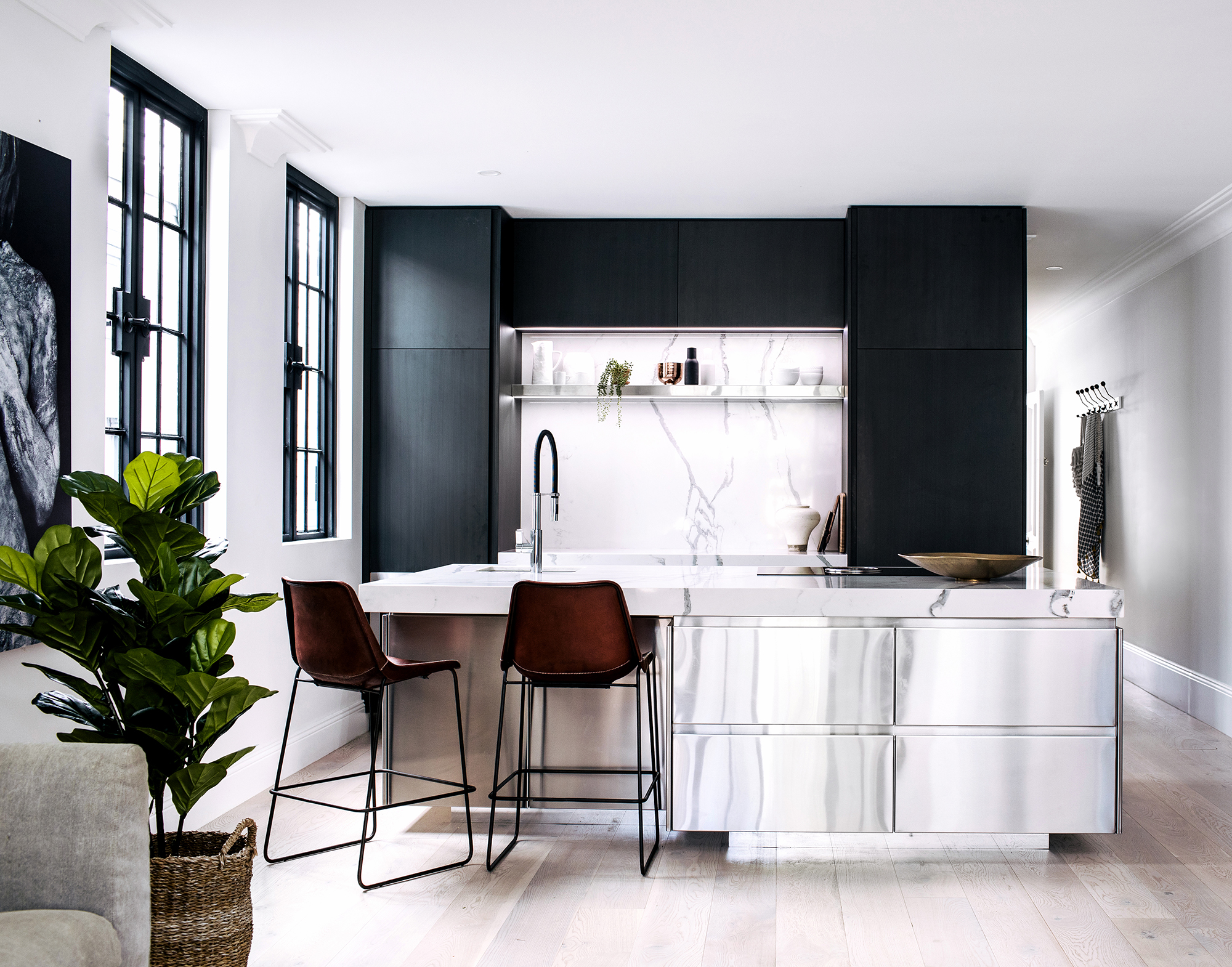

Now, let’s get down to the decorating – that classic, contemporary and oh-so-cool scheme directed by Linda and Maurice. Though neither have a design background, the couple proved that sometimes a little inspiration is all you need for maximum wow. Linda’s muse? The bi-fold steel doors and windows. “I’d call the look – a bit of French Provincial,” she says.


Indeed, this tres magnifique style is evident, from the lounge/dining’s chic, rustic windows, to the lavish marble tiles in the bathroom. The interior’s curvy furniture, tactile fabrics and lush greenery also contribute to the look, along with a neutral colour backdrop that keeps the design cohesive throughout – while giving the illusion of more space.
The style, however, has been made their own – modernised by sophisticated furnishings like the stainless steel, kitchen island; hand-painted black cabinetry; and contemporary artwork. These pretty yet refined punctuations help make the newly extended abode more livable and conducive to entertaining.
“We can use the kitchen whilst interacting with guests,” Linda points out. And those include her six grandchildren – all boys – for whom the downstairs and backyard are currently being designed. Meanwhile, Linda and Maurice will continue to enjoy all they’ve accomplished with just an extra four square metres and divine decorating: “We just love it.”

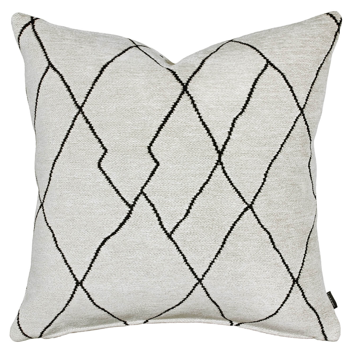
SHOP THE LOOK >


Want to see this home in print? You’ll find the full home tour in our Small Homes edition, available through our online shop. Click here to buy.
Understated Warmth
This new family home exudes warmth and vibrancy, with a bold and carefully considered aesthetic.

This new family home exudes warmth and vibrancy, with a bold and carefully considered aesthetic.
Photography: Hannah Blackmore / Styling: Claudia Stephenson / Interior: Kristine Jenkins / Words: Jacqui Greig


Building from scratch was a labour of love for Kristine Jenkins – who together with husband, Lionel, and six-month-old daughter, Harley, moved into their home in May 2016.
With an innate sense of style and big dreams, Kristine invested herself in creating the perfect space for her family.
Kristine gave more emphasis to the airy, open-plan layout through the addition of impressive, two-storey staircase voids featuring bronze-tinted mirror panels. Furthering the inviting sense of space and feeling of connectedness, she opted for bi-fold windows and doors that opened from the kitchen and family room into the alfresco area.
“We chose to use a base of neutral colours, and then layered different textures through the use of timber; woven-linen sofas; wool rugs and wall hangings; leather dining chairs; and stone bench and table tops.”
Pops of colour were then incorporated with carefully chosen artworks from United Interiors, and a stunning, vertical wall garden (with faux plants for easy maintenance).
“As we have such an open plan, it was really important for me that the colour palette had a flow through the house, with each room having its own unique character using different colour accents,” explains Kristine, who used varying tones of cream, tan and grey to complement the crisp, white walls – against which, the accent colours would add contrast and depth.


One of Kristine’s challenges was purchasing via the Internet: “Since I only had pictures and descriptions to work off of (it was rare that I could get colour swatches), I was always a little uncertain whether the proportions and colours of the different pieces would work together,” she says. “So, I created mood boards using Pinterest, and searched for images on Instagram to see how specific pieces were used in other people’s homes. And I always had the tape measure handy with our floor plans, to determine whether dimensions would work.”
The home is definitely not short on statement elements. Take, for example, the intricate craftsmanship of the herringbone flooring, which takes on a contemporary edge through the use of boards that were longer and wider than what is typical of traditional, parquetry style.
“...I created mood boards using Pinterest, and searched for images on Instagram to see how specific pieces were used in other people’s homes.”


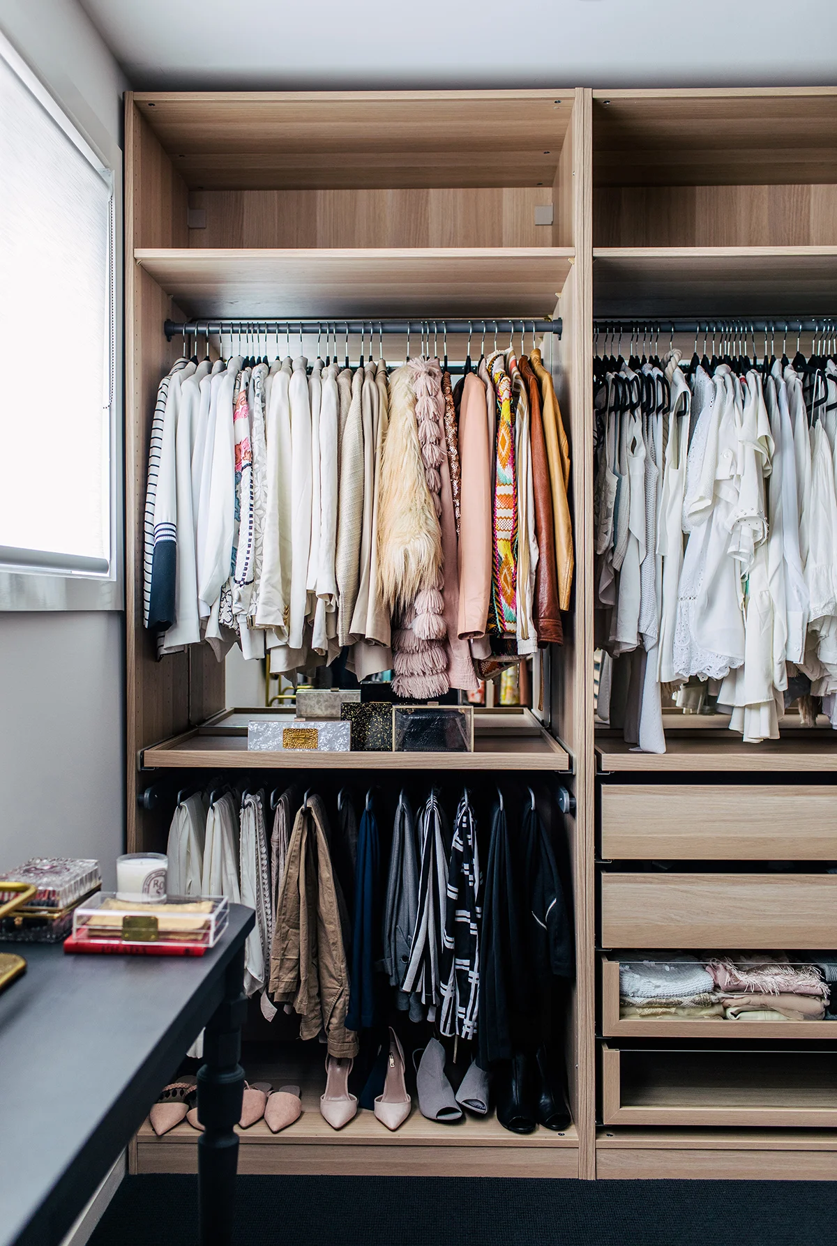
And if the luxe Cultiver linen in the bedroom was impressive, it has nothing on the custom walk-in robe that Lionel built for Kristine.
“I am so very lucky!” she says. “We were initially going to have a walk-in custom made, but when we got the quote back, it didn’t fit our budget. Not ready to give up, I was able to use this great online tool of IKEA’s to design the layout. The only thing that IKEA didn’t have was the middle island bench. So, we came up with an awesome IKEA hack, where Lionel cut one of the components in half to make up two parts of the island.”
It was this hands-on approach to the pursuit of perfection that resulted in a flawless home that Kristine and her family can now take immense enjoyment from.
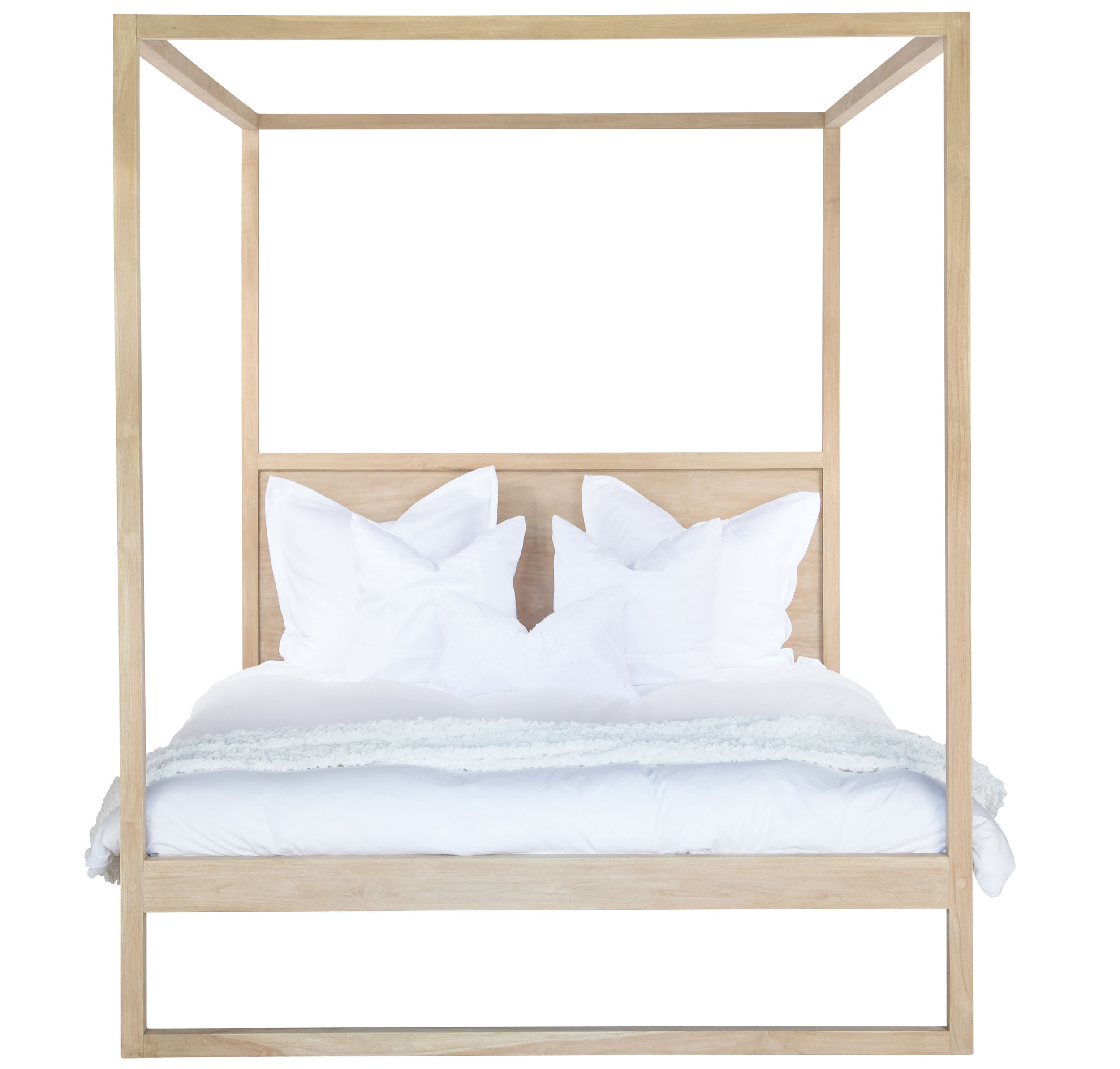
SHOP THE LOOK >


Want to see this home in print? You’ll find the full home tour in our Autumn edition, available through our online shop. Click here to buy.
Inner-city Oasis
Eve Gunson and Matt Benetti have transformed their dilapidated, long forgotten Victorian home from worn-out to a wondrous oasis.

Eve Gunson’s transformative powers with hair and makeup have set her apart, and now she adds another string to her bow – applying that same artistic force to interior design, with magical results.
Words: Pip Miller / Photography: Hannah Blackmore / Styling: Alana Langan


When she’s not getting Australia’s television personalities and actors camera-ready, Eve Gunson will most likely be obsessing over interior design and style. This is something she is very passionate about, as evidenced in her blog, Dot + Pop, which she intends to be a springboard for a future business with partner, Matt Benetti – a builder of 15 years.
Together, the pair have renovated two homes into covetable dwellings, and have just completed their third – taking a dilapidated, long-forgotten Victorian home from worn-out to wow.
According to Eve, they purchased a building whose front was still in its original 1880s condition, with an incongruous 1980s-eraextension out the back that featured – in her own words – an “oh-so-lovely, lavender kitchen”.
From there, the pair set to work, and while living in and around the renovation, completed their transformation in three years. Incidentally, Matt just so happened to be the onsite owner-builder operating under the umbrella of his own company, New Living Constructions.

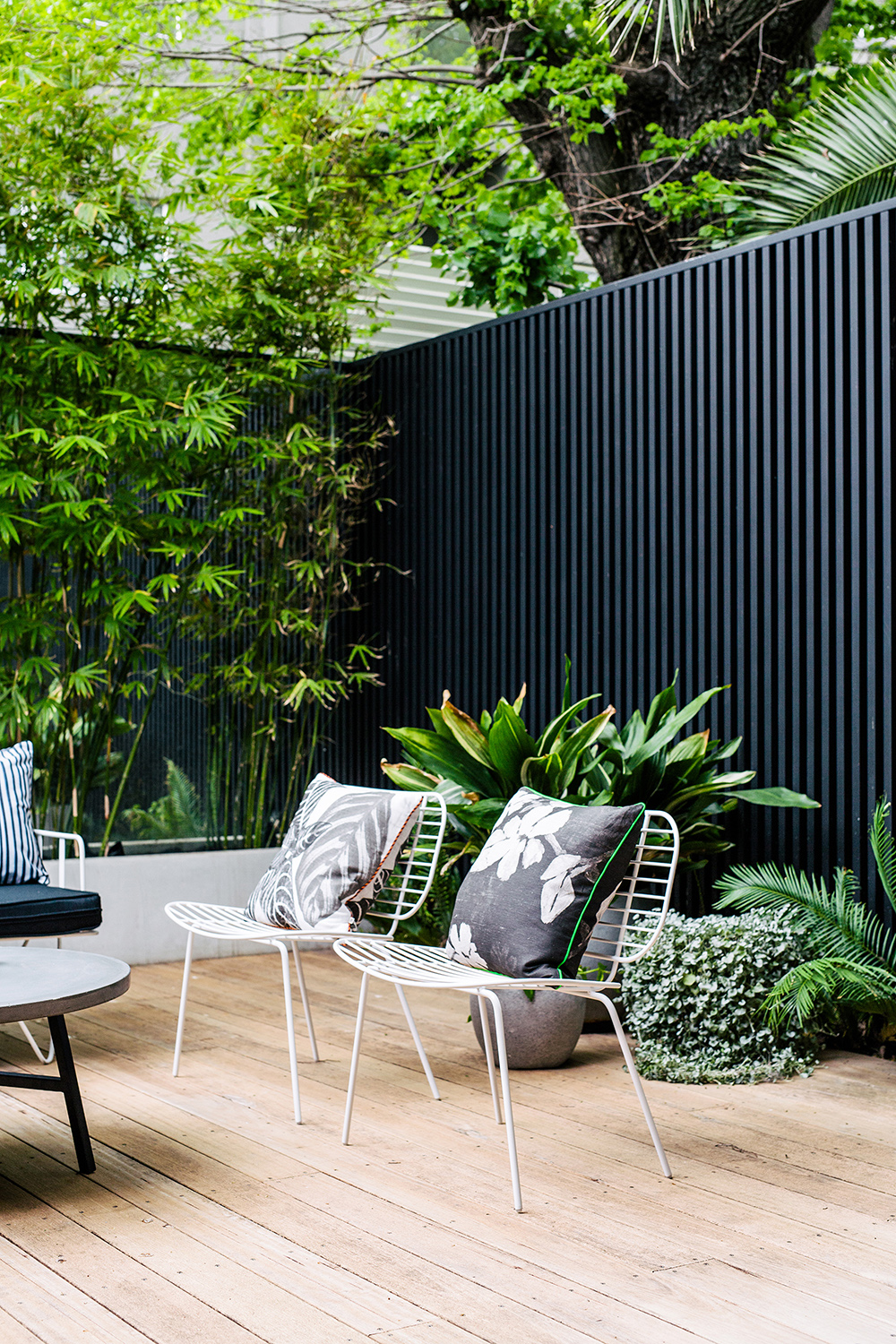
Outdoor sofa, bench seat and easy chairs from Space To Create. Cushions, moss terrarium and mister from Ivy Muse.


“The renovation included cutting the house in half from the original hallway, and demolishing the entire back end. We then started working on the contemporary reconstruction, while adding a second story,” Eve says.
Eve’s eye for understated, albeit statement-making style is unquestionable and evident in her now-completed home.
“The overall simplicity of the house comes from the use of raw materials, which create a clean finish but still with impact. We always favour the use of steel, concrete, timber and stone in our renovations, as the backbone of the design.”


The furniture effortlessly ties in with the overall neutral colour palette. Barstools, dining table and chairs from GlobeWest.


According to Eve, materials and texture is everything.
“We both love timber, and as you can tell, we have incorporated it into every room of the house. Using a textured wool rug, a woven linen couch, and wool- blend dining chairs – with the addition of steel aspects, such as the stair handrail detail – brings the look full circle with tones and texture,” she says.
Concrete rendering in the terrace adds to the minimalist feel the couple love. Black slats were also chosen to clad the boundary walls of the terrace, adding interest and depth.
In juxtaposition to the hard textures and industrial edge, there is a lot of soft layering at work, especially in the bedrooms. “I love to layer the beds with beautiful linens, bedspreads, throws and cushions, to make them feel super plush and inviting,” Eve says.
“We both love timber, and as you
can tell, we have incorporated it
into every room of the house.”

The kitchen also features a certain softness and warmth in its clever use of oak cabinetry, that has been elegantly paired with Carrara marble bench tops and smoked-mirror splashback, for a more sophisticated and modern look. The mirror also reflects the bamboo wall outside to create the illusion of added space, and to beckon the outdoors in. Interestingly, Matt also designed and built the black steel and oak linear pendant light.
“We wanted to create an oasis within the inner city because we live in such a high density area,” Eve says. “Screening the back wall of the terrace with mature bamboo gave us privacy, but also a luscious, natural green wall.”


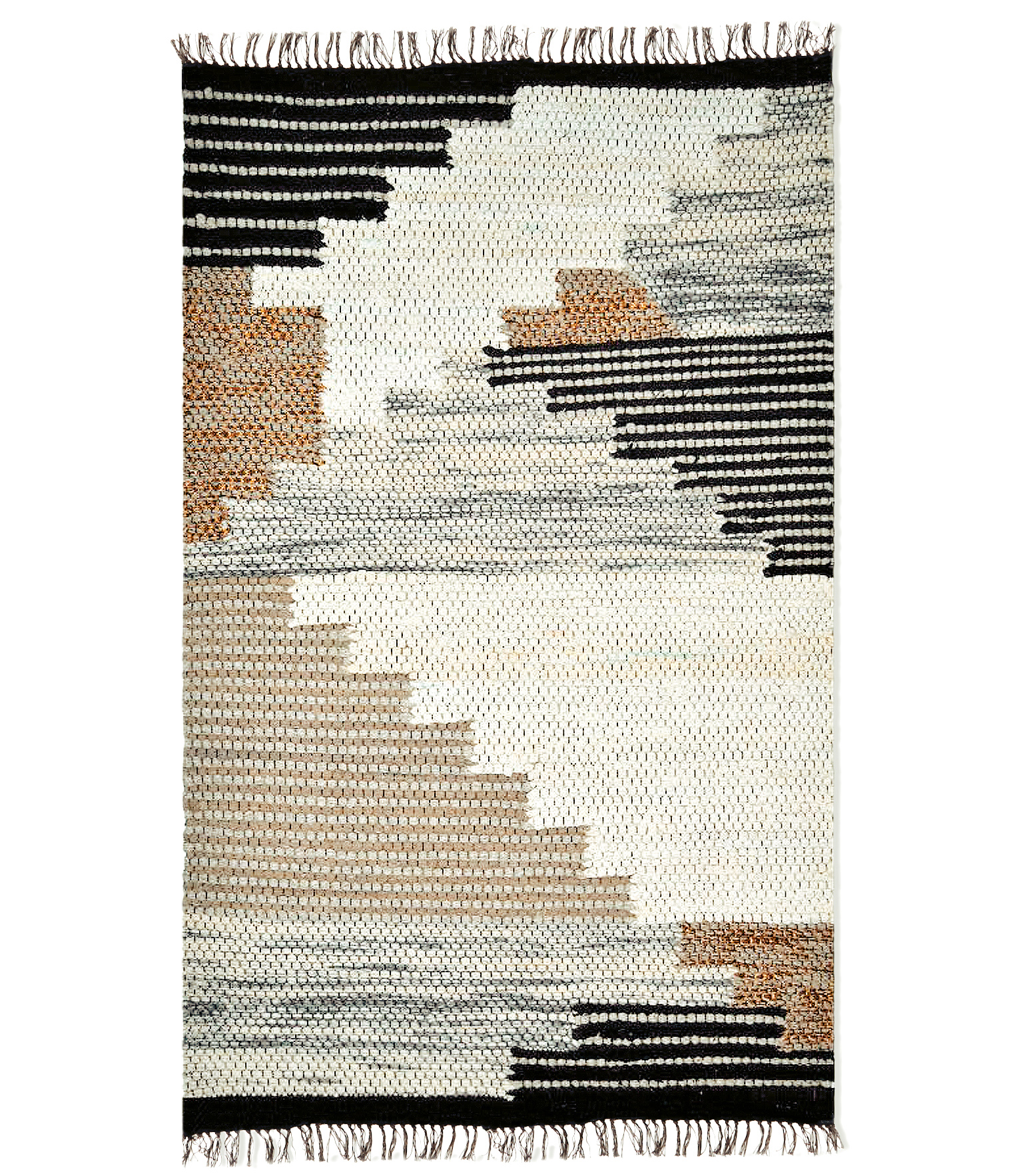
SHOP THE LOOK >


Want to see this home in print? You’ll find the full home tour in our Endless Summer edition, available through our online shop. Click here to buy.
Relaxed Bohemian Style
The laidback lifestyle of the Gold Coast provides the ideal setting for the super stylish home of Sophie and Michael Bell.

The laidback lifestyle of the Gold Coast provides the ideal setting for the super stylish home of Sophie and Michael Bell – perfectly encapsulating their relaxed bohemian style.
Photography: Hannah Blackmore / Styling + Interior Design: Sophie Bell / Words: Jacqui Greig


Total renovation and custom-made elements, paired with Sophie Bell’s innate glamour, have transformed this house into a luxe family abode. Home to Sophie and husband, Michael, along with their eight-month-old son, Hendrix, and dogs, Stella and Duke, the 1990s era home has been immaculately renovated.
“The original style was mega ‘90s,” says Sophie. “Think arches and wall intercoms, a peach colour scheme and old-school gold fixtures.”
“When I first moved in, we did some renovations ourselves – knocking walls out and painting everything white,” says Sophie. “Michael built the big deck at the front of the house and we opened the layout.”
In December of last year, the couple tackled their major renovation – completely gutting the house and starting from scratch. Rooms were added and moved, and everything went monochromatic with white paint, white subway tiles, black floor tiles, concrete, black sinks and black taps: “I like to bring in a little bit of colour through textiles and art,” says Sophie.


“I seriously loved renovating this house. Our poor builder must have hated me – I had mood boards and very clear visions of how everything needed to look,” laughs Sophie. “He was so patient and really brought my ideas to life. We have custom made almost everything in the house to be just what we want. It’s all super functional for a young family, but also is a style I love.”
Sophie leans towards a mix of industrial and bohemian – or as she says, “I just buy whatever catches my eye.” She concentrates on investing in beautiful textures and fabrics, and has a small addiction to cushions.


“I used to have colour everywhere and a lot of patterns, but I have really stepped it back and have a more neutral palette. The décor of this house is an eclectic mix of everything we love – timber, concrete, clashing fabrics and lots of art.”


Both Sophie and Michael love to create, and their home is testament to this. When they can’t source a piece of furniture they want – they build it. “Everything in Hendrix’s room was made by hand by either myself, my husband, my mother-in-law, my mum or our builder (who is a good friend). There is so much love that has gone into everything we have created, and to me, that is so important. It makes the house feel like ours, and everything has a story to it – which I feel makes it so special.”

Sophie believes that greenery adds life and warmth to an interior, and gravitates towards fiddle leaf figs, cacti, agaves, banana leaves and elephant ears, which are all in abundance.
“We spend a fair bit of time in Bali and I love all of the lush tropical gardens in the villas in Bali. I used to buy fresh flowers every week for the house, but I swapped to buying plants now as they last forever. I am sure our house will resemble a rainforest soon.”
Sophie’s main objective is to ensure her home feels welcoming. She wants her guests to eat, drink and hang out: “It’s a relaxed, fun house – with lots of love.”


CHAIR / THROW / COFFEE TABLE / CUSHION / FAUX CLAM SHELL / POT

Want to see this home in print? You’ll find the full home tour in our Endless Summer edition, available through our online shop. Click here to buy.
TOTAL LIVABLE LUXE
This airy, light and open home has nailed the concept of family-friendly, while knocking the notion of laidback sophistication out of the ballpark. It is total livable luxe.

This airy, light and open home has nailed the concept of family-friendly, while knocking the notion of laidback sophistication out of the ballpark. It is total livable luxe.
Photography: Hannah Blackmore / Styling: Claudia Stephenson / Interior: The Designory / Words: Jacqui Greig


Home to Adam and Lavinia and their two children, this 1970s townhouse in Sydney’s Paddington underwent a complete transformation, from front fence to back fence, and everywhere in between. Working with Larissa Raywood (pictured opposite) from The Designory to tackle the substantial venture, Adam and Lavinia were completely hands-on, which allowed for a seamless project from conception to completion. “With an awkward existing layout, achieving the brief meant making every area of the home work harder,” explains Larissa.
Brendon Bott from B2 Construction – an in-house building consultant with The Designory – was brought on board to help with the townhouse renovation.

“We were looking for a team who could manage the project end to end, spanning across DA application and planning, interior design, and the building works. The Designory’s relationship with B2 Construction made the project a breeze for us,” says Lavinia. Brendon worked on the design and development from the very beginning, ensuring the designs were buildable, on-budget and able to meet the timelines required: “It is essential to have a builder’s input right from the start, when you are making a lot of key decisions. It’s also critical during the build itself that the builder involves the designer, so that the overall design intent is maintained throughout the build. In some cases, when the designer isn’t involved, decisions can be made that loosen the connection from the initial concept,” says Larissa, who believes it is important to note that the builder is what makes a designer’s visions become reality, so a collaborative relationship is key.


Creating a sanctuary was top of the agenda, and this was achieved by establishing a relaxed aesthetic with a muted palette and a light-filled, contemporary interior. Textures were layered in soft hues of blues, navy and metallic accents, and furniture was chosen for its laidback sophistication. Pre-renovation, the home was quite dark, so “we explored all opportunities to brighten it up,” says Larissa. These included the large bi-fold doors and windows, keeping the kitchen white (including a mirror splashback) and an overall, vivid white paint on the walls and ceiling.


The element with the most impact in the house was the new opening created in the kitchen/dining area, allowing it to connect effortlessly into the backyard. Previously, the laundry and powder room blocked this area and made the whole house feel extremely small and dark. “Adam and Lavinia just love that (the home) feels visible and connected,” says Larissa, who is as thrilled as the family with the transformation.

CHAIR / QUILT COVER / TRAY / BEDCOVER / FRAMED PRINT / LIGHT

Want to see this home in print? You’ll find the full home tour in our Sweet Dreams edition, available through our online shop. Click here to buy.
MOODY CONTEMPORARY
Home to a boisterous and energetic family of five, this abode recently underwent a dramatic transformation to become warm, contemporary and full of laughter.

Home to a boisterous and energetic family of five, this abode recently underwent a dramatic transformation to become warm, contemporary and full of laughter.
Photography: Hannah Blackmore / Styling + Interior Design: Little Liberty / Words: Jacqui Greig


Owners Ollie and Lube, together with their sons Dylan, Nathan and Jordan, built the house in 2002. And after following interior designer Nicole from Little Liberty on social media, Ollie knew Nicole had the style and creativity to update their home.
Ollie wanted clean, sleek lines and neutral tones with splashes of colour: “Nicole listened to my ideas and my family’s needs, and then showed me designs and options for my input. She created each room with its own character.”
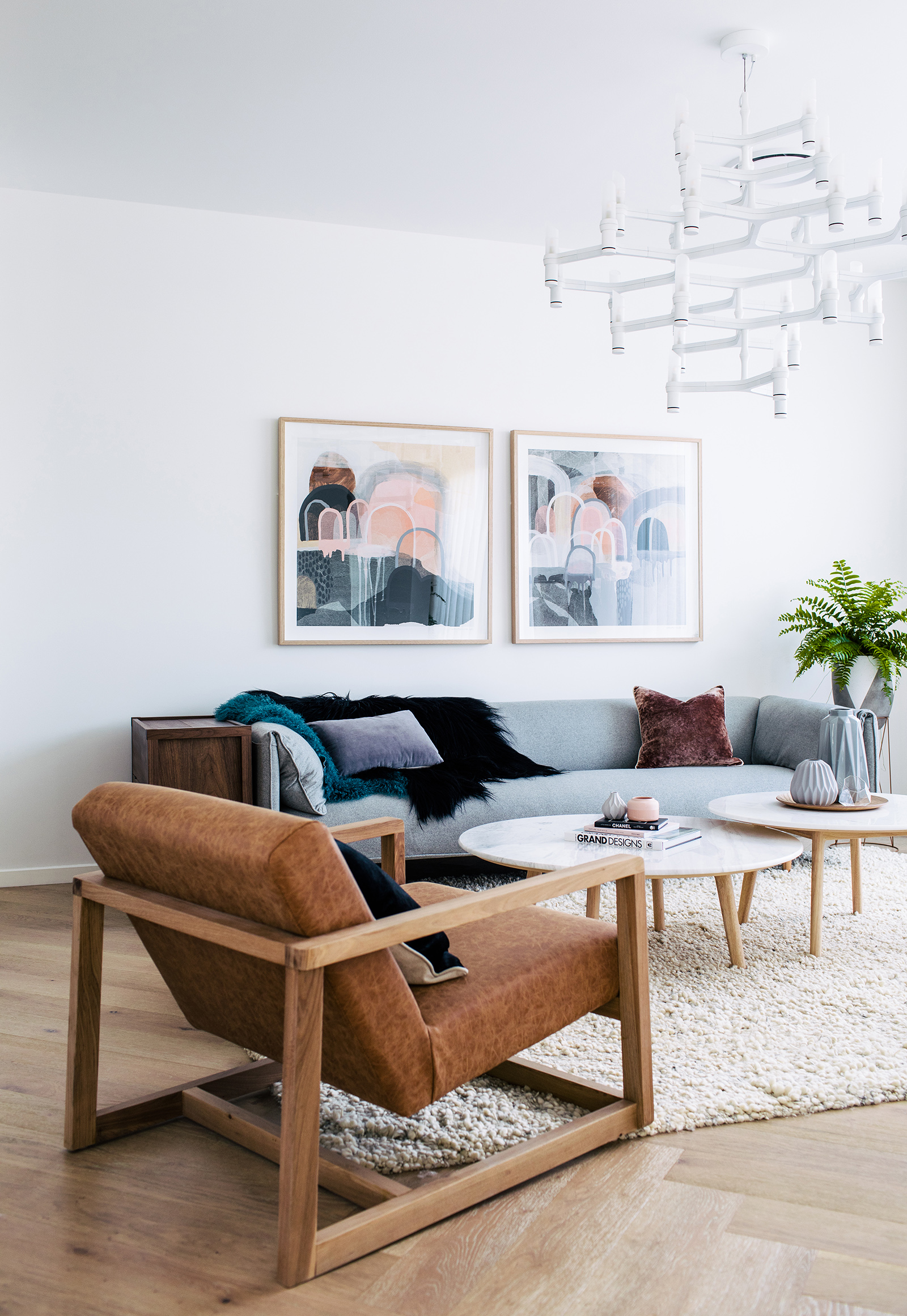
The complete overhaul was an exciting project for Nicole, whose primary goal was to create inviting spaces with a colour palette of “tonal moody colours” that would work together to create a luxe sense of contemporary charm.
“We also wanted to exchange any dark pieces of furniture with light pieces, and bring in marble and copper accents,” Nicole explains.


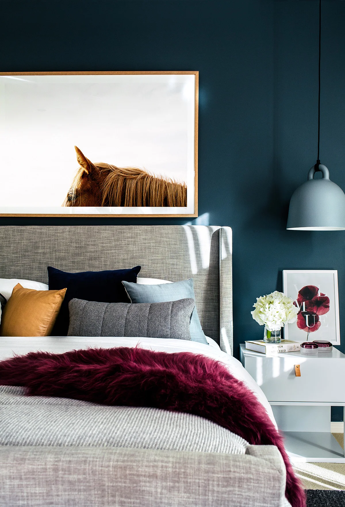
The current trend for all things navy or blue definitely had an impact, with Nicole pairing the blues with different colours in every space while purposefully giving each space a connection to the next, as well. “My favourite aspect of my home is the colour palette that flows throughout, to create fresh and vibrant spaces,” says Ollie.
The vibrancy is courtesy of carefully selected artworks that add depth and interest, such as the Katie McKinnon piece on the light grey wall in the lounge. In the dining room, an Urban Road print evokes moodiness with its blue and navy clouds, while a Pampa horse print in the main bedroom ties in beautifully with the tan leather accents and the iconic, bell-shaped Normann Copenhagen pendants.
Each lighting situation in the home was thoughtfully considered, with Ollie and Nicole choosing statement pieces that were still practical. Over the dining table, striking copper pendants hang at different levels, while the large, Twiggy-style floor lamp in the lounge room adds drama.


“We decided to use the ‘Brimnes’ bedframe from IKEA for both rooms, because of its clever under-bed storage drawers and added headboard storage that is concealed behind the headboard.”
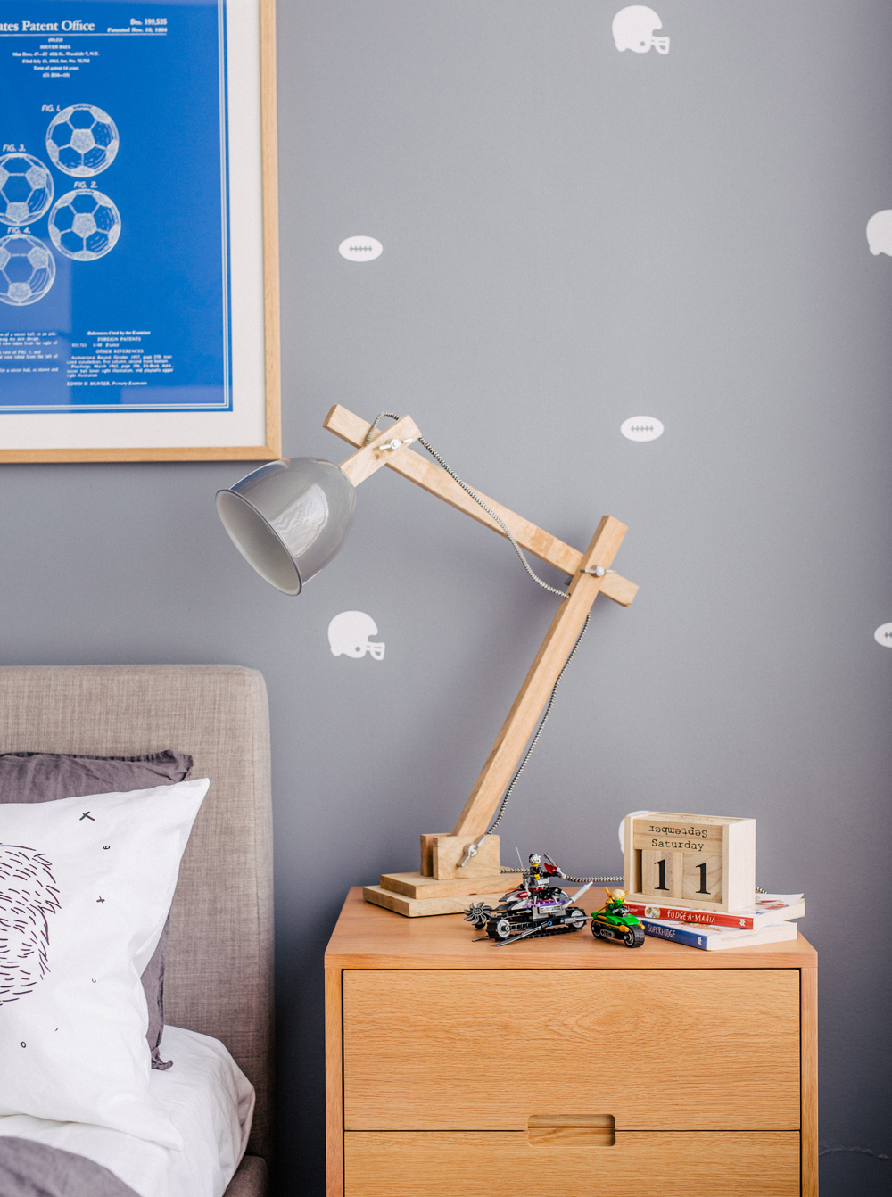
It is in the boys’ rooms, however, where Nicole’s creativity shines: “The boys reflect their fun and energetic personalities, and are able to display what they’re most passionate about,” says Ollie.
“We basically were starting from scratch in these rooms, and we wanted to incorporate as much concealed storage into the rooms as possible,” explains Nicole. “We decided to use the ‘Brimnes’ bedframe from IKEA for both rooms, because of its clever under-bed storage drawers and added headboard storage that is concealed behind the headboard.”

The rooms feature striking removable wallpaper, along with textural accents such as the beautifully soft, Uimi knit blanket, and plenty of fun, personal touches. These include the super-cool display rings to showcase the soccer-obsessed boys’ ball collection. In fact, the display options in both rooms have become statement pieces in their own right, with a masculine-looking A-frame shelving unit displaying a beloved Lego collection, and a Land of Nod acetate box shelving unit that boasts X-men and boxing figurines. Nicole was thrilled that she was able to make Ollie cry with every room reveal: “The end result was so emotional, because it was beyond my expectations,” says Ollie happily.


Want to see this home in print? You’ll find the full home tour in our Sweet Dreams edition, available through our online shop. Click here to buy.
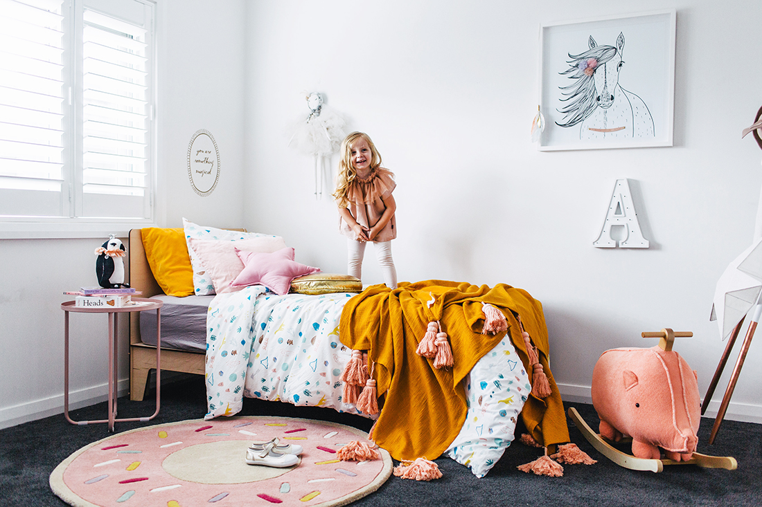
HOME WITH HEART
Adore Home meets Hayley Neal, the creative force behind This Little Love, and takes a tour of her family home – a stylish space where kids can still be kids.

Adore Home meets Hayley Neal, the creative force behind This Little Love, and takes a tour of her family home – a stylish space where kids can still be kids.
Photography: Hannah Blackmore / Styling: Claudia Stephenson / Words: Nadia Howland


Hayley Neal, 23, launched children’s design and décor business This Little Love (TLL) online in 2014 with the aim of filling a gap in her local regional market. Believing people who love good design and beautiful spaces shouldn’t have to sacrifice their taste when creating spaces for their children, Hayley stocks TLL with a range of exclusive and carefully curated products, from the gorgeous Jimmy Cricket donut rugs to La De Dah Kids’ wire chairs and Kip & Co tassel throws.
TLL has grown in leaps and bounds since its launch, so much so that Hayley’s husband Shane recently left his full-time job in IT to help her keep up with the demands of the business and their growing family.
The open-plan lounge/dining/living area is the heart of the Neals’ home, and allows daughter Addison and son Oliver plenty of space to play and do what kids do. A large dining table was a must, Hayley says, and had to be durable and adaptable – a table where they would eat meals as a family and entertain visitors that could also convert to a makeshift station or place to do homework when the time comes.


The couple has two little loves of their own – three-year-old Addison and four-month-old Oliver, who was born with tracheo-oesophageal fistula and oesophageal atresia. This condition means little Oliver’s oesophagus, or food pipe, didn’t connect to his stomach but rather ended in a blind pouch like a sock, and his trachea (wind pipe) was joined to his oesophagus. Hours after his birth, he was whisked away to Sydney for life-saving surgery at just two days old.
“It was easily the hardest thing we have ever been through as a family,” Hayley says.
“Oliver stayed in hospital for two weeks after his surgery, and we were commuting the first week until we got accepted into Ronald McDonald house – an absolute lifesaver that allowed us to be close to Oliver.”
Although the surgery was successful and their little boy is now at home, the Neals have to travel to hospital in Sydney each fortnight for further surgery to prevent Oliver’s oesophagus from narrowing and closing over.


“Neutral, classic pieces tie the room together and, as your child grows, you’ll be able to mix up the look by changing soft furnishings and bedding.”
This, of course, adds extra pressure to the usual juggling act of balancing parenthood with work life, but Hayley says the experience has taught them to “slow down a little” and enjoy more time together as a family.
Asked for her tips on designing a nursery from scratch, Hayley says her best piece of advice is to “style up”.
“Start piecing the room together with a few key pieces that will grow with your child, such as a cot that converts to a junior bed. Neutral, classic pieces tie the room together and, as your child grows, you’ll be able to mix up the look by changing soft furnishings and bedding. Almost anything goes when it comes to your child’s space – as with almost everything else, they get away with things that adults just can’t!”

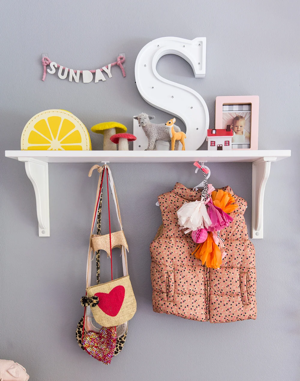
Addison’s room is a space that is constantly evolving with her personality, and she is always involved in making choices for her room as much as possible, Hayley explains.
“Keeping it fun and a little bit silly is our number one priority. There’s always a way to incorporate your kids’ favourite things into their rooms. The key is knowing how to position it in the space so that it works. Framed pictures of their favourite TV characters can be placed on a shelf or you can utilise a stylish basket to house soft toys. For superhero fans, a lightning bolt hanging above the bed is another easy trick, all of which can be changed as your little ones’ tastes change and develop.”
“Keeping it fun and a little bit silly is our number one priority.”


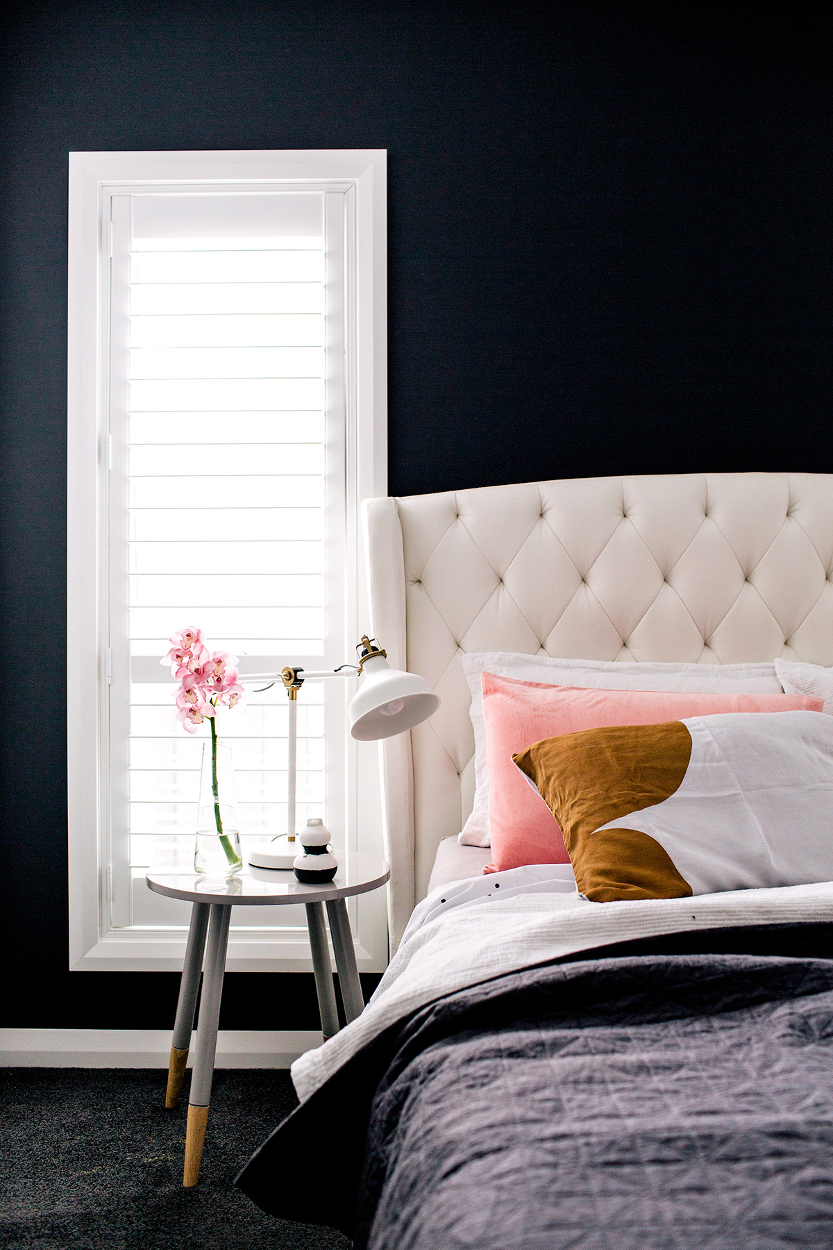
With the kids taken care of, Hayley and Shane turned their focus to the master bedroom (below) – a calming sanctuary from the chaos that comes with parenthood. “It’s our retreat at the end of a busy day. Not much beats climbing into clean sheets and sinking into the tufted headboard!” Hayley says.
“We are very lucky that we have our nanny, Lucy, help keep up our juggling act. Without her we would have definitely dropped a whole stack of balls by now!” Hayley laughs. “Our workday starts at 8am during the week. Now that we have Oliver, Shane heads off to the warehouse while I take care of the kids with Lucy.”
“If I need to head to the warehouse and take the kids with me, it actually works out pretty well – Oliver has very thoroughly tested every cot in our showroom and Addison loves helping pack orders and scribble notes on the wrapping paper for our customers to find! “TLL is the epitome of a family-operated small business, and we love that. We love that we get to take our kids to work with us and they will grow up seeing what hard work is like and how rewarding it is.”

DONUT RUG / CHAIR / PILLOWCASE / PIGGY ROCKER / PENDANT LIGHT / THROW

Want to see this home in print? You’ll find the full home tour in our Family edition, available through our online shop. Click here to buy.
Scandi by the Sea
Interior decorator, stylist and blogger, Briar Stanley shares here Sydney Northern Beaches abode which she aptly describes as 'Scandi by the Beach'.

She has worked on lavish sets for films like The Great Gatsby and TV shows like Underbelly. Now, Briar Stanley is keeping the credits rolling on her own interior design business and blog, The Sunday Collector.
Words: Pip Miller / Photography: Jacqui Turk / Styling: Claudia Stephenson and Briar Stanley


We all love Sunday but what is it about Briar and this particular day of the week? According to Briar, she was as young as 20 when she set her heart on Sunday for a girl’s name should she ever have a daughter. Then, some eight years later she found herself working on film sets and ‘collecting’ a lot of things. “Sunday was not only a word and name I loved, it was the day I would potter around the house, constantly rearranging,” she says. Not surprisingly, when she launched a blog six years ago she named it Sunday Collector and three years on, when her daughter was born, she was given the name too.


Briar says that while she spends most of her time now working on residential projects for her design business, she does find parallels to her former working life dressing film sets. “Over the past few years, I’ve worked on everything from a Hamptons style ‘mega’ home in Newport, to a rented, one bedroom apartment in Dulwich Hill,” she says.
“I love the variety, and truly tapping into the headspace of my client. In a way, it’s very similar to taking a brief from a production designer or director – you research the script and the character, and work out how that ‘character’ likes to live.”
Apart from family, Briar says her passion for home decorating reigns supreme. She describes her home on Sydney’s northern beaches as ‘Scandi by the beach’, with pops of fun colour.
“It’s a mixture of collected objects, furniture and art accumulated along the way,” she says. “There are things I have purchased when I was a poor student and pieces I’ve saved for.”


When it comes to her own personal style, she is pretty relaxed and would rather be shopping for furniture and interior bits and pieces than fashion. Except when it comes to her daughter, that is. “Dressing Sunday is a completely different story – I have so much fun choosing her outfits and I’m lucky that she loves to accessorise with sunglasses and bags, making her one cute little muse.”


“I love a bedroom with a comfortable hotel feel, and created a calming space by painting the walls in Dulux Tranquil Retreat.”
When it comes to client briefs and designing interiors, what would be her biggest challenge? “Space. It’s all well and good if you come across a beautiful piece of furniture, but making the final selection often turns in to a mathematical exercise and getting the proportions right,” Briar says. “There is nothing worse than a rug that is too small.”
Briar’s advice for creating a covetable living space hinges on the gradual gathering of personal things while keeping clutter to a minimum – especially when sharing with children. “Everything in our home has its place, but I’m also constantly updating things, and donating items to charity. I have a loose rule that when something new comes into the home, something should be donated,” she says.

While Briar is busy working on a whole raft of interior design projects, her blog remains a constant source of inspiration for readers. She redesigned it a couple of years ago, leaving Briar feeling a renewed sense of energy to share what really is a delicious edit of finds, spanning kids and motherhood to DIY, food and travel.

ARMCHAIR / ART / FRUIT BOWL / TAP / ROUND CUSHION / MEDIA STAND
The Colourful Life
While she may not profess to be an interior designer, Melanie Duzel-Zammit obviously has a great sense of style, as is testament in the renovation of her home.

While she may not profess to be an interior designer, Melanie Duzel-Zammit obviously has a great sense of style, as is testament in the renovation of her stunning Essendon home.
Words: Pip Miller / Photography: Martina Gemmola / Styling: Jessica Frazer / Interior design: Melanie Duzel-Zammit


One look at this glorious Melbourne home and you’d be forgiven for thinking it had been created by an experienced interior designer. But Melanie Duzel-Zammit just happens to have an innate sense of style and a passion for beautiful interiors. The result is one stunning family home renovation.
The home, which Melanie says is quite modest in size, is the domain of herself, her husband Jay and two primary school aged children, Kristen (11) and Lucas (eight).
“We only have the one living area in our home, so we had to make it functional,” she says. “Most of our time is spent in the kitchen and lounge which sit side by side. The long, 3.7 metre kitchen bench has turned out to be the hub of our home. It’s where all the fun stuff happens – family meals, after-school chats, homework, games and socialising. And three steps away is the large comfy couch, where you can chill out but still be part of the action.”


“To create a space that was warm, happy, comfortable and inviting was very important to me. I wanted to wake up every day, walk out into the living area and feel like I was on a holiday in my own home.”
According to Melanie, her interest in design and interiors is new-found and has become an addiction purely as a result of renovating their home.
Melanie is drawn to light, bright, and open spaces. “To create a space that was warm, happy, comfortable and inviting was very important to me. I wanted to wake up every day, walk out into the living area and feel like I was on a holiday in my own home.”


Melanie definitely nailed her own brief and puts her success down to starting with a neutral base. “For me, a white kitchen is always a good idea, and coupled with the warm tones of light floorboards and Tasmanian oak furniture, that light bright feel I was looking for was achieved. To inject some personality into the spaces, I used beautiful, bright, and colourful artworks by my favourite Australian artists. I also have to mention the coloured dining chairs. It was a risky thing to do, but I adore the look. Ambient lighting was also a must in my home. Right throughout, I relied on using lots of different lighting options including down lights, lamps and pendants – some of which shine on their own as statement pieces.”
Melanie is a firm believer in classic style. “When investing money on big furniture items, you don’t want them to date too quickly. Classic pieces are the way to go. With young children they also need to be durable, so spending a little more on quality items that will actually go the distance is also important.”


While Melanie advocates quality and spending a little more on big ticket items, she is also a fan of budget accessories and soft furnishings – items that can be regularly replaced and update a look without the high price tag.
At the moment Melanie’s favourite room is the master bedroom, which has recently received a complete overhaul. “It has the same light bright feel as the rest of my home and I love it. I could stay in there all day. As for my favourite piece, it is without doubt the Rachel Castle original artwork. I describe it as pure happiness. I always joke that if my house goes up in flames, that is what I will be saving first.”
Melanie gives kudos to interior magazines and Instagram which she says is “a glorious place I look to for inspiration.”
“It has the same light bright feel as the rest of my home and I love it. I could stay in there all day.”

COFFEE TABLE / PENDANT LIGHT / PRINT / TOWEL SET / CHAIR / CUSHION

Want to see this home in print? You’ll find the full home tour in our Annual edition, available through our online shop. Click here to buy.
Dreamy Family Home
Interior designer Nicole Rosenberg shows how to transform a ‘70s-style Melbournian home into a stylish haven fit for a family.

Interior designer Nicole Rosenberg shows how to transform a ‘70s-style Melbournian home into a stylish haven fit for a family.
Words: Beth Greshwalk / Photography: Hannah Blackmore / Styling: Aimee Tarulli / Styling Assistant: Jessica Frazer


Who can resist the magic of a makeover? And nowhere does it stand out, like within a home.
Ask interior decorator/designer Nicole Rosenberg, whose seven years as founder of Little Liberty (an interior decorating firm specialising in kids’ rooms) landed her “a renovator’s dream” gig – transforming an entire ‘70s style, family home in Melbourne.
Although all-inclusive renovating has become the norm for Nicole in recent years, this two-parent, four-child abode required a complete overhaul, made slightly more challenging by the client’s initial scepticism.
“The home was pretty dated and needed a massive freshen-up,” Nicole recalls. “I knew the house had excellent bones, but my client couldn’t see the potential and was sceptical of how it would end up. But I changed her mind.”


The makeover required refreshed floorboards, carpet, paint colours and sheer curtains – and the numerous spaces within the two-level house ensured the designer had her work cut out for her. Structurally, however, Nicole believed nothing needed changing: there were many vintage features worth embracing, such as the gridded doors between the entrance landing and dining space.
“My client wanted to rip them out, but I begged her to keep them,” says the designer. “Now that everything is renovated, they look so amazing.”
The existing wide-open spaces and floor-to-ceiling windows throughout were also assets, allowing the free-flow of natural light. This played directly into Nicole’s overall colour palette.


“I really wanted to let the light do its job, so I chose light grey, neutral tones for most of the bigger design choices. I then brought in colours with art, pendants and soft furnishings.”
The soft backdrop played the perfect canvas to the dining room’s Tom Dixon copper pendant lights and stunning Katie McKinnon artwork, while allowing the pink story to continue into the lounge, with the addition of the sunset-pink, Jardan ‘Wilfred’ chair.
Seamless intermingling of different patterns and textures, particularly within the master and kids’ bedrooms, also provided abundant flair without compromising cosiness.
“I really wanted to let the light do its job, so I chose light grey, neutral tones for most of the bigger design choices.”


“I think the key is to stick to two to three colours and make sure some of the patterns are easy on the eye, like a grid or stripe,” recommends Nicole. “People can go overboard with mixing too many patterns – I always try to make spaces looking calming and inviting. I also love the use of texture. For example, a lambswool cushion or thick weave cushion can create interest and add warmth.”
Durability and function was just as important as style in this transformation, especially being a family home of four children, ranging from preschool- to school-aged.

“I wanted the living and dining area to feel like an adult zone, but still kid-friendly,” Nicole says. “So, I decided against fabric HAY dining chairs and went with the white/wood version, which are more durable.”
Arguably the most striking example of style-meets-purpose lies in the study, where the lush, green velvet lounge, Lumiere Art & Co. prints and built-in cabinetry not only ‘work it’, but work hard.
“You can do so many things in this stylish room,” says Nicole.“I wanted this space to be a parents’ retreat where Mum could come home and work on the computer, or where Dad could just sit on the couch, watch some TV or read the paper. It’s a small space, but we made use of every square metre.”

“The children have their own kids’ retreat, which I made extra inviting so they’ll want to stay. And the adults have lots of areas to get away from it all, when needed.”
What made the family happiest about the makeover? Personal spaces and break-away areas – “so important for a family this large,” Nicole says.
“The children have their own kids’ retreat, which I made extra inviting so they’ll want to stay. And the adults have lots of areas to get away from it all, when needed.”


PRINT / VASE / HIDE THROW / SIDE TABLE / SOFA

Want to see this home in print? You’ll find the full home tour in our Annual edition, available through our online shop. Click here to buy.
Coastal Meets Metro
Property stylist Julia Treuel has applied cool tones and a classic aesthetic to create a little slice of Hamptons magic in metro Melbourne.

Property stylist Julia Treuel has applied her love of cool tones and a classic aesthetic to create a little slice of Hamptons magic in metro Melbourne.
Words: Pip Miller / Photography: Martina Gemmola / Styling: Aimee Tarulli / Interior Design: Showpony Interiors

According to Julia, her partner Sasha purchased this little Edwardian home many years ago and lived in it for some time, before making the decision to renovate. “Originally, it was part of the renowned Rippon Lea Estate. The front section of the house was telling of the era but the rear had seen better days. Our brief to the architect was simple; we wanted to maintain the heritage of the home whilst adding the latest mod cons.”
Julia and Sasha, who are also partners in the business, Sasha taking care of the business side while Julia focusses on creative, said their original intention to sell the home once it had been renovated was overturned when they fell in love with it all over again for what they describe as the perfect marriage of old and new.


Fast-forward two years and the duo decided it was time to sell the house, taking it to market late last year amidst a stellar campaign.
“I filmed a home tour with our agent that showed the property in a beautiful light. To say we were thrilled with the end result is an understatement. As for the buyer, my lips are sealed. Let’s just say I won’t be surprised if the house pops up on our screens later this year!” quips Julia.

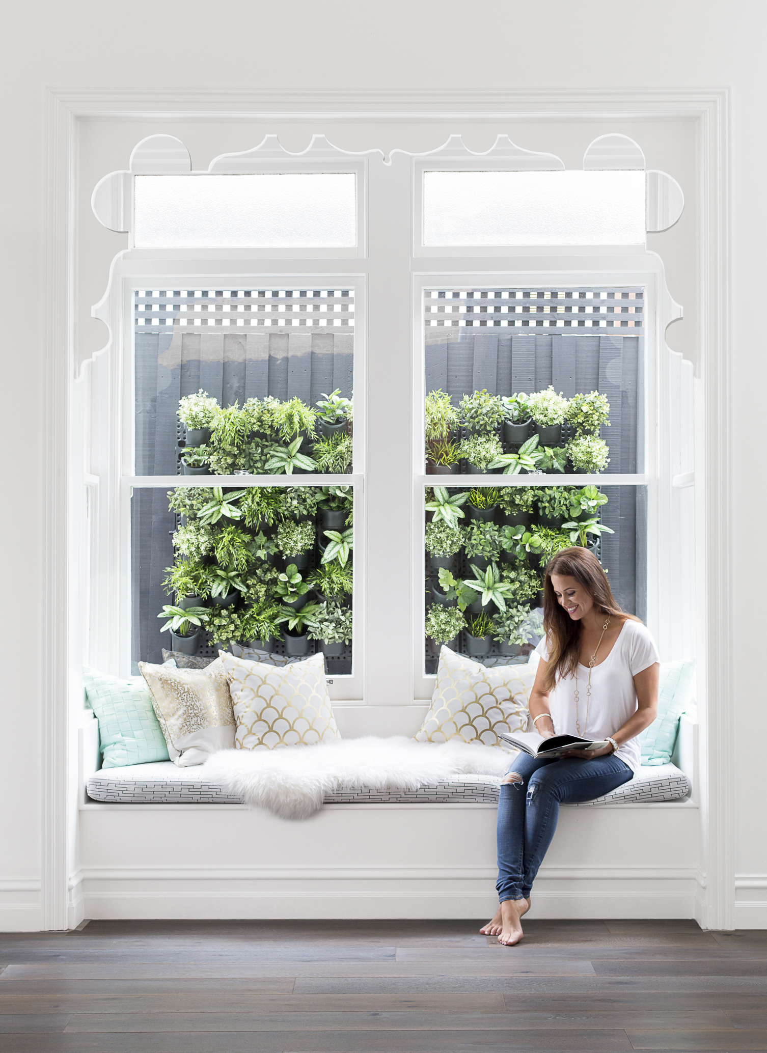
The close proximity to the beach was one of Julia and Sasha’s favourite aspects and they wanted to reflect that in their home. “There’s a certain softness in the décor and I’ve utilised natural materials throughout. Together, these elements create an airy, almost whimsical vibe. The cool tones elicit a feeling of tranquillity and provide the perfect anchor for our seaside abode,” says Julia.
For Julia, the heroes of this home are the floorboards. “They work with so many different finishes and merge the grey exterior with the internals. In some light, they’re akin to driftwood and add to the relaxed feel. So too does the seamless transition between the indoor and outdoor living spaces. The house feels larger for it and makes summer entertaining a breeze.”


From a style perspective, generally speaking, Julia says she is a fan of the crisp, clean aesthetic including the simplicity of Scandinavian design and the softness of coastal living. “I lived in New York for some time and adore American architecture. They have a knack for stunning weatherboard and gorgeous front doors.
“I’m happiest in a home filled with light, white, and gentle pops of colour. In this home we maintained the original 12 foot ceilings, installing highlight windows for added impact. The oversized French doors are stunning and bring a classic element to the modern, open-plan. We chose to keep the original bay window as a nod to the past. It frames the wall garden beautifully and creates a real focal point,” she says.
“I lived in New York for some time and adore American architecture. They have a knack for stunning weatherboard and gorgeous front doors.”


“I actually modelled our exterior colour scheme on a property in Montauk. It's our little slice of the Hamptons in metropolitan Melbourne.”
In coming up with the beautiful and unexpected colour scheme of this home, Julia says it came down to her love of cool tones and desire for the exterior to reflect the bayside location.
“I actually modelled our exterior colour scheme on a property in Montauk. It’s our little slice of the Hamptons in metropolitan Melbourne!”

TOWEL / CUSHION / STOOL / VASE / COFFEE TABLE
