Welcome to Adore's
HOME TOURS
Take Tour

Built to last
Furniture makers Nykita and Scott Shannahan found creative synergy with their architect Ben Edwards, reenvisioning this 1970s Adelaide home while honouring its history and surroundings.

Furniture makers Nykita and Scott Shannahan found creative synergy with their architect Ben Edwards, reenvisioning this 1970s Adelaide home while honouring its history and surroundings.
Words Casey Hutton / Architect Ply Architecture / Builder Den Berger Built
Photography Coastpark Creative / Styling Emily O’Brien

Following the renovation of their Henley Beach home, Nykita and Scott Shannahan had neighbours ringing their doorbell. “People who’d lived in the area since childhood wanted to thank us for not knocking the house down and for building something sympathetic to the neighbourhood,” says Nykita.
Embarking on their renovation in 2020, the couple asked Ben Edwards of Ply Architecture to create a modernist Palm Springs-style home that integrated natural materials. The project was also a perfect departure point for Nykita and Scott, who own Built Furniture, to design a range of timber furniture inspired by the home’s architecture and landscaping.

The original house was U-shaped, with a central kitchen and living zone linking two wings for bedrooms and bathrooms. Ben’s design replaced the centre of the U with a more expansive living and kitchen space, as well as an atrium at the entryway. “My favourite part of this design is the point of arrival,” Ben says. “The front door opens and you can see through the entirety of the space.”
“We toyed with the idea of changing the roof and including circles in the design, and Ben came through on both fronts,” Nykita recalls. While its altered roofline and Palm Springs landscaping gives the home a distinctive personality, their decision to retain the local Basket Range stone on the facade respected the style of other houses in the area.

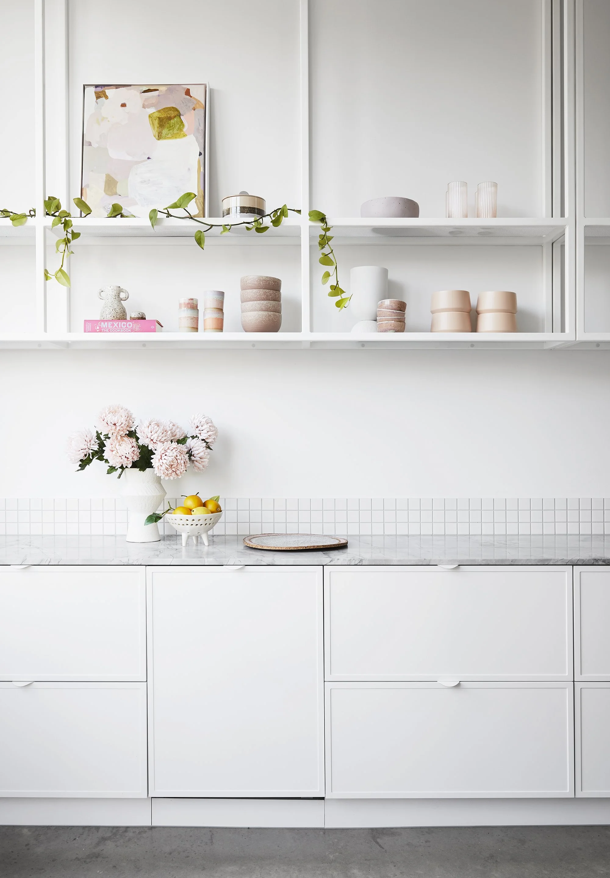
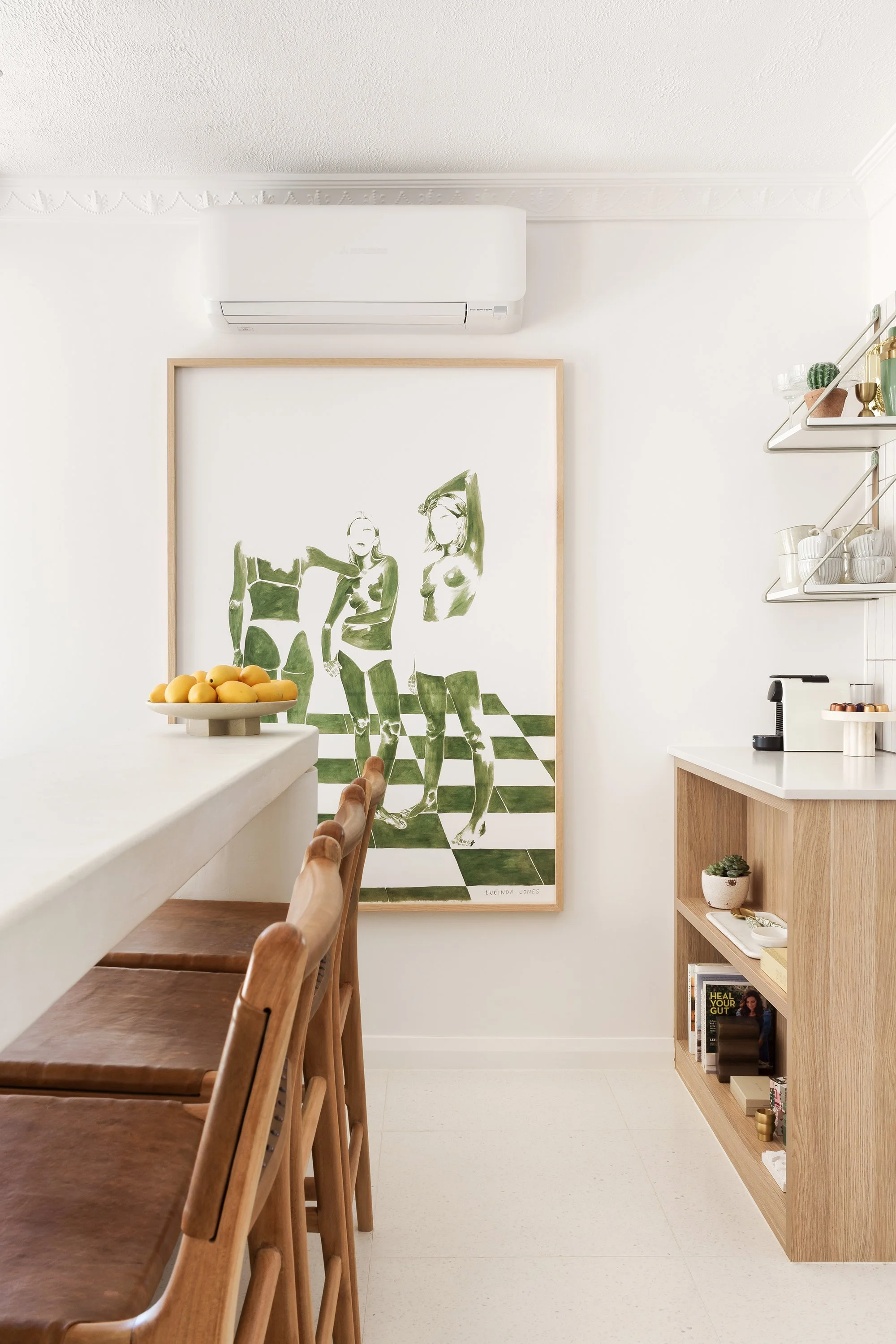
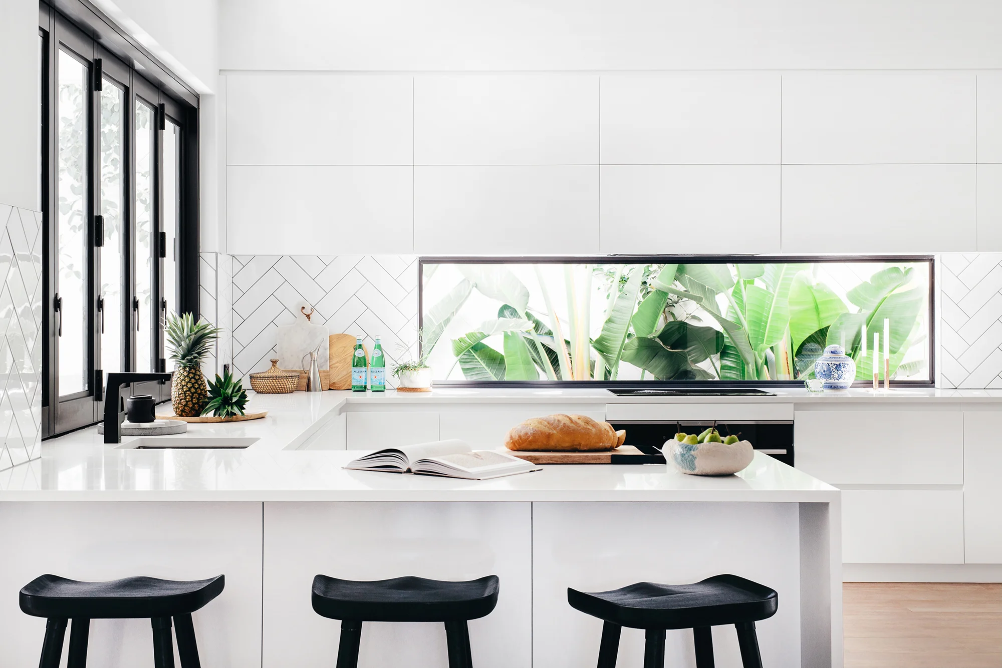
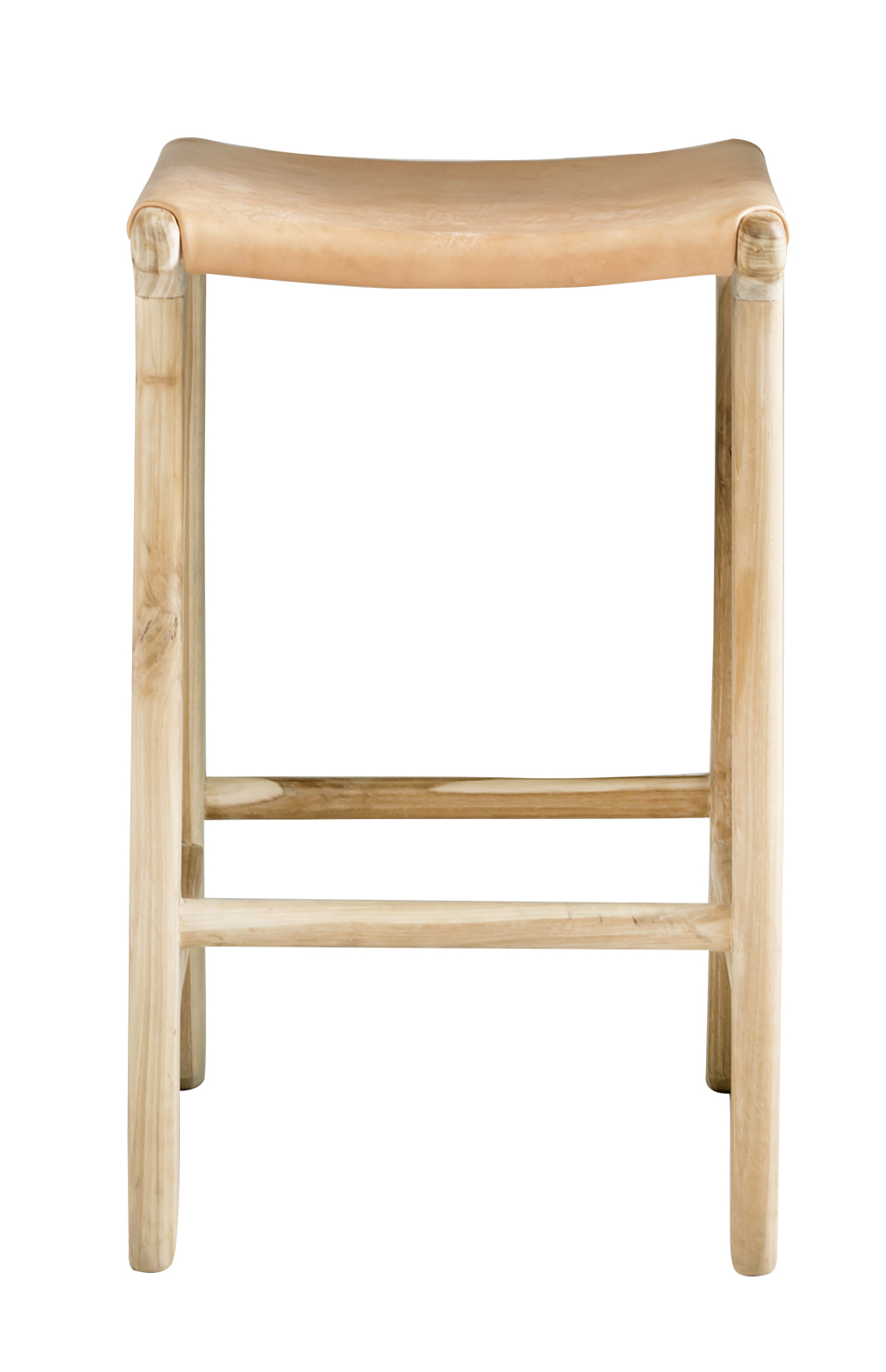
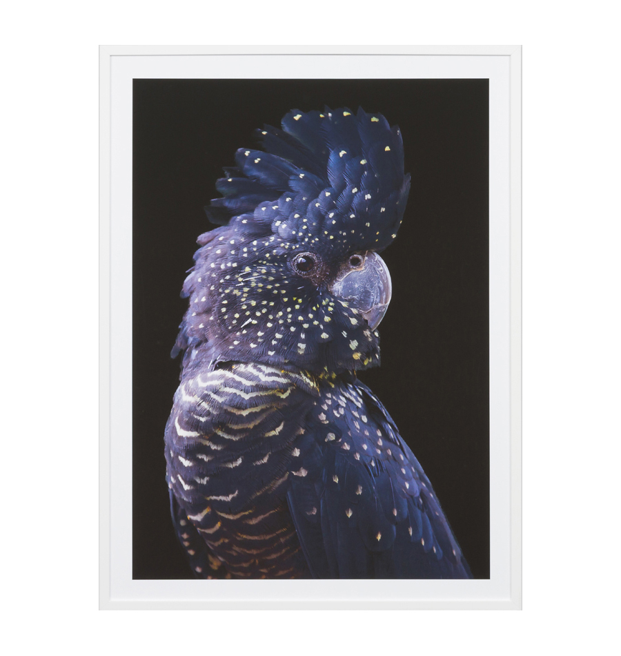
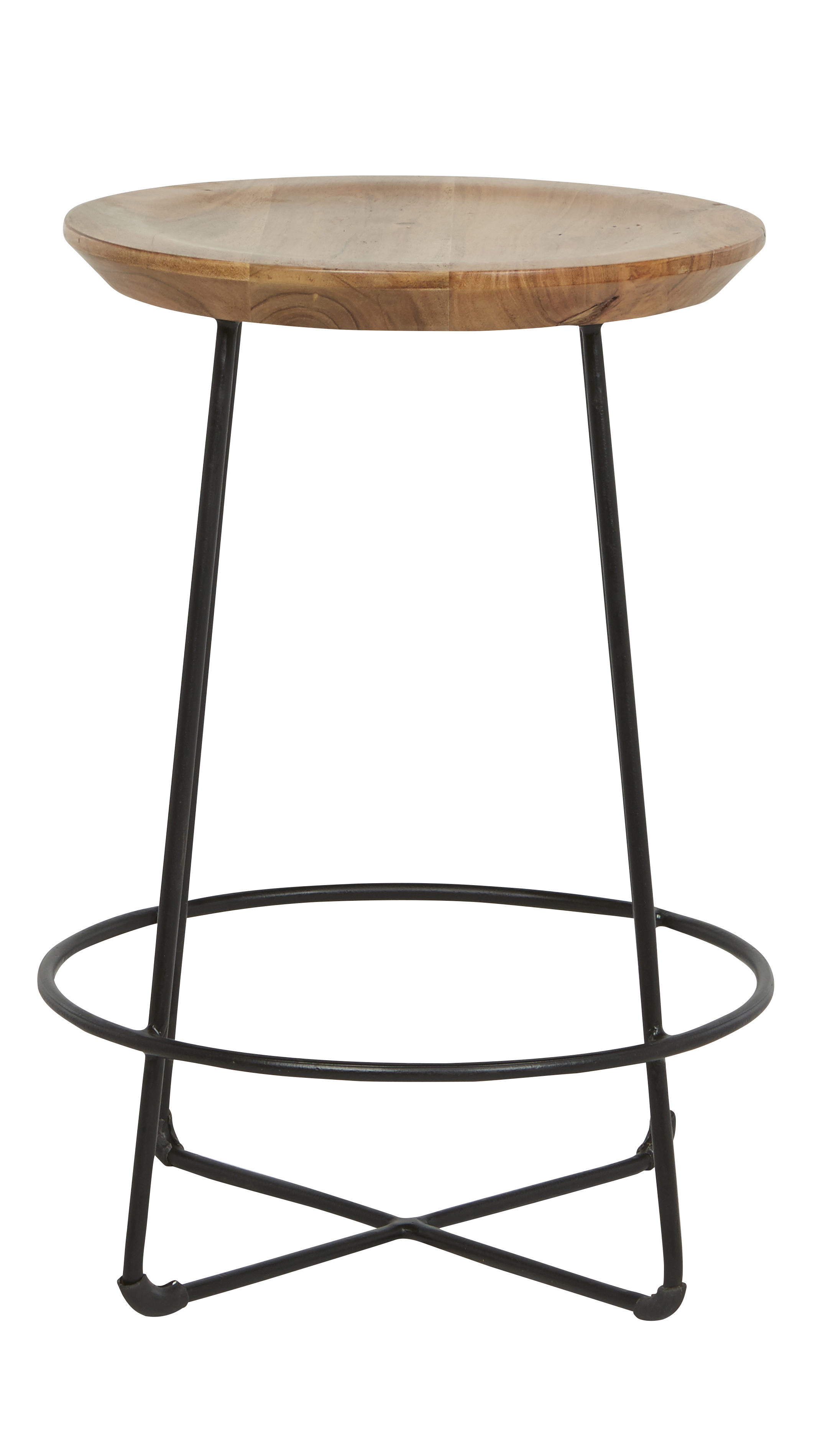
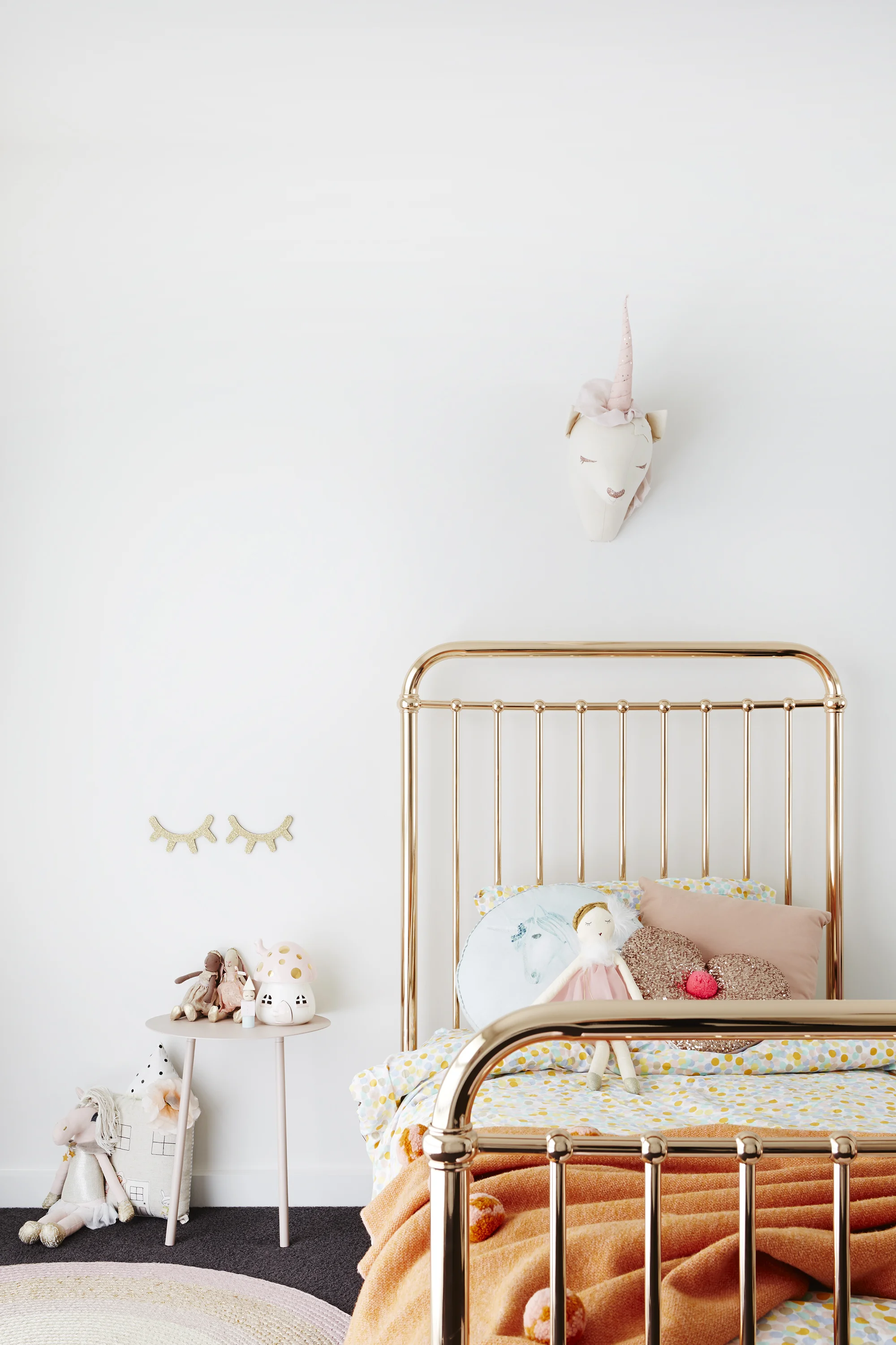
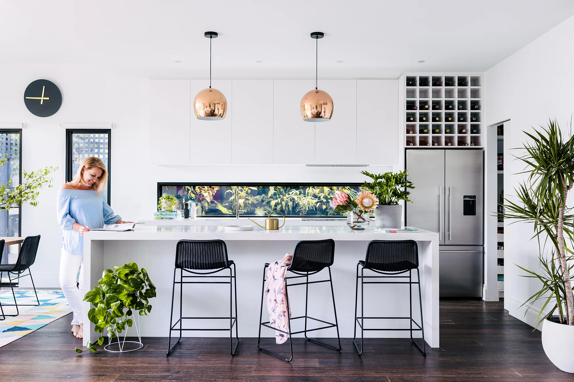
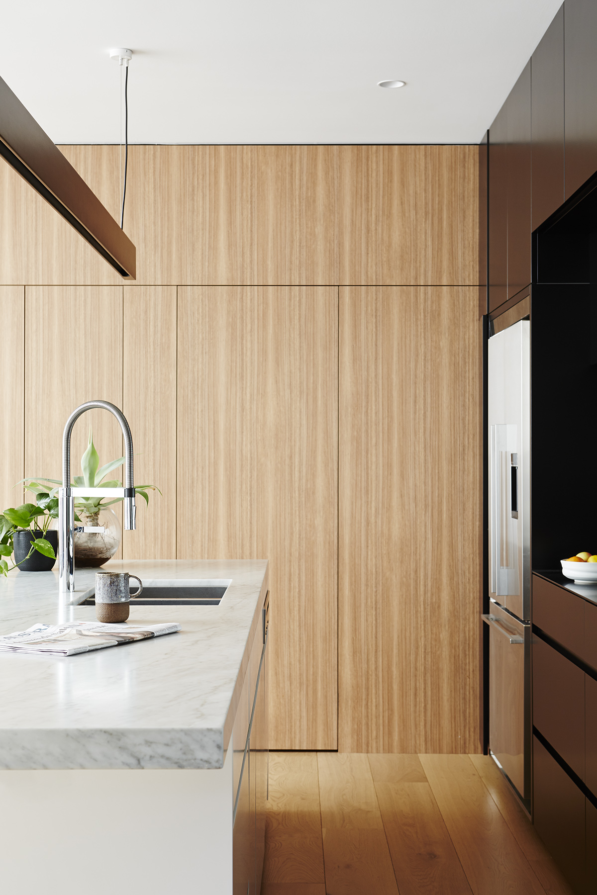
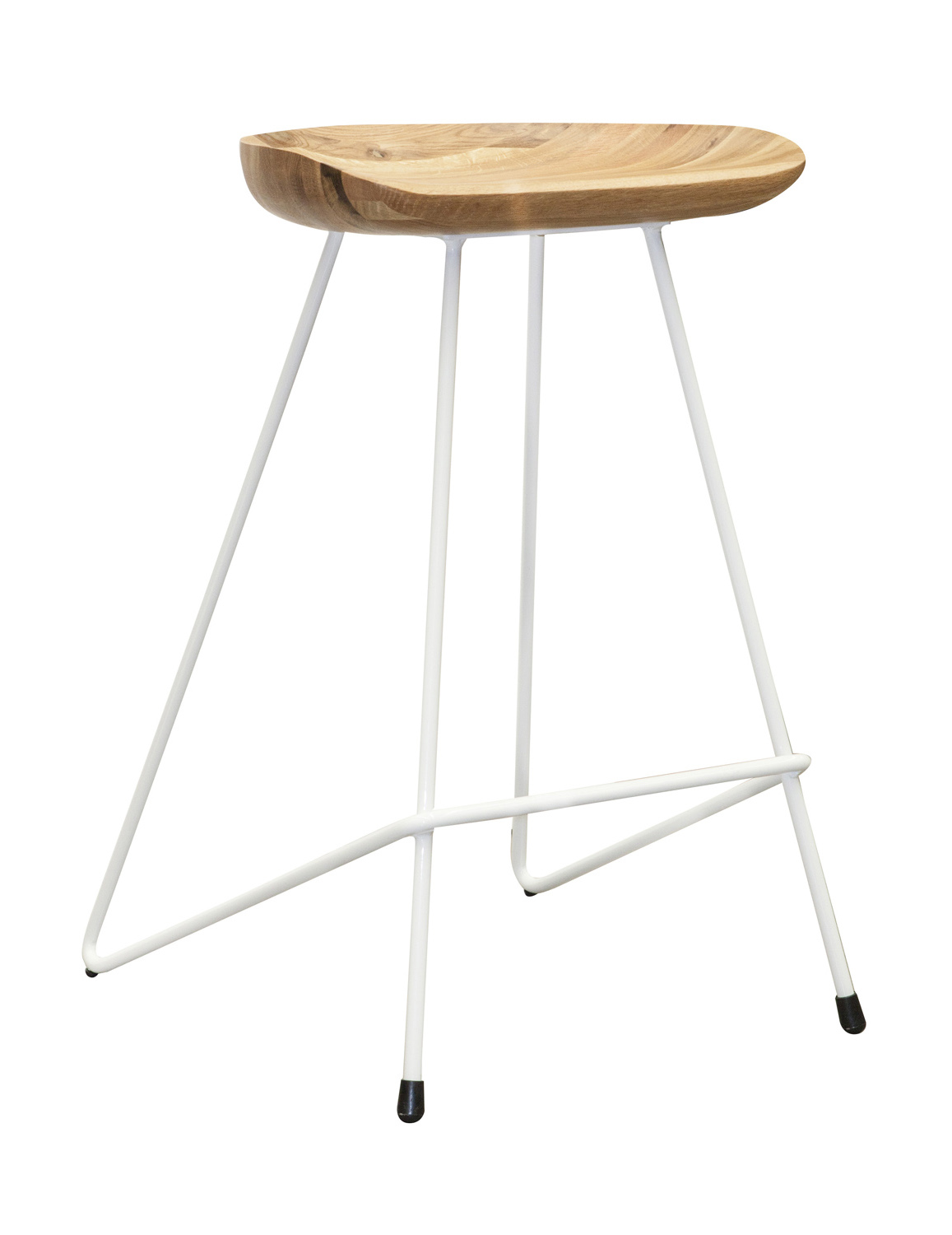
Kitchen joinery and bar stools by Built Furniture / Art by Georgie Wilson
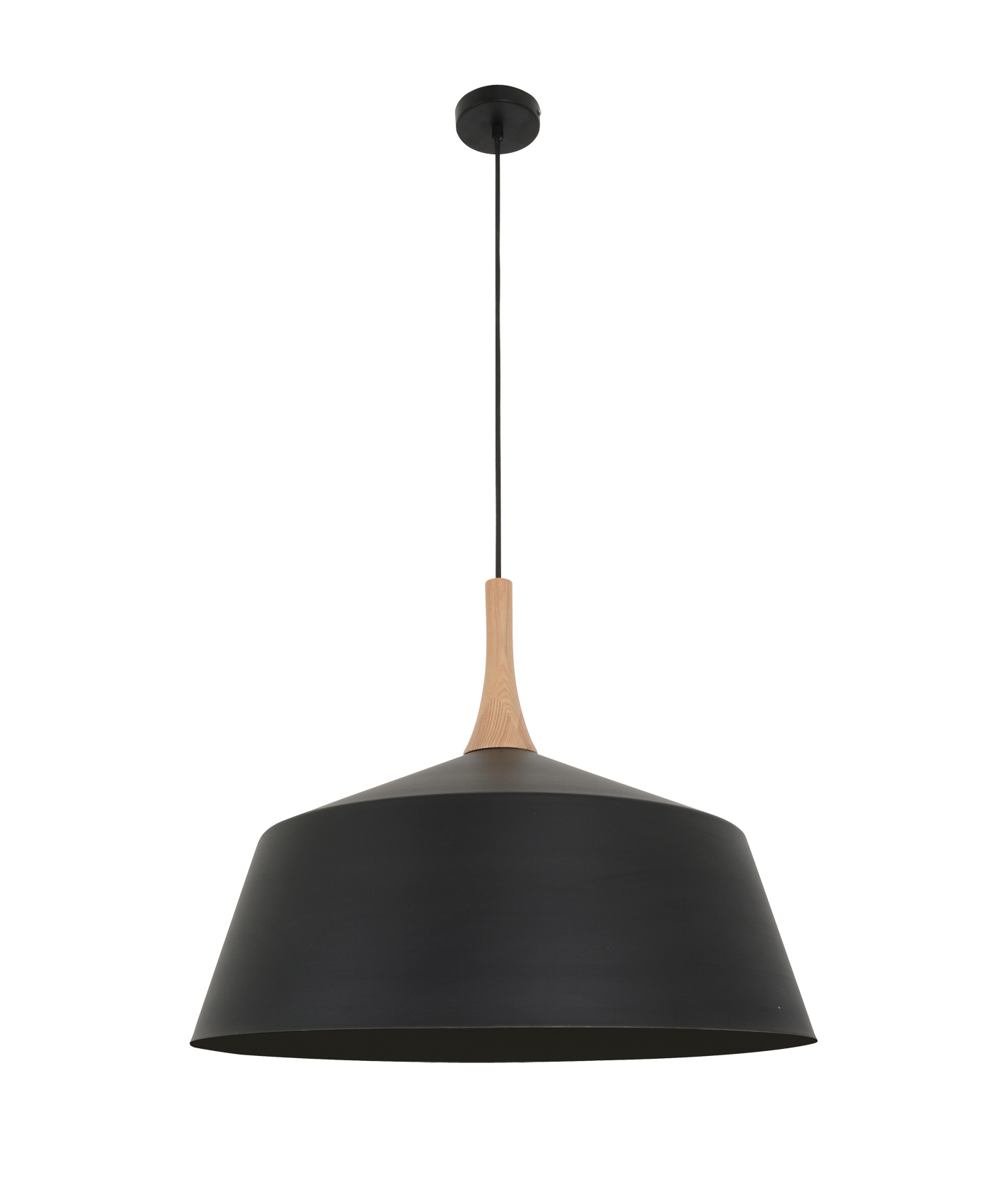
Pendant lights from South Drawn / Vase by Janna Schneebichler of Schapes

Nykita’s love of modernist homes goes back to her childhood “between the desert and the sea”, in a South Australian town she describes as a modernist time capsule. “I vividly remember visiting my cousin’s house and looking over the fence at the modernist ‘mansion’ next door, which was lined with palm trees and had a curved metal balustrade, a flat roof and stone feature walls,” she recalls. “As a kid, it was a huge inspiration to me.”
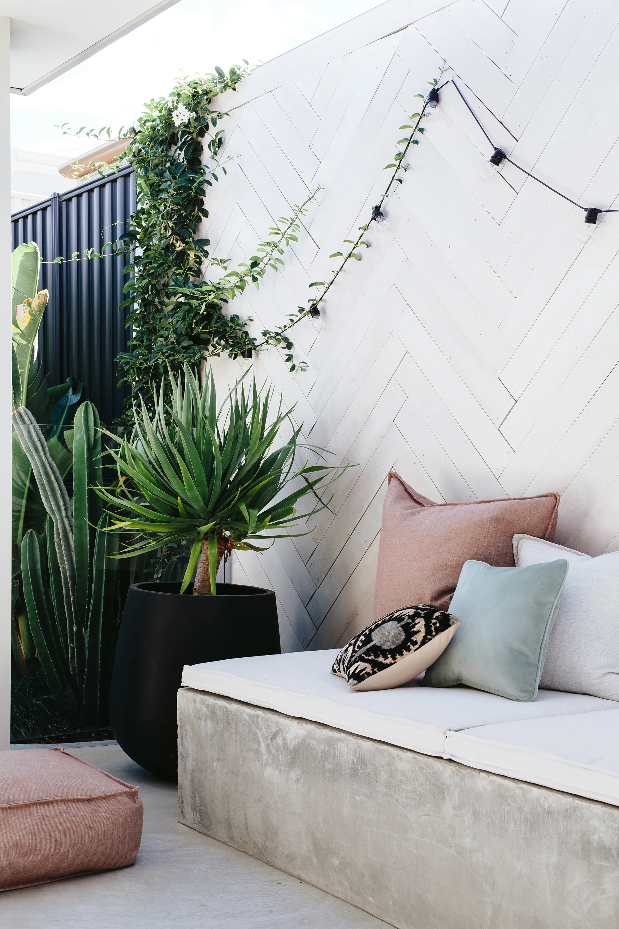
Now, years later, it’s Nykita’s own house that has curious passers-by peering over the fence. The home’s new design plays to this curiosity; the garden features an impressive cacti collection, scalloped walls and breeze blocks, delivering what Ben describes as “a series of curated sightlines that open the dwelling to the surrounding neighbourhood”.


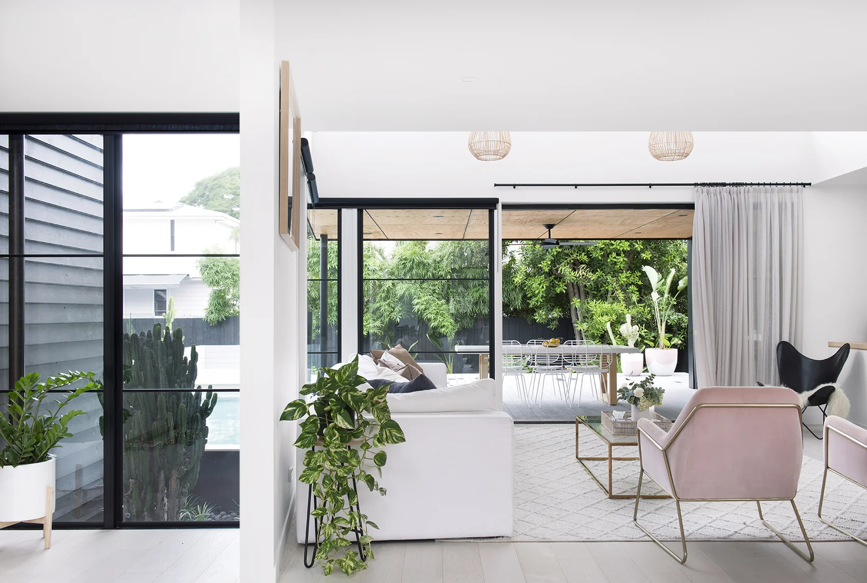
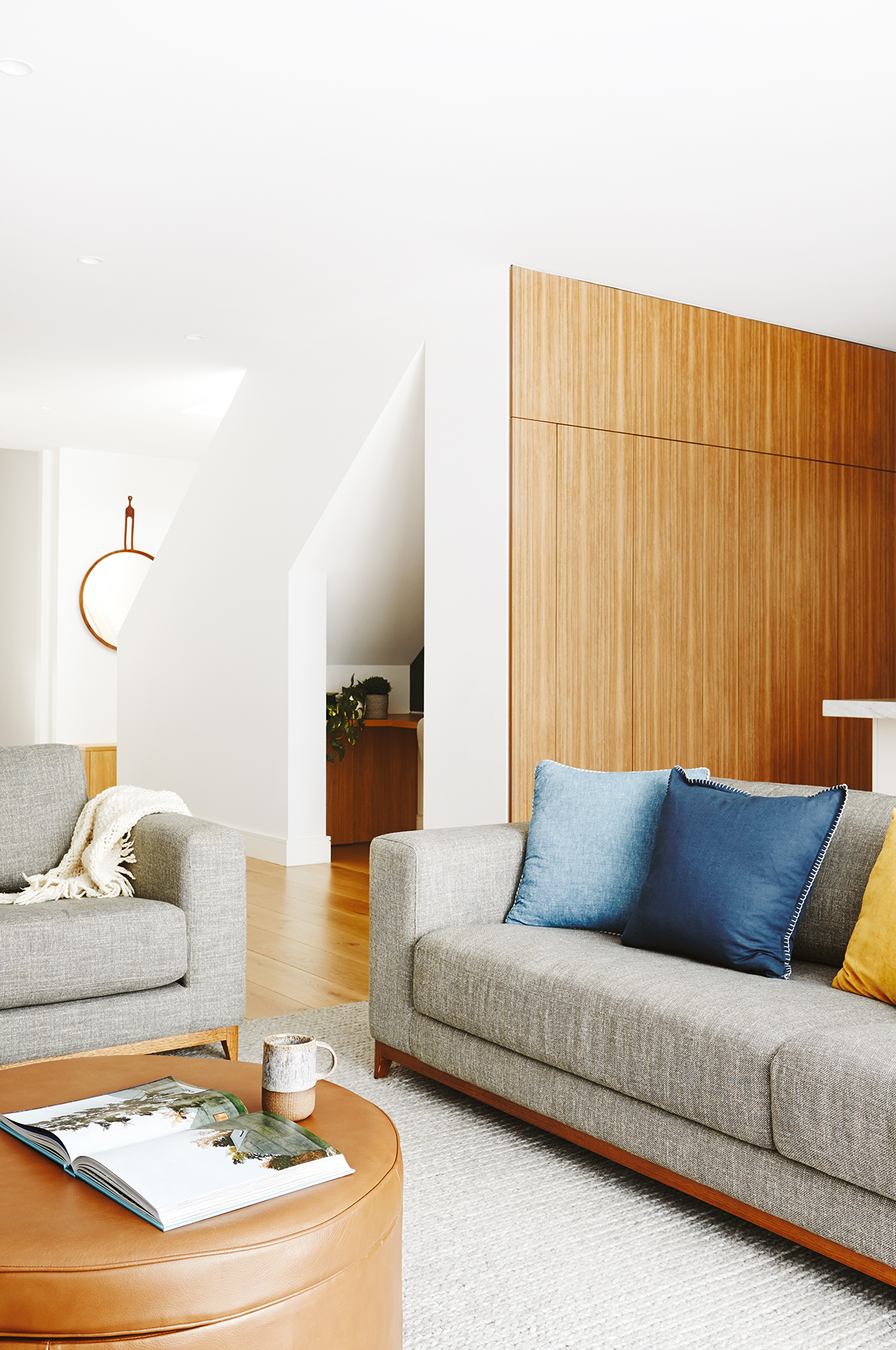
Sofa and coffee table from Built Furniture

This quality of transparency is continued throughout the project, whose guiding principle was “inside spliced outside”. “At any point in the space there is a direct visual and physical connection to the outdoors,” Ben explains.
Shapes, colours and textures are repeated across thresholds. The home’s sandstone facade, preserved to great effect in the renovation, is echoed in the pool’s stone backdrop, while crazy-pave flooring delineates the kitchen workspace and is repeated on the patio.
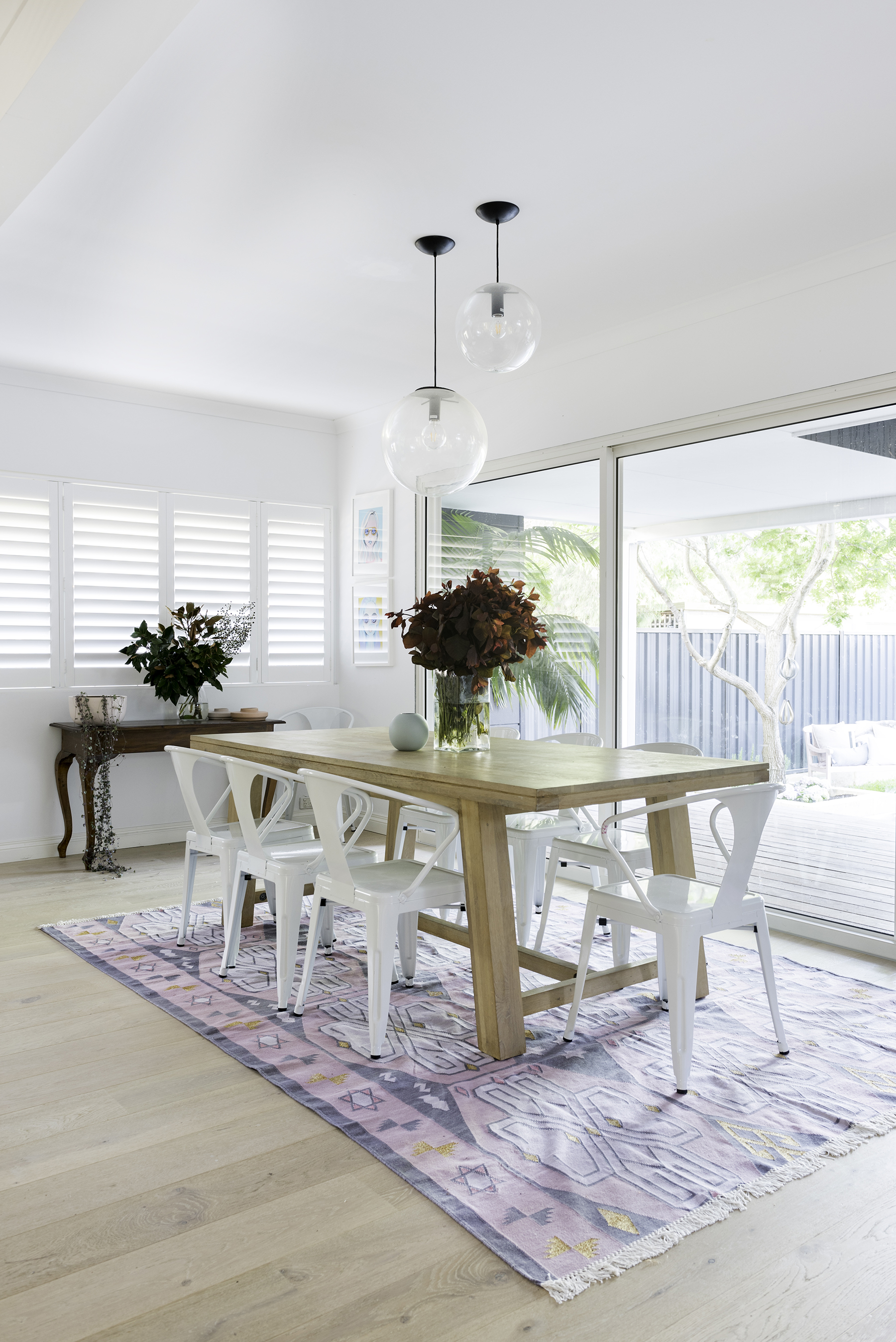
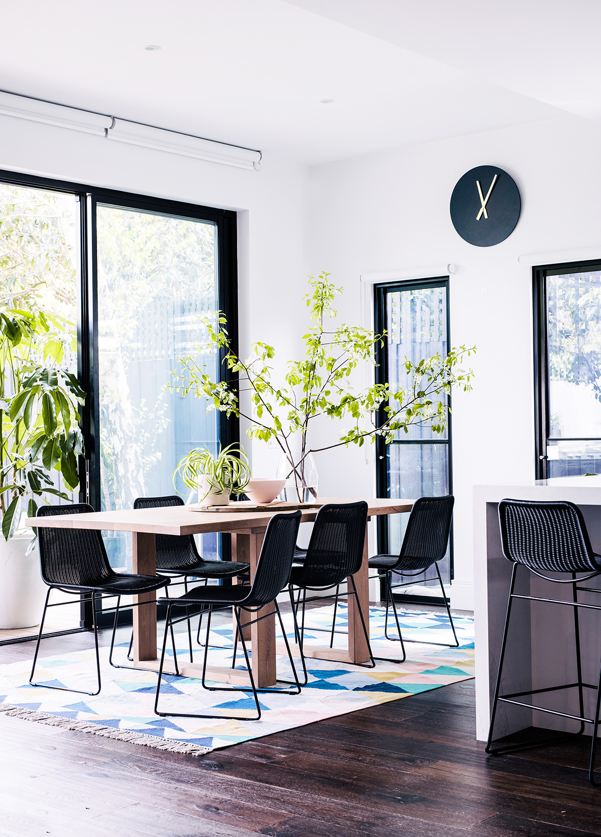
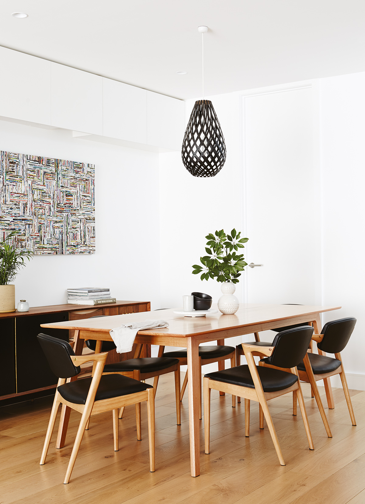
The kitchen’s 4.5-metre-long island bench is shaped from a huge piece of solid American white oak that Nykita and Scott were able to source from the US. The couple designed their joinery, dining table, chairs and coffee table to engage with curved elements in the house and garden.

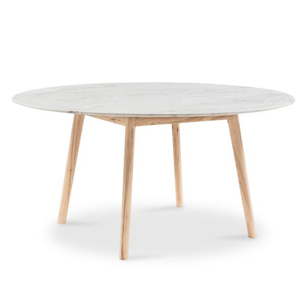
Dining table, chairs and stools from Built Furniture
Vases by Janna Schneebichler of Schapes

Bedside table from Built Furniture


“The home comes alive during the warmer months, with family and friends often gathering around the island bench and spilling into the dining spaces while the kids use the pool,” Nykita observes.
By contrast, the atmosphere in the bedrooms in the original wings of the home is geared towards rest and retreat. Nykita and Scott created custom bedside tables and bedheads referencing the old house’s weatherboards, along with minimalist timber vanities for the bathrooms.


Bed and bedside table from Built Furniture / Wall decal from Miss Pie Designs


For Nykita, Scott and Ben, the beauty of this project came from working within constraints to find innovative solutions. “Modernist homes come from a time when design was about creating a feeling and utilising creative thinking to solve problems,” Nykita points out. “Harnessing those ideas to bring a home back to life is one of the best ways, we feel, to make something unique.”


Want to see this home tour in full, in print? You’ll find this home tour in our Reno edition, available in newsagents, online and in select stockists across Australia.
Or buy the digital issue here.
ZEB Modern Barn
The farm-style buildings that dot the landscape around queenstown in New Zealand were the inspiration for this striking modern barn built on a hillside in Northern NSW.

The farm-style buildings that dot the landscape around Queenstown in New Zealand were the inspiration for this striking modern barn built on a hillside in Northern NSW.
Photography Coastpark Creative / Words Casey Hutton / Interior design Christal Alexander
Building designer Jardine Design Space / Build JDC

From the outside, the dark frame and pitched roofline of this home offer a dramatic counterpoint to the lush greenery that surrounds it. From the inside, huge expanses of glass beckon the eye outward to the forest treeline and an ever-changing sky. “Day and night, it’s a beautiful reminder of how lucky our family is,” says homeowner Christal Alexander.
Family is at the heart of this home. The seeds for its design, Christal explains, were planted over holidays to Queenstown with her husband Luke and their three children. “We’ve spent hours driving and exploring their rolling green hills and all these stunning black, high-pitched, single-level barns with timber detailing – the five of us falling more and more in love with the area each time we visit.”
The couple resolved to build a similar home in the Tweed region of New South Wales where they both grew up.


The house would be Luke and Christal’s fourth build and third renovation together. Nevertheless, it wasn’t smooth sailing. Christal recounts their initial impressions of the block of land in Nunderi: “It was bad! Hilly, with weeds and grass taller than a double-storey house. We couldn’t even get to the land to see it! There was a road, but it was so overgrown it wasn’t viewable.”


The location, however – ten minutes from Cabarita Beach and within easy reach of the highway to Byron Bay – was perfect, and Christal’s vision for a Queenstown-style home held strong. She sketched out her own plan – a modern barn with a central living zone between an adults’ and a children’s wing – then handed it over to Josh Jardine at Jardine Design Space. “He transformed my layout into a masterpiece, creating all the finer details,” she says.
“The property had a one-bedroom, fully off-grid shed that we lived in for the two years it took to clear the land and build. My husband purchased a 23-tonne excavator and, with every spare minute he had, he cleared, dug, and moved a lot of dirt.”


Then, when the build was due to begin in early 2022, torrential rain drenched the region and caused widespread flooding. “Although our land wasn’t directly affected by the floods, our town, friends, and family were. The land was too wet to even walk on,” Christal recalls. The build was delayed another six months.
After a nine-month build, the home – named ‘ZEB’ after their three children, Zayd, Eva and Brax – was finally completed.


Its dark silhouette and the scale of its windows give it a luxurious and contemporary edge, which has been balanced beautifully with rustic elements and organic textures and materials. The design prioritises connection with the outdoors via large sliding doors from all the rooms.
Christal’s favourite space is the main bedroom, with its luxe ensuite and 180-degree views of the property, including the pool and sauna. “Our first morning in the house, my three children all came in and lay on the bed with us, and I thought, ‘This is just heavenly’,” says Christal. “Picture-perfect it was.”


This is an edited extract from Adore magazine’s ‘Modern Farmhouse’ edition – available to buy from the Adore online shop. Also available as a digital edition.
Charred Charm
Beyond the blackened timber exterior of this Mornington Peninsula home lies a light-filled sanctuary that’s a study in restrained colour and curated continuity.

Beyond the blackened timber exterior of this Mornington Peninsula home lies a light-filled sanctuary that’s a study in restrained colour and curated continuity.
Words Casey Hutton / Interior design The Grace Collective / Interior Photography Annette O’Brien
Interior Styling Amber Lenette / Landscape Design Mint Design / Exterior Photography Erik Holt

Much like the Mornington Peninsula’s native melaleuca trees – from the Greek words melas (black) and leukos (white) – whose pale papery bark remains charred after fires, the dark facade of Sarah and Beau Muston’s home masks its light interior.
“We wanted a black house as soon as we purchased the land,” recalls Sarah. The block’s established greenery was the main reason they chose it, she explains, and a charred timber-clad home would offset the colour of the lush foliage.
Beyond the home’s outer shell, though, the contrast is immediate. High ceilings, generous skylights, gleaming polished concrete floors, white walls, and soothing layers of colour create the atmosphere of an inner sanctum.


Home owner Sarah Muston
“Our aim was to make it our own unique aesthetic, while remaining cohesive to create a soft flow throughout our home,” says Sarah, who is a stylist (The Grace Collective) and owner of clothing boutique Mirror Mirror. She and Beau had built before and were confident when it came to envisioning this home: “We designed every detail, including the entire floor plan.”
Natural light and colour were crucial elements in the home’s design. “For me, colour evokes happiness and joy, so to be surrounded by it every day really elevates your mood,” Sarah reflects.


The home’s approach to colour is restrained and carefully considered. Dusty pastels and earthy hues are introduced sparingly but with great effect via floral arrangements, artworks, ceramics and textiles. “We really wanted to create a crisp yet textural home, mix cool tones with warm tones, and introduce sharp lines against soft curves,” she says.
The result is a layered and tactile space, in which all elements exist in a calming equilibrium. Sarah’s decor, florals and soft furnishings are often chosen in response to cherished artworks. “Most times I will wait to start styling a room until I find an artwork that I fall in love with.”


Likewise, the choice of finishes in each room is carefully balanced against the whole. “It was important to me that each space needed to flow into the next,” Sarah explains. “I subtly changed up the tile composition in each bathroom while using the same tiles or, alternatively, selected the same tile in a different shape or size for the next space.” Likewise, the profile of white tapware throughout the home is consistent, but slight variations in design work to differentiate spaces.
Built over three descending levels, the home unfurls beautifully into an airy living and kitchen zone. Floor-to-ceiling glass runs the length of the room, opening up seamlessly to an outdoor area and pool surrounded by mature trees. This generous living space is the heart of the home for Sarah, Beau and their three young children, while a media room on the middle level – cleverly lit with clerestory windows – is where they barrack for their favourite sports teams.


Sarah explains that the floor plan was designed not only for how their family lives now, but also in terms of how they’ll use the spaces in years to come. “This included multiple inside and outside living zones, considering space and privacy so everyone in the family is able to have their friends visit simultaneously and enjoy our home comfortably together.”
Sarah’s favourite spot to retreat to is the luxurious freestanding bath in their ensuite. “It’s positioned in front of a large window in the treetops – a very Zen escape from our busy day-to-day life.”


This is an edited extract from Adore’s ‘Life in Colour’ edition – available to buy from the Adore online shop as a digital edition.
Saguaro
This stunning new build in Blue Mountain Heights, just north of Toowoomba, combines mid-century Palm Springs vibes with innovative design features.

This stunning new build in Blue Mountain Heights, just north of Toowoomba, combines mid-century Palm Springs vibes with innovative design features.
Photography Coastpark Creative / Words Rebecca Jamieson Dwyer


When you’re a real estate photographer who’s shot iconic houses across the country, you’re spoilt for choice when it comes to inspiration for your own home. This was the case for Ben Walker, who sketched out thousands of possibilities before designing his home, ‘Saguaro’, which he shares with his partner Adriana and their two dogs.
“I’ve photographed over 15,000 homes over the last decade, and I’ve probably drawn 10,000 floorplans,” he says. “I’d been writing notes in my phone of all the cool ideas I’ve seen and layouts I liked. Then one day we found the right block, with the right view, and designed Saguaro from scratch.”

The low-profile house, built by Paragon Homes, is filled with clever design elements that enhance the beauty of the space and make it a joy to inhabit. “One of my favourite things is the microcement in the bathroom,” Ben says. “I also love the skylight in the shower, our brushed brass ABI Interiors tapware, and the pool and daybed area looking out over that incredible view.”

The home was named after the Saguaro cactus. Aptly, the gardens are filled with cacti and an assortment of sun-loving plants, most of which were sourced from Beautiful Gardens Exotic Nursery & Design.

Saguaro’s open-plan interior feels epic and expansive, but the addition of sliding doors means the home can easily be partitioned for privacy or leisure, creating smaller, more intimate spaces. “The bedroom wing is to the left of the front door and the living area is to the right, so when we have guests, we can close off half the house,” explains Ben. “We also have a floor-to-ceiling cavity door that divides the media room in half. You can watch a movie in complete darkness or open the door to play a game of pool while watching football on the big screen.”


Ben also designed the outdoor spaces, spending months meticulously planning the layout and the vegetation, and building a 3D model to perfect his vision. “I had help from a landscaping team for the hardscaping — the retaining walls, irrigation and fencing — but I planted 90 percent of the plants myself,” he says.
Named after the classic three-pronged cactus, Saguaro (pronounced with a silent ‘g’) is an apt moniker for an abode where the spiky plants reign supreme; landscaping was a key element in the home’s design rather than an afterthought.


The front garden – affectionately named the Zen Garden – is filled with drought-loving, low-maintenance cacti, creating a showstopping space that’s as peaceful as it is stylish. “On a hectic windy day, it’s all so still, which is very relaxing,” says Ben.
Out the back of the home, the entertaining area leans into modernist desert style, with circular stepping stones, an infinity pool and a fire pit, punctuated by views of the Australian bush.
Every window was made as large as possible, bringing the outside in and helping the home’s inhabitants feel close to nature. “Instead of a splashback in the kitchen, we installed a big panel of glass, which brings the Zen Garden inside,” says Ben.
“We absolutely love it here; the whole house is such a vibe.”


This is an edited extract from Adore’s ‘Palm Springs’ edition – in newsagents Australia-wide, and in the Adore online shop as a digital issue.
Banadero
Won over by a ‘70s apartment in need of some love, Carissa and Nev Heath enlisted the help of interior designer Danni Morrison to transform it into an inviting beachfront escape.

Won over by a ’70s apartment in need of some love, Carissa and Nev Heath enlisted the help of interior designer Danni Morrison to transform it into an inviting beachfront escape.
Photography Coastpark Creative / Interior design Danni Morrison / Words Casey Hutton


Banadero inspiration
“Drawing inspiration from Carissa and Nev’s favourite colour, their appreciation of art and their love of Mexico, ‘Banadero’ is a collection of key elements like trending art pieces, custom tiles, and unique selections,” explains designer Danni Morrison.
Wandering into the ‘Banadero’ apartment block at Cotton Tree on Queensland’s Sunshine Coast one lazy Saturday morning, Carissa and Nev Heath had no intention of buying. “We were killing time more than anything,” recalls Carissa. “But from the moment we walked in, we fell in love.”
The unit was dated, but the couple saw huge potential in its beachside location and cool vintage features, so they snapped it up and briefed interior designer Danni Morrison to create a laidback and luxurious Airbnb.
Renovating within an existing block meant that the floor plan and exterior features would essentially remain the same, but Danni worked cleverly and sensitively within the apartment’s constraints. “Having the assistance of an interior designer to mock up the space prior to beginning the renovation was priceless for us,” Carissa points out.


Danni’s approach incorporated bespoke fixtures and high-quality fabrics and finishes in a thoughtful design that caters to the needs of Airbnb guests. “Drawing inspiration from Carissa and Nev’s favourite colour, their appreciation of art and their love of Mexico, ‘Banadero’ is a collection of key elements like trending art pieces, custom tiles, and unique selections,” she explains.
“Being a small three-bedroom unit, built in an era when cabinetry design and storage solutions weren’t at the level of importance that they are today, meant that maximising space and comfort was high on the agenda.”
In the bedrooms, built-in robes were replaced with open shelving and lift-up storage to free up space. “We also removed built-in shelving at the front door,” explains Carissa. “This was turned into lift-up bench storage for beach equipment and a drop-off area for guests’ belongings when they enter the apartment.”


The laundry and bathrooms were gutted and remodelled with high-quality finishes. Custom encaustic tiles in green, teamed with white tiles and chocolate-brown grout, lend the spaces a nostalgic Mexican energy.
Existing elements of the building were worked into the new design. Its distinctive hooded brown window frames, for instance, are echoed in arched doorways, pill-shaped bathroom basins, and the curved niche behind the dining space. The apartment’s ornate insect-inspired cornices were also left intact, Danni explains. “Who in their right mind would have the audacity to remove those gorgeous little beetles? Not me!”
Strategic updates to the kitchen and living zone made it more spacious and functional. “We really wanted to provide enough seating and comfortable places to relax for up to six guests,” Carissa says. Removing a portion of the kitchen cabinetry opened the space; replacing it with a small woodgrain cabinet created a visual link between the kitchen and living area.


Meanwhile, a new custom-designed furniture piece became the room’s standout feature. The addition of this multi-purpose raised bench was, Danni says, “the ultimate game changer for ‘Banadero’ – acting as a console table, desk, bar, or kitchen island overflow, depending on guests’ requirements”.
“We also introduced the built-in seating area with niche shelving around the dining table for plenty of relaxing space,” Carissa adds.
The renovation, which took place over five months, delivered a holiday apartment that’s as practical as it is beautiful. “The most important facet of the design brief,” says Danni, “was to create a space where guests feel warm, comfortable and relaxed, like they would at home, but with a sprinkle of luxury detail that you’d expect from a five-star hotel.”


This is an edited extract from Adore’s ‘Makeover’ edition – available to buy in the Adore online shop as a digital issue.
The Villas
Awash with natural light, this dual accommodation on the Gold Coast mixes calming pastels with energetic pops of sorbet-flavoured colour.

Awash with natural light, this dual accommodation on the Gold Coast mixes calming pastels with energetic pops of sorbet-flavoured colour.
Photography Coastpark Creative / Words Casey Hutton / The Villas by Bilinga Beach Abodes


BEFORE
Back in 2020, Sarah and Aaron Waters fell in love with an idiosyncratic 1960s building in Bilinga on Queensland’s Gold Coast. “From the outside, you’d think that it was just a standalone house, but on the inside it was two three-bedroom units layered on top of each other,” Aaron explains. “At first, we didn’t know what to call them. Were they units or were they a duplex?”
They dubbed them ‘The Villas’, and embarked on a detailed two-year renovation where both apartments were retained but completely reworked.
Sarah, who owns baby bedding and accessories business Bubbles Lane, and Aaron (aka Aza), co-founder and Head of Operations at Balter Brewing, have a penchant for renovating 1960s homes. Back in 2008, they transformed a dowdy ’60s beach shack into ‘Bilinga Beach Abode’, a stylish Palm Springs-inspired haven that they now live in with their three children.


This time round, they worked within the building’s existing footprint, removing asbestos and crooked walls along the way. “We are so proud that we kept as much as possible of the original building,” says Aza. “Let’s just say we threw it in the washing machine and then put it through the dryer and gave it an iron.”
The completed reno is a knockout, owing largely to its joyful and ambitious use of colour, pattern, and texture. Aza explains that flooding the building with natural light was crucial to making those interior elements sing; they lifted the original roof to accommodate soaring raked ceilings and admitted as much light as possible without compromising on privacy.


Their biggest design gamble became their favourite feature: a dramatic helical staircase leading to a new loft in the upstairs villa. “We wanted it to be a work of art,” Sarah says of the staircase, which is rendered in Venetian plaster with a luxurious ‘Oyster’ finish. “Tiling the rise of the stairs with some leftover tiles from our bathroom added another pop of colour against our sage-green kitchen.”
Throughout The Villas, contemporary furnishings with a retro flavour pay homage to its iconic coastal location, while the bold use of convex panelling from Easycraft’s ‘Silhouette’ range puts a modern spin on classic beachy VJs. “We wanted to veer away from the standard gyprock finish,” Aza explains. “The folks at Easycraft assumed we were thinking of just a feature wall here or there, but once we told them the quantity we were chasing they nearly fell off their chairs!” he chuckles. “Amazingly, Easycraft recycled 100 percent of offcuts from our project back into making new products.”


This is an edited extract from Adore’s ‘Life in Colour’ edition – available to buy as a digital issue in the Adore online shop. This extract features the upstairs villa, see our print magazine for the full tour including the downstairs villa and pool areas.
Patch of Paradise
Former Sydneysiders Jessi and Koombs customised their new build on the Gold Coast, creating a bold, modern home for their growing family.

Former Sydneysiders Jessi and Koombs customised their new build on the Gold Coast, creating a bold, modern home for their growing family.
Photography Coast Park Creative / Words Nichola Davies


Creative couple Jessi and Koombs made the move from Sydney to the Gold Coast with their two little ones (human and dachshund) a month before the outbreak of the COVID-19 pandemic.
“We wanted to have a home with a backyard for a dog and to cater to our growing family,” explains Jessi. “That didn’t seem possible with our budget in Sydney. We wanted a slower-paced life and the Gold Coast seemed to offer that.”
Opting for a new build for their family home, Jessi and Koombs chose a standard design through GJ Gardner Homes, adding some customisations to suit their needs.
“We wanted a lot of natural light,” says Jessi. “The raked ceiling provides heaps of light and makes the main living spaces feel bigger and brighter.”


“Open-plan living was really important to us to bring the outdoors in, and we wanted our main bedroom to open onto the pool to create a relaxing atmosphere and the feeling of being on holiday.”
The couple chose a black, VJ-panelled feature wall in the study and black feature walls in the living room, media room and main bedroom to add impact to the home’s interior. “As our home is mostly white, we wanted to create some contrast,” says Jessi.
Jessi and Koombs tackled the landscaping themselves – a feat made easier by the fact that green-thumbed Koombs is a bricklayer with experience in stonemasonry. Sourcing inspiration from gardens on Instagram and Pinterest, the couple had a rough idea of what they wanted: “tropical plants, different seating zones, a barbecue area, a low-maintenance garden, and a backyard that the family could enjoy and spend a lot of time in”.


The landscaping is designed around the pool, the corner of which lines up with the original alfresco area. Jessi says this was important to get right in order to maximise the other areas of the backyard on the 450sqm block.
The bench seat and planter boxes are an original design feature dreamt up by Jessi and Koombs, who were looking to elevate their plants and create privacy from neighbours. “The planter box and bench seat were perfect for the space,” says Jessi. “The area can also be seen when you’re standing in the dining room, kitchen and living room, so we wanted to make it a feature and create a view from all of these rooms.”
The process wasn’t without challenges though; the planters needed to be redone to make them higher and able to hold bigger plants. The area also originally had real turf that had to be ripped up – twice – due to lawn grubs. “Artificial turf has been amazing,” says Jessi. “It’s green all year round, low maintenance, and our daughter and dachshund Maple love playing on it.”


In addition to being open to the option of artificial turf, Jessi and Koombs’ top tips for DIY landscaping are to source plants locally and check out Facebook Marketplace for bargains. “Almost all of our plants are from local nurseries,” explains Jessi. “We purchased many items, such as the breezeblocks and railway sleepers, which we used as steppers by the pool and the front of the house, from Facebook Marketplace.”
The couple say they saved “so much money” by choosing to do the landscaping themselves – a big win for this growing family.


Want to see this home in print? You’ll find this home tour in our Tropical edition, available to purchase as a digital issue here.
Nesting instinct
Light, shadow, form and shape perform a captivating dance in this artfully composed modern beach house in Cronulla.

Light, shadow, form and shape perform a captivating dance in this artfully composed modern beach house in Cronulla.
Words: Casey Hutton / Photography The Palm Co / Interior design + Build Nested Projects / Joinery Finch Projects


“I’m inspired by people who aren’t afraid to take a risk with design – to make it truly about the design and not just how the house will be sold.”
“I’m inspired by people who aren't afraid to take a risk with design – to make it truly about the design and not just how the house will be sold,” muses interior designer Katie Burt, who runs Nested Projects with her husband James, a construction manager. “I always make sure the home really does feel like a home, and not just a showpiece.”

When renovating their own house in Sydney’s beachside suburb of Cronulla, Katie incorporated a handsome mix of materials and finishes. “I avoid being too on-trend; it’s fine to pick up some current details but on-trend will definitely date,” she points out.
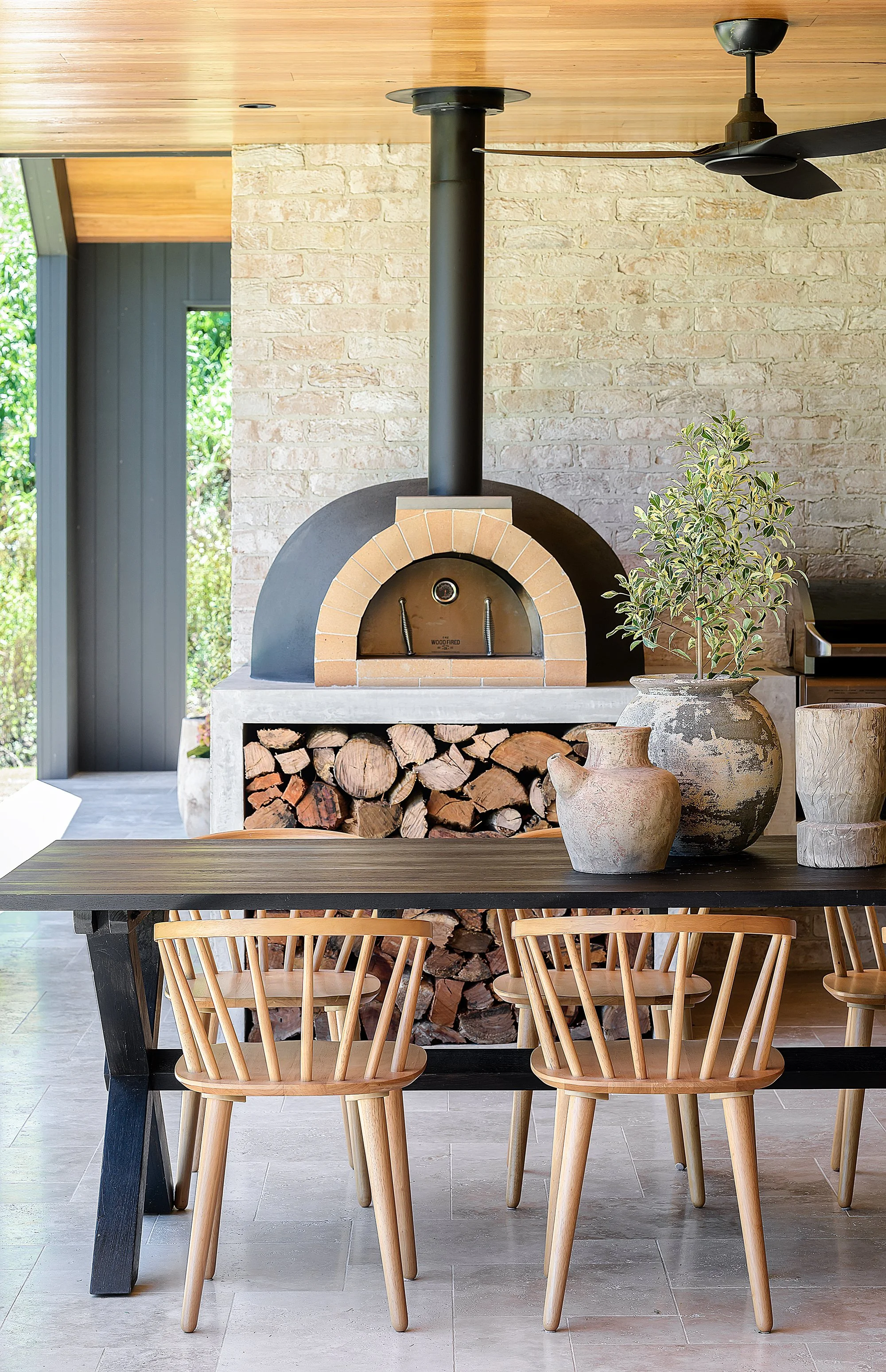
The transformation of the home’s interior and exterior began in September 2019 and took around five months. The finished product melds sparse Scandinavian sensibilities with Mediterranean flourishes such as arches, alcoves, terrazzo, terracotta tones and even a pizza oven. These elements are underpinned by a laid-back beachiness that’s unmistakably Australian.


“The facade was very tired,” says Katie. “We had the exterior rendered with lime plaster in ‘Natural White’ and added breeze blocks, keeping their natural concrete finish.” The distinctive circular motif in the breeze blocks is repeated in wall-mounted outdoor lights and the oversized round timber handles on the front gate and matching front door.
The entrance to the house reveals one of Katie’s favourite spaces: a striking dining area with banquette seating and custom shelving. The existing staircase was moved in order to create this nook, and angled sunlight floods the area from windows in the void above. “I love this space; it’s such a beautiful feature as you enter the home.”
With a young daughter, Georgie, and stepson, Hudson, Katie was conscious of the practical aspects of family life when planning the reno. The couple opted to have all their living spaces on the ground floor, with the alfresco lounge area and pool in view. “It’s so much easier with young kids,” explains Katie.


In the open-plan kitchen and lounge, clean vertical lines are balanced by curved forms, and white walls are warmed by timber tones and stone surfaces. “When our fireplace stone arrived it was too pink, so we had it painted white and just love it!”
A guest bedroom and bathroom, office, powder room, laundry and rumpus room complete the downstairs layout. Upstairs, what used to be one big room was carved up to create three bedrooms, an ensuite and a main bathroom. The main bedroom enjoys the best scenery. “We added a balcony off this bedroom to make the most of the sea views and breeze. It feels so soft and inviting with the curtains and bedding.”
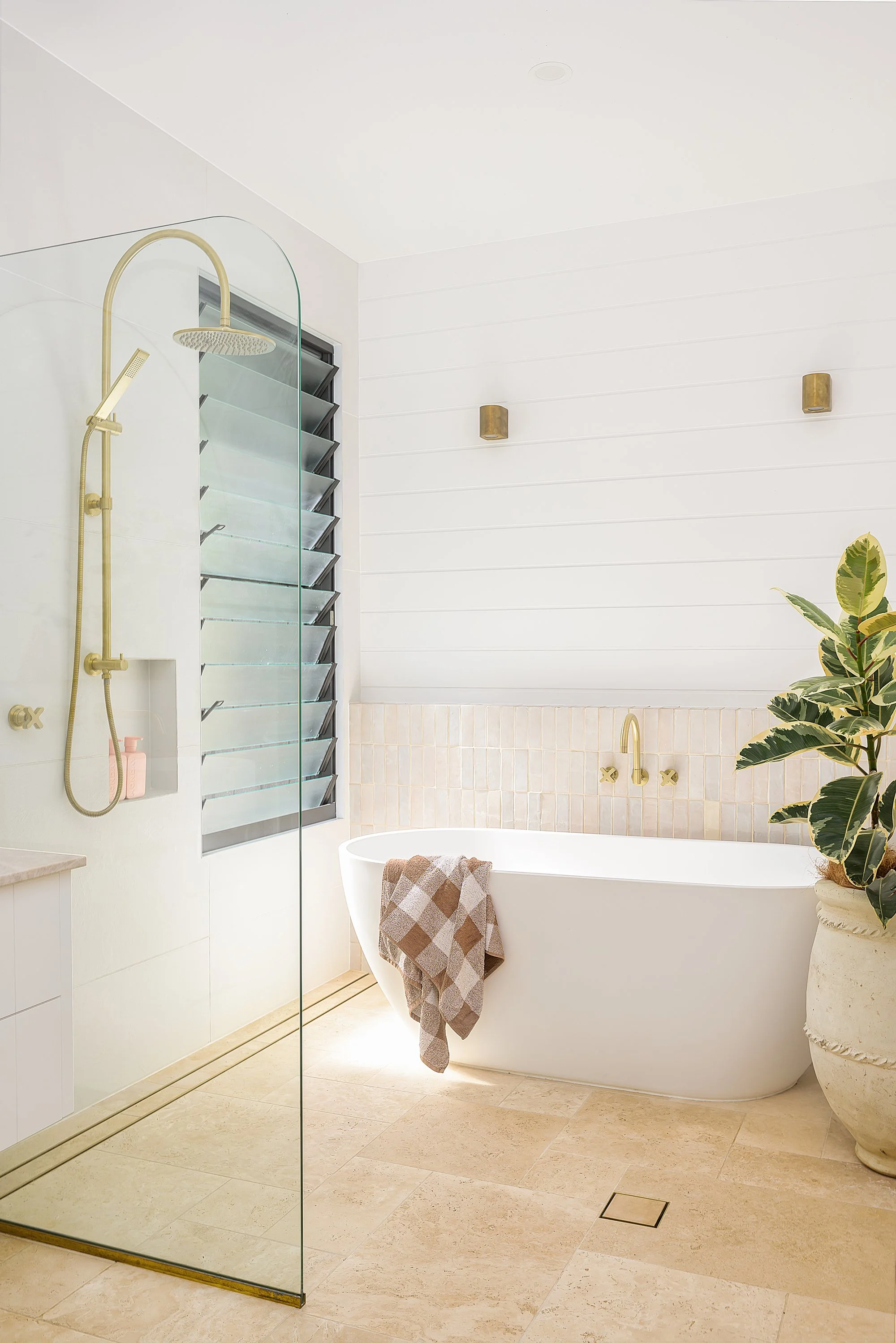
The home’s beachside location informed many design decisions, Katie explains “Wind and salt always need to be considered. We also chose lots of louvres to take advantage of the breeze and, more importantly, to hear the ocean!”

Outside, the effortless coastal cool continues. A largely monochromatic palette is offset by lush greenery, natural stone textures, and the inviting pale blue of the pool beyond. A bench seat incorporating breeze blocks is “hands-down the best place to lie in the sun – our pug Peggy loves it”, and a pizza oven and built-in alcove for firewood set the scene for poolside entertaining.
“A bench seat incorporating breeze blocks is “hands-down the best place to lie in the sun – our pug Peggy loves it”, and a pizza oven and built-in alcove for firewood set the scene for poolside entertaining.”


Want to see this home in print? You’ll find this home tour in our Winter edition, available in newsagents, online and in select stockists across Australia.
Striking beauty
Not even an unexpected move abroad could get in the way of this Melbourne family creating their dream home.

Not even an unexpected move abroad could get in the way of this Melbourne family creating their dream home.
Photography: Annette O'Brien / Styling: Alana Langan / Interior design: NCS Interiors / Words: Nichola Davies


Interior designer Nerida Stewart of NCS Interiors and her husband Andrew fell in love with their Camberwell house in 2010. Situated across from a beautiful park, the home’s location offered a great place to raise a family. At the time, their son Hugh (now 11) was just a toddler, and their younger daughter Ruby hadn’t come along yet.
“Our underlying principle was to improve the house’s curbside appeal, maximising the park views and creating a street presence, without being overbearing or ostentatious.”


According to Nerida, the house lacked street appeal and needed modernising, but it had a lovely light-filled interior with a lot of potential.
After living in the home for four years, the family had a good sense of what they needed to improve, and they began their renovation, which took place over five years in two stages. Nerida took charge of the interior design and engaged Rod Hannah Design Group for the drafting.

Beginning stage one in 2014, they undertook substantial renovations to the front of the house, including the façade and driveway. “Our underlying principle was to improve the house’s curbside appeal, maximising the park views and creating a street presence, without being overbearing or ostentatious,” says Nerida.
The couple decided to excavate and go under the house for the garage, which was a major job. It proved worthwhile in the long term though, as they were able to add a second living room above the garage. They then renovated the kitchen and family room.


After moving in and enjoying their transformed home for only a matter of months, Andrew was offered a job in Houston, Texas, and the family opted to take the plunge and move overseas for three-and-a-half years.
“It was an unexpected life change but such an amazing adventure for the family,” explains Nerida. In 2018, towards the end of their time in Houston, Nerida put plans in place to get stage two of the renovation underway. This would involve transforming the back of the house, including the bathroom, laundry, entertainer’s kitchen (formerly a playroom), outdoor entertaining area, guest bedroom and ensuite.
“Managing the early stages of the second renovation from overseas had its logistical challenges, but we had a very good builder (Terry from Latrobe Building Services), who was excellent at communicating,” says Nerida.


“ “Managing the early stages of the second renovation from overseas had its logistical challenges, but we had a very good builder (Terry from Latrobe Building Services), who was excellent at communicating.”


Blending indoors and outdoors was an important factor for this area of the house. “The joinery detailing of the kitchen nook extends out to the barbecue area, while the large-format porcelain floor tiles run from the inside and continue outside and around the pool, creating a seamless transition,” Nerida explains.
“We also opened up the ceiling to a gable roofline, along with fully extendable glass bifold doors, which has completely transformed the feel of the space. It’s perfect for entertaining friends while the kids swim in the pool.”
Nerida says she loves their forever home for its overall feel. “The layout is unconventional,” she says. “The split levels overlooking glimpses of garden give the house a relaxed, inviting atmosphere.”


Want to see this home in print? You’ll find this home tour in our Winter edition, available in newsagents, online and in select stockists across Australia. Or buy the digital issue here.
Concrete to contemporary
Tile Cloud co-founder Drew Mansur worked closely with an architect to transform a dated property in Redfern into a contemporary family home.

TileCloud co-founder Drew Mansur worked closely with an architect to transform a dated property in Redfern into a contemporary family home.
PHOTOGRAPHY THE PALM CO / STYLING THE HIRED HOME / WORDS NICHOLA DAVIES


Not all homeowners meet their architect by knocking on their door and telling them they like their house, but that’s how Drew Mansur met Daniel Kontista of Kontista + Co. Drew was walking through Redfern on a Sunday afternoon admiring the terrace homes when he saw one in particular that caught his fancy.
“I just thought I’d go and knock on their door and ask them who their architect was,” says Drew. “Next thing I know, he was the architect and it was his own house, and he invited me in to have a look.”
Drew’s Redfern home is the second project the duo has worked on together; by the time he bought the property, Drew had some fairly extensive “back-of-the-napkin sketches” of the elements he wanted.
“Daniel added a little bit of seasoning on top, but he was the original inspiration and the person who executed the drawings, so I sort of slotted in the middle there.”


Drew explains that the home is situated in a heritage conservation area, which meant they were able to gut the interior, just keeping the façade and streetscape of the house.
There was no garden; every square inch of the house was concreted, including random little additions such as a concreted external laundry, concrete steps, and so on. “There was even a barbed-wire fence on the back,” Drew recalls. “It looked a little bit like a South American prison – it actually looked hectic,” he jokes.
But the abundance of concrete worked in Drew’s favour. “Because it was completely concreted, our floorspace ratios of what we were allowed to build were greater,” he explains. “[According to Council], if there’s already a precedent on site – say they had a massive garden in the middle and you wanted to develop the site a bit more, you would have to maintain the same amount of green space. This had zero green space, so it defaulted back to minimum requirements.”


The renovation was done in stages because the terraces rely on each other for strength; excavating the garage meant having to underpin the adjacent properties. “We gobbled up plenty of time doing that, but it allowed us to create this two-car garage in a location very close to the city.”
Drew says he can’t take too much credit for the style of the interior of the home, as he based it on a house he fell in love with in the Paddington area. “That home was super stylish, and it sold for a squillion dollars,” says Drew. “I thought if we could replicate the vibe of that house and apply it to our site and aim for half-a-squillion dollars, that’s a good outcome!”


Want to see this home in print? You’ll find this home tour in our Heritage Homes edition, available online and in select stockists in Australia.
Or buy the digital issue here.
Californian bungalow
Expanded for a young family, this heritage-listed home has been steered into the 21st century with elegant design choices that remain sensitive to the building’s history.

This heritage-listed home has been steered into the 21st century with elegant design choices that remain sensitive to the building’s history.
INTERIOR DESIGN BONE MADE / WORDS CASEY HUTTON / PHOTOGRAPHY THE PALM CO
BUILDER MIRAGE DEVELOPMENTS


Though less decorative than their Victorian and Edwardian counterparts, Californian bungalows have a charm and warmth that continues to endear them to Aussie families. Having become a feature of our suburbs in the early 20th century, their unfussy construction and straightforward floorplans lend themselves well to renovation and open-plan living.
“These homes are typically clad in brick with some solid rendered and masonry elements, with interior details such as ornate ceilings, skirtings and architraves,” explains Leah Pitman of Bone Made. She and her business partner Fliss Pitman are the interior design duo behind the elegant transformation of this home in Concord.
The owners needed to extend the bungalow to accommodate their family of six. “They wanted it to feel open, light and airy but also have ample storage,” Leah explains. A draftsman was enlisted to add bedrooms, a generous living space and a mudroom entry from the carport. Meanwhile, Leah and Fliss were tasked with creating a large kitchen with butler’s pantry; separate living areas for the parents and children; a his-and-hers wardrobe and ensuite in the master bedroom; and a large kids’ bathroom.


Their design had to adhere to heritage regulations, which included retaining the original fireplace. “We didn’t mind at all!” says Fliss. “We painted it white to align with the refreshed colour palette and allowed it to be a feature when walking through the front entry and down the hallway.” They also needed to preserve the old architraves, skirting and ornate ceilings.

Oak herringbone flooring was installed from the front door to the new living space, blending the home’s past and present footprint, while skirting, architraves and brass detailing were kept consistent throughout. “We didn’t want it to feel like two separate homes,” Fliss explains. “We ensured that the new kitchen fixtures were a beautiful classic brass and joinery showcased a classic profile, and we used a timeless neutral colour palette to ensure cohesion and continuity.”

“We ensured that the new kitchen fixtures were a beautiful classic brass and joinery showcased a classic profile, and we used a timeless neutral colour palette to ensure cohesion and continuity.”
While new elements were carefully integrated into the home’s historic personality, they are simultaneously cool and contemporary, creating an intriguing conversation between new and old. In the light-filled living area, Leah and Fliss designed bespoke oak and rattan joinery with a built-in gas fireplace and exposed flue. The design balances a sleek profile with the traditional cosiness of a hearth, and also provides plenty of storage space.


In the main bedroom, a custom-designed wardrobe with oversized knurled brass handles opens somewhat playfully to reveal a ‘hidden’ ensuite. “The ensuite showcases a sophisticated colour palette of charcoal, white and brass, with a floor that aligns back to the Californian Bungalow style,” says Leah. They also deepened the bedroom’s original window seat, adding luxe dark velvet padding and building in storage below.
The home is furnished with pieces that will stand the test of time, including a beautiful oak dining table teamed with Le Corbusier and Hoffmann-style chairs. Clean lines, high-quality textiles and pops of deep colour against light timber, rattan and brass elements lend the space an air of confidence, comfort and quiet luxury. “We find the styling in any project is the final piece of the puzzle,” says Leah.
If you’re renovating a heritage home, Leah and Fliss recommend researching the era to work out what must be retained and what can be reused in an extension. “Be open-minded about the design too, and certainly pay homage to the original style.”


Want to see this home in print? You’ll find this home tour in our Heritage Homes edition, available online and in select stockists and newsagents in Australia. Or buy the digital issue here.
By the Barwon
An epic renovation took a dated ‘60s brick home and turned it into an enviable Byron-meets-Palm Springs-style abode.

An epic renovation took a dated ’60s brick home and turned it into an enviable Byron-meets-Palm Springs-style abode.
Words: Nichola Davies / Photography: Rochelle Eagle / Styling: Lee Blaylock


A lot of hard work went into this home to get the feeling the Miller family – made up of Lucy (@riverlandprojects), her husband Marcus, children Sunny (seven) and Frenchy (five), and Banjo the dog – wanted: one that was calming and serene.
When the couple bought the house at auction (well, Lucy did as Marcus was on his Christmas work break up), it was in a very bad way.
Lucy explains, “it was a 1960s brick three-bedroom, two-bathroom, set to the front of a great north-facing block. It hadn't been lived in for 15 years, and you couldn't even walk up the front stairs as they were falling down. Plus, it had rotten window frames and a bad ’80s colonial timber kitchen refurb. It was in need of a lot of love, but we could tell it had so much potential, and we love the location right near the Barwon River.”


The family took the option of a long settlement to get the planning stages of the renovation and extension underway, knowing exactly what they wanted to do for the extension.
“We just needed someone to draw it up, so we went with a draftsperson instead of an architect,” says Lucy. “The engineering and waiting for approval is by far the most tedious waiting period of the whole project.”
From purchasing the property through to planning and building, the process took just under two years, the build itself taking around 12 months.
“It all of course took so much longer than we anticipated,” says Lucy. “The build started about 10 months after purchasing the house, with much excitement, and then 12 months to complete once everything began.”
Achieving the look they wanted for their home meant incorporating into the design a lot of natural light, white and timber, VJ panelling, and keeping the original raked ceilings.


“We also love terrazzo tiles, so they feature a lot too,” says Lucy. “Linen curtains give such a beautiful feel to a room, so we opted for those in the master bedroom and main lounge.
“It’s a little bit mid-century Palm Springs, and a little bit relaxed Byron Bay … a couple of our favourite vibes mixed together.”
While Lucy admits the costs of the renovation and extension blew out, Marcus is an electrician so they were able to save some money that way.
“You get so far into the process that it's hard to go back,” says Lucy. “And all the little things that add a thousand dollars here and a thousand there, end up being the details that you love the most about the house, and make it worth it.”


Now that the project is finished, Lucy offers the sage advice to would-be renovators that an important thing to do is work on your ability to make choices – and good ones – quickly.
“You can really get bogged down in the million things that you have to decide on with renovating, a bit like planning a wedding,” says Lucy. “But in the end, you just have to trust your gut and make a decision. I never wanted to be the one to hold things up!”
Despite all of the beautiful spaces in the home, Lucy says the original sunken lounge is the family’s favourite room.
“We kept the original timber beams on the raked ceiling, and the same large window plan, there is the most amazing big tree right out the front, so it's very protected there even though it’s on the street,” Lucy says.
“We are so thrilled with how the house has been transformed – inside and out.”


Want to see this home in print? You’ll find this home tour in our Renovation edition, available in select stockists and newsagents in Australia. Or buy the digital issue here.
TEXTURAL PARADISE
This modern family home exudes raw, contemporary style with a focus on natural elements. The result? Simple perfection.
This modern family home exudes raw, contemporary style with a focus on natural elements. The result? Simple perfection.
PHOTOGRAPHY TARINA LYELL / STYLING ERICA ZUCCALA / WORDS JACQUI GREIG

Having built their Perth home in 2016, Erica Zuccala and her husband Peter, together with their children Aniela and Dominic, have been happily living the dream ever since. Their abode is a comfortable and inviting space, creating an intimate family sanctuary that is also ideal for entertaining.
“In a home that uses lots of white, layer different textures and materials for effect,” Erica suggests. “Consider using natural elements like leathers, timber, stone and metals to achieve a contemporary raw style.”
Starting with a crisp white base on the walls, Erica has expanded on her neutral colour palette by incorporating grey concrete render to the living room wall and external concrete floors, as well as matte black accents on tapware and handles. In contrast, grainy timber furniture, woven pendants, textured rugs, and soft furnishings with muted tones were chosen to add warmth to the interior.


Erica used different treatments on the walls for interest, including wallpaper (the stunning wallpaper in Aniela’s room is from Origin Wallpapers), timber panelling and renders, and decorated with moody photographic art as well as eclectic and handcrafted pieces.
Large windows allow natural light to flood the home, giving a bright and airy feel that is softened by flowing, sheer curtains. In fact, one particular window creates one of the home’s standout elements: deciding against a statement splashback in favour of a highlight window, the family have made the garden outside a feature of the kitchen, blurring the line between indoors and outdoors.
Likewise, small details make a big impact, such as laying the kitchen subway tiles in a herringbone pattern with a contrasting charcoal grout and opting for textured timber plank tiles over timber flooring. “We’ve had solid timber before but, with young children, we wanted to move towards something that could handle the traffic and wear and tear, without the maintenance. I wanted a rustic, earthy base to warm up and tone down the coldness of the white walls,” says Erica.


RESORT-STYLE EXTERIOR
Mon Palmer was hired to design the outdoor space. “The brief was to create a contemporary, oasis-style entertaining area that incorporated a pool. Being a small space, this was a challenge, so it was important that we selected the right designer. Mon is the queen of plunge pools and resort-style exteriors, so this was a no-brainer for us. We love her use of concrete and her plant choices,” says Erica.
Concrete finishes are a favourite element of the home. “It ties the whole home together to accentuate the raw contemporary look that we wanted to achieve. It continues through to the statement outdoor bench seat, which is a favourite spot to chill and enjoy Perth’s balmy nights.”
It is not surprising that Erica, a popular influencer on Instagram, has an eye for styling and interiors. Her top design tip? Don’t underestimate the power of greenery. “Plants are a must in our home,” she says. “They add freshness, drama and dimension to a space.”
Greenery has been carefully selected for the home to ensure it thrives in its given location. Erica advises that Euphorbia succulents work well for indoor areas with low light, while Monstera and Dracaena are ideal for well-lit indoor areas.


“Indoors, plants act as striking accent features. They can be a cheap alternative to decor pieces and often stand the test of time while other trends come and go.”
Having loved plants since childhood, Erica feels a great sense of achievement in maintaining a thriving garden. With a small backyard, Erica and Peter chose to work with Mon Palmer, who is known for creating exceptional modern outdoor spaces. Given a brief to design an oasis-style entertaining area that incorporated a plunge-pool, Mon excelled.
“We love her use of concrete and her choices in striking plants. The whitewashed herringbone privacy screen planted with Madagascan Jasmine creeper creates a total wow factor – it grabs attention before you even step outside,” says Erica.
Which is no small feat in a home that’s high in wow factor, inside and out.


Want to see this home in print? You’ll find this home tour in our Entrepreneur edition, available in newsagents in Australia and through our online shop. Click here to buy.
BEAUTY FROM THE NORTH
A hassle-free building experience gave Kayla and Darius Boyd this dreamy home amongst the leafy streets of Brisbane’s north.

A lucky find, a hassle-free building experience and spot-on styling instincts gave Kayla and Darius Boyd this dreamy home amongst the leafy streets of Brisbane’s north.
Photography Mindi Cooke / Styling Kylie Jackes / Build Graya Construction / Architect Base Architecture
Interior design Kayla Boyd / Landscaping Mon Palmer / Words Casey Hutton


“The only musts were an all-black timber family home – with light timber elements and a void or two,” Kayla Boyd says of the laidback brief that she and her husband, former Brisbane Broncos captain Darius Boyd, gave to their architect and builder.
The resulting home ticks all the boxes, with its striking black exterior tempered by warm timber tones. Swathes of glass reflect the Queensland sky and the lush green and scarlet of the neighbourhood’s trademark poinciana trees.
The couple were keen to build in one of the established northside suburbs that border two of Brisbane’s iconic horse racing venues. Having found a property – a nondescript, post-war home in Hendra – and been given the green light by their architects, Base Architecture, Kayla wasted no time in securing it.
Darius was away at State of Origin camp at the time, and hadn’t viewed the block. “It was one of those rare opportunities,” Kayla says, “and I am so glad I got it over the line before we missed out.”


HUB OF THE HOME
“The kitchen is the hub of our home – it’s where we do a lot of entertaining. It’s functional and very practical for a family. It has everything you need without being overdone,” remarks Kayla. Stools from MRD Home; pendant lights from Beacon; flowers from White Havana.

“I love light, lots of glass, and earthy tones with a simple touch of warmth,” Kayla says.
After an easy seven-and-a-half-month build, during which they extensively reworked the existing house, Kayla, Darius and their toddler, Willow, settled into their new home in July 2017. The building process was “smooth sailing”, according to Kayla. “We had Graya Construction involved very early on. You hear so many horror stories, but our build with Graya was an enjoyable experience for us.”
Kayla’s work as an ambassador and lifestyle blogger, along with Darius’s football schedule, keeps this family busier than most. Their home functions both as a calming family oasis and a perfect space for entertaining, indoors and out.
The building’s design captures plenty of natural light, and its minimal, functional styling choices give it an airy, unfussy elegance. “I love light, lots of glass, and earthy tones with a simple touch of warmth,” Kayla says.


The couple chose not to work with an interior designer – Kayla took on the massive job herself. Pragmatic Scandinavian-inspired simplicity is peppered with bohemian flourishes and personal treasures: “I selected all of the finishings, colours, materials, features, and so on. I feel extremely proud to be able to say this home is a complete reflection of me and my personal style.”
The living room is the family’s favourite spot. The overhead void floods it with daylight, and the pool behind Kayla’s beloved white sofa (“It’s huge – truly big enough for an entire family”) throws tranquil blue reflections into the space. “We wanted the pool to be in the middle of the house. We love that you’re able to view it from spaces internally,” she explains.
“I feel extremely proud to be
able to say this home is a
complete reflection of me
and my personal style.”


A double-height wall in the dining area is home to a painting by American artist Kimberly Rowe. Kayla fell in love with the work after a gallery loaned it to her for a shoot, so she purchased it afterwards. “I am so grateful, because she sits perfectly in our home. It’s a piece I will take with me wherever we go.”
For Kayla, the process of styling the home came naturally: “Seeing it all fall into place was very rewarding.” In fact, the entire build was such a smooth experience that the Boyds are keen to do it all over again, in the future. Adds Kayla, “We know we could do another – even smarter and better – next time around.”

SHOP THE LOOK >


Want to see this home in print? You’ll find the full home tour in our Escape edition, available in newsagents, select stores and through our online shop. Click here to buy.
CHARACTER HOME
Preserving the original character of this older-style Perth house was a priority – as was infusing it with the personality of the vibrant family who call it home.

Preserving the original character of this older-style Perth house was a priority – as was infusing it with the personality of the vibrant family who call it home.
Photography Claire McFerran / Styling Andrea Pienaar / Words Jacqui Greig


A statement front door is not for the faint of heart, and for Andrea Pienaar of SIBA Interiors, it wasn’t a decision she took lightly. In fact, she tried 13 different sample pots of paint before she settled on her perfect blush shade - Taubmans Beige Pink.
It is this love of colour and design, that makes the Perth-based home she shares with husband Stef and sons Max, Griffin, and Jasper (and Gypsy the dog) such an inviting space.
The family moved into the house three years ago, and completely gutted and renovated 12 months ago: “We loved the fact that it was big enough for our crazy family, and loved the character of it – original, pressed tin ceilings, and lots of quirks.”


“Someone once said they thought that green chair needed its own Instagram account. This was a piece of furniture I saw and just knew I had to have - at the sacrifice of buying plants for our landscaping.”


While aware of not detracting from the character of the older-style house, the couple completely gutted the bottom level and changed the layout – the only part they didn’t touch was one bedroom at the front! They added a new kitchen, laundry, scullery, bathrooms, floors, landscaping and cladding.
With such a mammoth task, it was fortunate that Andrea already worked in the industry.
“SIBA (her business, Style It By Andrea) started as a niggling desire to work in the interiors industry about six years ago,” she explains. What began as a property and interiors styling business has since evolved into a bespoke interiors styling service.
That said, sometimes too much knowledge proved to be a hindrance on the renovation. “My indecision was chronic,” Andrea laughs. “Just when I thought I’d settled on a general look, I’d find a new product or colour scheme and second-guess everything.”


Gravitating toward a natural aesthetic, Andrea used natural timber finishes and brass fixtures to create a fusion of Scandinavian/boho style in her home. “I generally love a bit of colour, but started off quite neutral with my palette and added colour in my soft furnishings and furniture,” she says – discounting that pink door, of course.


“There’s no denying I am in a pink haze, at the moment. With three boys, I feel like the bits of pink I’ve been inserting into our lives is me asserting some feminine influences amongst the footy balls and bits of Lego. I think my husband just knew there was no arguing with me on that colour choice, plus he’s used to me having seemingly crazy colour ideas I don’t budge on.”
Something else Andrea understandably loathed to budge on was the green, velvet armchair that now graces her lounge room. “Someone once said they thought that chair needed its own Instagram account. This was a piece of furniture I saw and just knew I had to have - at the sacrifice of buying plants for our landscaping.”
It is this genuine love for all elements of her home that gives it ‘soul’ – from artwork choices that reflect the family’s passions, adventures and history, to the comfortable, sustainable furniture.
It stands to reason that a home with such a delicious front door is filled with love and laughter – which is exactly what Andrea has achieved.

SHOP THE LOOK >


Want to see this home in print? You’ll find the full home tour in our Autumn 2018 edition, available through our online shop. Click here to buy.
Family friendly
A young family worked with Michelle Hart of Bask Interiors to inject warmth and personality into their Melbourne home.

A young family worked with Michelle Hart of Bask Interiors to inject warmth and personality into their home. The result – a beautifully textured interior that’s hard-wearing enough to withstand the toddler factor.
Photography: Annette O'Brien / Styling: Alana Langan / Interior design: Michelle Hart / Words: Casey Hutton

For this young family, moving from a Federation-style home to a freshly renovated, 1950s house presented a challenge – how to furnish it.
Their new place was ideal for a family, but lacked warmth. Local interior stylist Michelle Hart was enlisted with a clear brief – make the home inviting, but keep it practical for a family with young children.
The more traditional decor from their previous home didn’t suit their new space, so they opted to keep only a few artworks and two beloved silk rugs.
“My client was drawn to the Scandinavian style with light timber finishes and pastel colours, but was very adamant about not making the living space appear overly feminine,” Michelle recalls. “Her interior style also crosses over to a more flowing, bohemian feel, so their home is quite unique to them – and quintessentially Australian. A lot of the furniture and artworks we selected were customised and made in Australia, by Australian brands and artists.”


In the living room, a palette of navy, light grey and white, warmed with blush accents and tan leather, keeps the space soft but grounded. The room is anchored by a neutral Wilfred linen sofa and armchair, and a navy Andy armchair (all by Jardan), atop a woven rug from Halcyon Lake. Michelle mixed materials – a marble-topped Fenton & Fenton coffee table, timber Mark Tuckey side table, tan leather ottoman from Jardan, soft cushions and throws, and living greenery – to create a laidback, textured look.
The living room is part of an open-plan dining room and kitchen. Though it’s a large space, Michelle says it was also the most challenging, as two long, thin windows along one wall interfered with the placement of a sideboard – “it ended up being halfway in the living room and halfway in the dining room, looking like it didn’t belong to either”. To solve the problem, she commissioned a large artwork by Australian artist Michael Bond, to unify the two zones. She then dispensed the sideboard and instead installed a Fenton & Fenton bench with a woven leather top.


Michelle styled the master bedroom as a restful retreat for tired parents. She lightened the space by switching the bedside lampshades from black to a white-and-oak combo, and installing a custom-made bedhead upholstered in light grey fabric from MuBu Home. A photographic work – At Peace by Aussie photographer Joanne Piechota – adds another layer of tranquility.


The home’s casual style flows out into its alfresco space, which is furnished with unfussy layerings of white, blue, and timber. The client chose to install lush, self-watering, vertical gardens (by PAPS Vertical Gardens) outside the kitchen window – and as a showstopping backdrop to the pool.
The family is thrilled with the transformation of their home. “Michelle has this very relaxed and calm aura that translates into her styling,” the client says. “I couldn’t be happier!”


Want to see this home in print? You’ll find the full home tour in our Autumn 2018 edition, available through our online shop. Click here to buy.
A MODERN OASIS
Kirsten Thompson of GlobeWest shares with us, her major renovation that turned her mid-1940s, Melbourne family home into a thoroughly modern haven.

“Life changing” is the way Kirsten Thompson of GlobeWest describes the rewards of a major renovation that turned her mid-1940s, Melbourne family home into a thoroughly modern haven.
Photography: Annette O'Brien / Styling: Alana Langan / Architecture: Adrian Kucyk / Words: Pip Miller

After purchasing their Highett, Melbourne, home in 2004, Kirsten Thompson and her husband, Brett, spent the next decade making gradual improvements before demolishing 30 percent of the existing building and embarking on significant remodelling to the remaining floorplan, while adding a pool and spa.
According to Kirsten, their home renovation was a massive undertaking that took nine months to complete – and a further six months to finish the landscaping.


Having interpreted their brief to create a home that was “open and conversational, making the outdoor areas and swimming pool focal points”, Kirsten says the architect, Adrian Kucyk, was creative in approach, while interior stylist Kirstin Sweet took great care of the fixtures and finishes (with all furniture, naturally from GlobeWest).
From a structural perspective, Kirsten says the original building required work to a number of areas. They were pleased to follow their architect’s suggestion of using vertical black cladding as a distinctive style element, which would create an interesting contrast and relationship between old and new.
Changes included the introduction of two outdoor entertainment spaces – seamlessly connecting home and garden – while the master bedroom took on a new persona with the addition of a luxurious ensuite and considerably larger wardrobe space.
“It’s not a big house, but the floor plan is super functional,” says Kirsten.


“It’s not a big house, but the floor plan is super functional,” says Kirsten. “And with essentially the same footprint, we now have an additional bathroom, separate lounge, and generous study that has become a functional home office. Outside, we now have three areas set at different levels, where people can all hang together or enjoy quiet relaxation.”
Thanks to the renovation, the house is now perfect for entertaining, according to Kirsten: “We always loved having family and friends over, but now, lunches have become long afternoons and often dinners. We joke about how no one ever leaves, but we actually love it.”


She adds, “Our architect, Adrian, was a great listener. I really believe him knowing us and our lifestyle is one of the reasons what he has done – on a modest budget – has had such a profound impact on our lives.”
Inside, the home was given a minimalist albeit contemporary feel – thanks to the assistance of interior stylist Kirstin Sweet, who worked together with the homeowner to create a relaxed and light ambience with the finishings. “We were keen to use a lot of light timbers on the floors, joinery and furniture, to counterbalance the minimalist façade with dark timber window frames,” the homeowner explains. “Because the rooms aren’t huge, we went for pale fabrics and higher legs on the sofas, and have used a lot of white finishes and white marbles to keep it light and airy.”


“I don’t stray too far from the soft mints, pale blues, navy and turquoise.”
When it came to adding colour, Kirsten says she has always been drawn to blues and greens due to their calming effect – the perfect antidote to their sometimes hectic work and family life.
“The large-scale artwork by Ngaio Lenz in the main living space probably was also a bit of a conduit,” Kirsten says. “I used the colours in Ngaio’s piece to inspire the rug, cushions and throws. Now, I find that even when I update them, I don’t stray too far from the soft mints, pale blues, navy and turquoise.”
As the heart of this family’s home, the kitchen was designed by their architect to link the old and new, creating a transition point from the existing house to the new living space.


“Previously the kitchen was closed off, so we wanted to open it up to our living areas,” Kirsten says. “It’s cleverly positioned to receive north sunlight, and has views to the outdoor living and pool. I worked with our stylist on the finishes, and love how the European oak floorboards wrap up into the benchtop, and the combination of white stone benchtops and dark overhanging cupboards. Kirstin also ensured we used quality fixtures and fittings, including Blum door and drawer closers, which make a big difference to the day-to-day.”
How to achieve a home like Kirsten’s? “I strongly recommend engaging an architect and/or an interior design professional when renovating,” she says. “I think people don’t realise how affordable it can be, and what a fabulous investment it is.”
If you too are also interested in hiring the services of an interior design professional for your home renovation/update – try GlobeWest's new Find A Designer service through their website (click here).

SHOP THE LOOK >


Want to see this home in print? You’ll find the full home tour in our Summer 2017 edition, available through our online shop. Click here to buy.
Renovator's Dream
With her knack for creating enviable albeit liveable spaces, it’s hardly surprising Kristy Gordon’s heritage-listed family home is what dreams are made of.
With her knack for bringing the outdoors in and passion for creating enviable albeit liveable spaces, it’s hardly surprising Kristy Gordon’s heritage-listed family home is what dreams are made of.
Photography Hannah Blackmore / Styling Ruth Welsby / Words Pip Miller


When Kristy Gordon purchased her home in Melbourne’s Elsternwick almost a decade ago, she spent a few years working out what it was she wanted to change before embarking on a major renovation – that just so happened to double as her first project as a freelance interior and property stylist for Lady Marmalade Styling.
Kristy says that while she was lucky to purchase the home in its near original condition, there were a few things that she couldn’t wait to change – namely, the exterior paint colour (army green with a bright yellow door), fence and front garden – in order to add street appeal.
For Kristy, it was important to keep the exterior of the house in line with its century-plus provenance and heritage listing. Then, when it came time to making serious changes, Kristy had already formed a clear vision of what she wanted, and it became a simple case of putting plans into action. According to Kristy, the renovation process took about 10 months and was fairly straightforward, thanks to the help of her reliable builders, Adbuild.

“I wanted a space that was open, functional, simple and timeless – perfect for family life and entertaining – with all rooms flowing into one another and exuding a similar feel. The ability to open up to the outdoor space in warmer months and connect the main living space to the outdoors, where the kids spend most of their time, is a great benefit,” Kristy says.
It is not surprising that the kitchen is the where the heart of Kristy’s home can be found, being the central point which connects the rest of the living space. Admitting to an obsession with greenery, Kristy wanted to bring the outdoors in and for the garden to be as visible as possible, while capturing lots of natural light. Kristy says the kitchen window was screaming out for a vertical garden and, in her determination not to have an ordinary splashback, designed her own glass window view of lush greenery.


As for the bathrooms, Kristy says they needed to be as luxurious as possible – with plenty of space and storage, while keeping a minimalist edge to which she could add a pop of colour, when styling. In keeping with her desire to stay with a simple modern palette, Kristy opted for CDK Stone limestone tiles, which were applied floor-to-ceiling, for a timeless effect.


Asked to choose the favourite elements of her home, Kristy says she loves the contrast of the dark wooden floors against the simple white walls and cabinetry used throughout the home:
“You can easily change the feel of a room with colour – blues being my favourite – while adding timber accents and plant life for a softening effect.”
While Kristy applied much thought and attention to the inside of her home, the outside commanded just as much respect in her aim to create a welcoming sanctuary and entertaining space.
The result is a lively, low-maintenance garden that cleverly blends a timber deck with faux lawn and abundant plant life – the pièce de résistance being a beautifully eye-catching and clever vertical garden, comprising two bespoke circular planters designed by Kristy and made by her gardener.

SHOP THE LOOK >


Want to see this home in print? You’ll find the full home tour in our Summer 2017 edition, available through our online shop. Click here to buy.
Minimalist Warmth
Paola Gredler shares the trials of her massive home renovation and the triumph of achieving her dream home in Melbourne.

Paola Gredler shares the trials of her massive home renovation and the triumph of achieving her dream home in Melbourne.
Photography: Annette O'Brien / Styling: Alana Langan / Interior design: Paola Gredler / Words: Beth Greshwalk

Deciding to renovate based on the need for more rooms, living space, weather insulation and energy efficient appliances sounds like your everyday remodel, right? Not so much, as Paola Gredler discovered. But with hard work, perseverance and a serious eye for style, the Gredler family survived the seven-month ordeal and are now living happily in the extraordinary, Melbourne-based home they’ve always wanted. So, how’d it all begin?
“We wanted to keep the façade of the existing (Edwardian) house – and there is a heritage overlay on the property,” Paola explains. “So, we decided to maintain the front two rooms, then demolish from that point on.” The addition would then require the building of one top-floor and two bottom-floor sections, which would include two bedrooms, two bathrooms, walk-in wardrobe, powder room, laundry, stairs and study nook.
With two boys aged four and two at the time, Paola and husband Steve decided it would be the most family-friendly scenario to have the sections built offsite. From there, it was off to live in the homes of Paola’s mum and her in-laws, for two months.

“We did receive lots of photos, which was great, but it was harder to keep an eye on things,” Paola recalls. The challenges didn’t end there.
“Planning the renovation with the view of utilising our space the best we could was an issue with neighbours and council planning,” says Paola, who says the larger home size received initial objections from both, causing her to reconsider the second storey. “Also, access was an issue, as we built out to the boundary. The builders needed access to both our neighbour’s properties on various occasions.”


But Paola and Steve stayed true to their vision, even designing the interior themselves – sourcing everything from tiles to appliances.
“I have always loved interiors. I spent lots of time on Pinterest and reading house mags for inspiration – and had been doing that for a few years prior to the renovation,” says Paola, who is currently undertaking an interior design course while working as a senior tax advisor. “Steve is in construction, and at the time, was producing high-end, residential towers. So, we knew what we liked.”
The chosen fixtures, paired with a timeless palette of
dark and neutral colours, embodied Paola’s interior style –
“a mix of minimalist, Scandinavian and contemporary.”
“I have always loved interiors. I spent lots of time on Pinterest and reading house mags for inspiration – and had been doing that for a few years prior to the renovation.”


The minimalist element is evident through minimal shades of grey, white and black (“I like using some colour with cushions and throws, but keep it minimal.”). Meanwhile, softening greenery and timber floors, cabinetry and outdoor storage sing Scandi. And when it comes to contemporary flair, look no further than any room in the house: the master bedroom’s cushioned headboard, the bathroom’s sleek timber vanity, the kitchen’s Carrara marble island benchtop. Not to mention, the seamless storage and seating in the open-plan living and dining area.

Though Paola nearly nixed her modern chesterfield leather couch due to cost, and chased down her sold-out then discontinued dining chairs until she found a company that would reupholster the same style chair– she remained committed to her dream of the home she wanted.
Today, the whole family is glad she did. “We now feel we can all have our own space within the house,” Paola says. “The kids can play upstairs happily, while we relax downstairs.” And no doubt they’d be doing it in style.

SHOP THE LOOK >


Want to see this home in print? You’ll find the full home tour in our Bliss edition, and the outdoor space in Planted magazine, available in newsagents in Australia and through our online shop. Click here to buy.
SMALL HOME BIG ON STYLE
This apartment might be small in size, but it's big on style - and storage solutions thanks to interior designer Petrina Turner.
When a young Melbourne couple decided to purchase an apartment off the plan, they collaborated with Petrina Turner Design to create a stylish home they are proud to call their own.
Photography Annette O'Brien / Styling Julia Green / Words Pip Miller


After a decade of renting in the CBD, Jason Potter and Penny Bolgia said they were keen to invest in their own property, and craving the chance to create, inhabit and enjoy their own space.
Having purchased an off-the-plan apartment in Flinders Street, the couple set about designing something that would suit their needs and personalities. To do so, they secured the services of Petrina Turner, whose design aesthetic they had both admired - particularly her use of colour and texture. The couple agree they made the right decision and, thanks to Petrina’s involvement, are living the dream in a functional and stylish home.
“We wanted to make the most of our apartment plan, and that meant not losing any space,” Jason says. “Apart from that, all we needed was a pop of colour. We happily left all those decisions to Petrina, who lived up to – and exceeded – all our expectations.”
According to Petrina, providing clever storage solutions that integrated with the furnishings and fit-out was one of her clients’ main objectives when designing the apartment.


“In the living room, we designed a quad-door, floating TV unit that cleverly conceals a 65” TV, and all of the technological gadgets and gizmos of which the client required housing,” says Petrina. “Two-tone bespoke joinery and a beautiful, handmade, 250mm round split feature door handle add a subtle pop of colour, and a lovely, light, furnished feel.”


“My aim was to make the space highly practical, multi-functional, light-filled and fresh, to reflect Jason’s and Penny’s personalities.”
Thanks to Petrina’s involvement, each room is packed with bespoke joinery, complete with hidden storage solutions designed to accommodate the couple’s lifestyle needs, while increasing visual space in the guise of beautiful furniture.
Examples of Petrina’s savvy approach include a custom L-shaped banquette, positioned off the back of the kitchen island, which generously seats the extended family when they visit.
“It has plenty of drawers underneath, storage niches in the back with power points (for laptop or iPad charging), and a metal vessel that fits inside, to be used for herbs or chilling wine when entertaining,” says Petrina.


While Jason says he loves the multi-use practicality of their second room – which can be a study, bedroom, reading or indoor cycle training area – Penny prefers the dining table and seating, which comes with the beauty of hidden storage. Other favourites include Petrina’s custom-made rugs, and the LED macramé sculptural light feature that adds a glow of warmth to the bedroom, while providing a fun talking point for guests.


Petrina says the bedrooms also received the storage treatment to ensure they remained clutter-free zones. The master bed was custom-made to accommodate Jason’s bike roller underneath, and a slim, floating bookshelf was fitted to the narrow walkway to the bedroom’s balcony.

In the second bedroom, Petrina used her genius to meet the varying lifestyle needs of the couple, and create two rooms out of one – a guest room and a home office.
“A full-length desk with concealed cable channels and plenty of storage in the drawers was built along the front windows of the room, and a wall cabinet for files (clears the way for) views to the Royal Botanic Gardens,” she explains.
“But the real secret in the room is the concealed Murphy bed: The original mirror-door wardrobe was replaced with bespoke joinery that houses a pullout, queen-size bed.”


SHOP THE LOOK >